Jane Gish, CEO of Ann Gish, joins us this week to discuss the “Dowry” collection, and the high-end linen brand’s collaboration with the Metropolitan Museum of Art. From famous art-inspired accessories to bedding that channels deities of ancient Egypt, the partnership has yielded stunning results.
Raymond Paul Schneider: When did you first start to develop this new collection?
Jane Gish: Dowry is part of our second introduction for The Met x Ann Gish collaboration. We began the design process in November 2021.
RPS: What was the overall timeline from conception to achieving the final design?
JG: From conception to final design, we spent about two months perfecting the pattern and color. From there, it was another two months for sampling and sewing.
RPS: What was your initial inspiration, and where did the idea(s) come from?
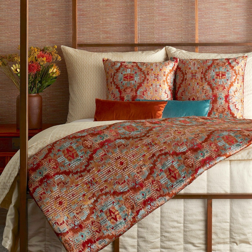
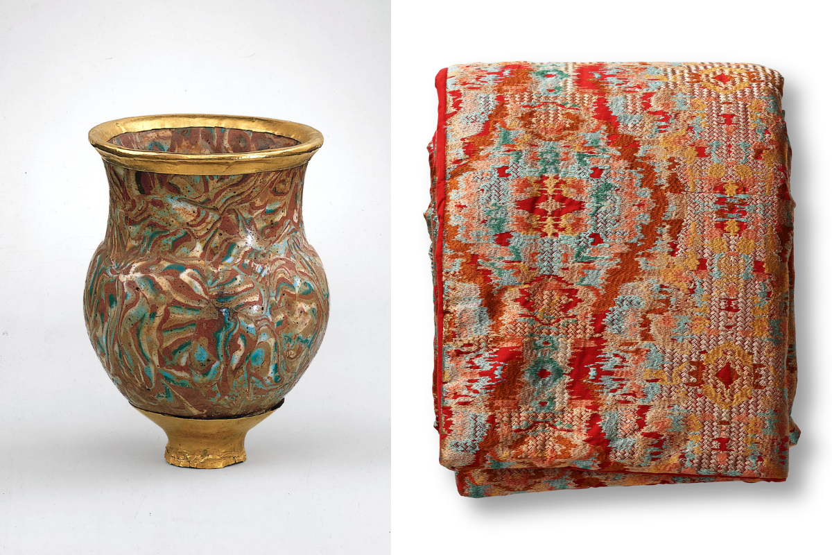
JG: The Dowry collection was inspired by this drinking cup, part of The Met’s Egyptian collection. I felt so compelled by the story behind this artifact: brought from Asia to Egypt by one of the foreign wives of the Pharoah Thutmose. The social act of offering a Dowry is so long-standing and present across all cultures, which makes it fascinating to me.
RPS: Please describe your overall creative and design process.
JG: What immediately stood out to us was both the color palette and the ogival shape of the cup itself. Without the shape of the cup, the pattern of the colors would be a little “marbled book paper lining” which was not what we were going for. We started (as shown in the video) with a rough layout, repeating the ogee motif and then filling in the rich colors of the cup’s faience.
RPS: Did you have a specific audience or theme that you had in mind?
JG: We did think this would be well received in the Mountain West and Southwest – that’s proven true! This palette really works with the light & landscape of those places.
RPS: Please describe the methods, tools, and materials you used to develop and prototype this design?
JG: We use Procreate (an Adobe app) to handle the initial drawing. This acts as a design brief for the particular mill we work with for the fabric. Then comes a CAD, color strike-offs, and sample yardage. We pay close attention to color and honestly always get very OCD about the embroidery colors. The color card has about 200 color options and we really dig deep every time!
RPS: Please describe any challenges that affected the design and perhaps steered you to an entirely new final design?
JG: As you can see in the video of the initial drawing, the hatch marks of color are not as strong in the final design. It looks a little too tribal in initial iteration, and we did a gut check to re-address this. The colors are so strong that the lines and shapes could soften a bit and still keep the overall feeling of the drinking cup artifact.
RPS: Describe your overall brand DNA and Ethos
JG: Sophisticated, beautiful, unexpected, timeless, and original.
Click here to see more of our “Anatomy of a Design” series.
Like what you see? Get it first with a subscription to aspire design and home magazine.