Influenced by a rural Montana upbringing, designer Lisa Kanning’s love of organic shapes and materials often inform her textile collections. But for her most recent collaboration with Hartmann&Forbes, she took a more coastal approach – looking to the sea and sky across the Greek islands to guide her designs.
Raymond Paul Schneider: When did you first start to develop this new collection?
Lisa Kanning: While my initial collaboration with Hartmann&Forbes was focused on more rugged mountain nature themes, as that is where the bulk of our work takes place, this second collection was inspired by the place I go to relax and be inspired – the Greek islands. A journey I look forward to each summer that provides a much-needed escape from the constant daily overload of design concepts, both real and imagined these days. In this austere environment, I can truly focus on the basic characteristics of materials and how they interact with the oft-harsh elements of nature; both illustrating the passage of time and encapsulating true timelessness. It was this feeling that I have always aspired to capture, and with this collection was able to do so in a small way.
RPS: What was the overall timeline from conception to achieving the final design?
LK: I feel I’ve developed a rhythm with the Hartmann&Forbes team and we were able to seamlessly collaborate on these designs in a timely fashion, producing patterns that truly reflect my sensibilities as well as the broad capacity of Hartmann&Forbes to master any milieu.
RPS: What was your initial inspiration, and where did the idea(s) come from?
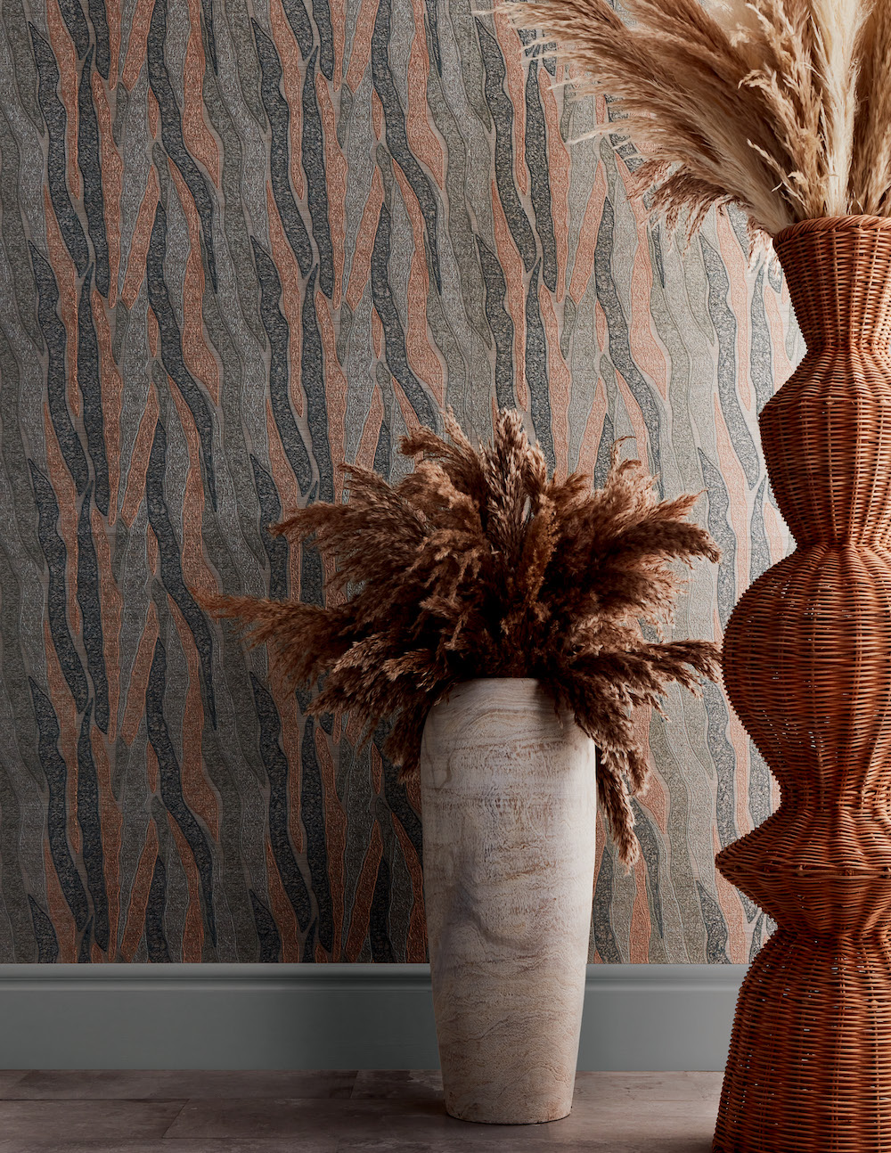
LK: My travels to Greece over the years provided the underlying inspiration. More specifically the interaction of light with natural materials feels enhanced in the island environment, with the addition of near-constant wind adding another layer to the ever-evolving landscape. The rich history of the Cycladic islands and the ability to transform throughout the ages, utilizing the forms and shapes of the natural surroundings and incorporating them into both ancient and modern designs was an enviable concept, and one I wanted to try and capture. The sun, earth, sea and wind are the major components of the islands and comprise the themes of the patterns and colors in the collection.
RPS: Please describe your overall creative and design process.
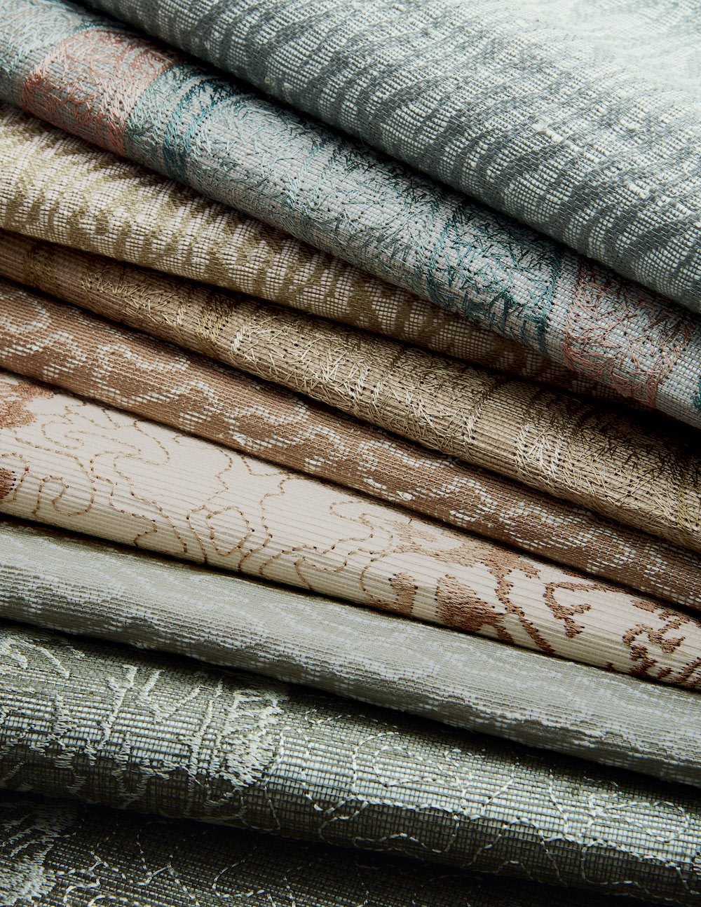
LK: My designs are based on layering, whether it’s a new construction project where we start with the flooring and build up from there, or a wall covering where the ground material is the basis to build upon. In each scenario, the designs involve layering varying textures and sheens to reflect light and create subtle interest.
RPS: Did you have a specific audience or theme in mind?
LK: Creating product designs that transcend a specific aesthetic and can harmonize in many different habitats is always a goal. And while the appeal of these patterns to coastal locales and clientele is apparent, the nature-driven patterns realized in a sophisticated manner allow them to adapt to any environment.
RPS: Please describe the methods, tools, and materials you used to develop and prototype this design.
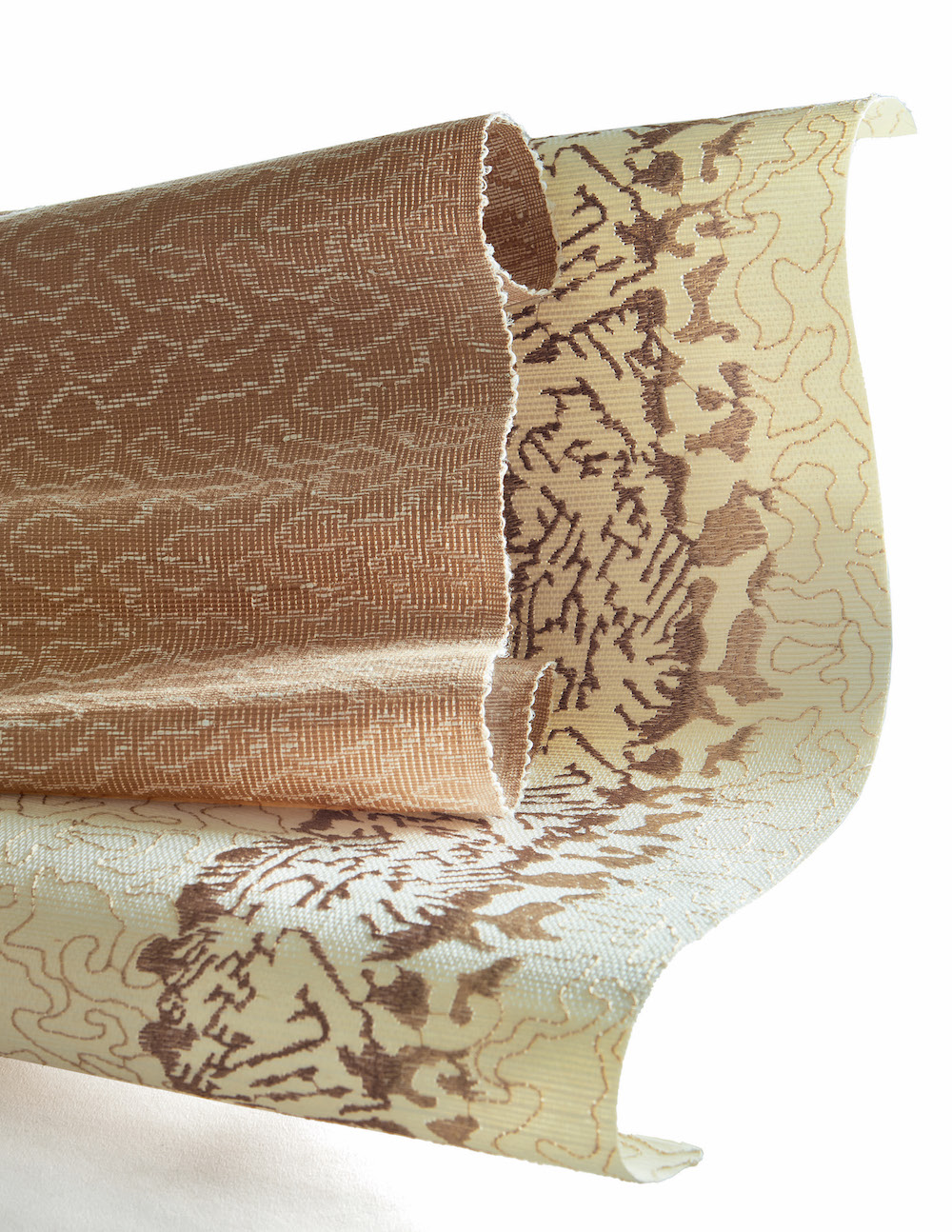
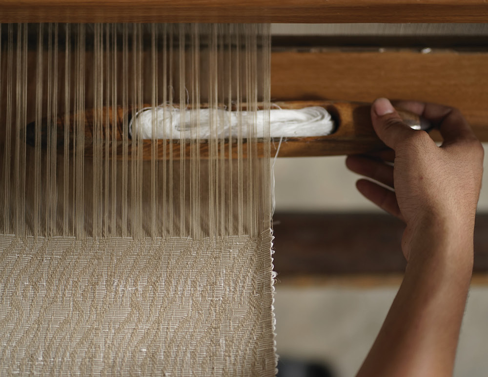
LK: A pattern design is typically initiated by a shape or form in nature, illustrated in a random image that is then transformed through selection from the myriad of materials, techniques and palettes available, to achieve intricate tapestries representative of those found in nature.
RPS: Did you utilize a new technique or technology to conceptualize or create this product? If yes, please share the details.
LK: The jacquard weave utilized for the window covering patterns was new to my repertoire, and I absolutely love the stability of the fabric and the reversible capabilities of the weave. The designs truly capture the movement of the natural patterns they mimic, clouds and waves bolstered by the wind and highlighted by the sun.
RPS: Describe your overall brand DNA and Ethos
LK: Texture is integral in LKID interiors. While excitement can be created solely with the juxtaposition of different textural elements in furnishings, it is even more impactful to incorporate these details into the interior architectural features as well. Adept at many styles of design, often dictated by the location of a project, one can sense a common aesthetic woven throughout all LKIDs work. Clean lines, textural contrast, proportional balance and a thoughtful composition of period and color are trademarks of the firm. Careful consideration is taken with every detail of a project with the knowledge that the overall outcome reflects its components.
LKID’s designs are characterized by modern comfort, as our clients are seeking high-end luxury design with no compromise on performance and durability. And they look to us to provide the latest trends and innovations utilized in a timeless fashion.
Like what you see? Get it first with a subscription to aspire design and home magazine.