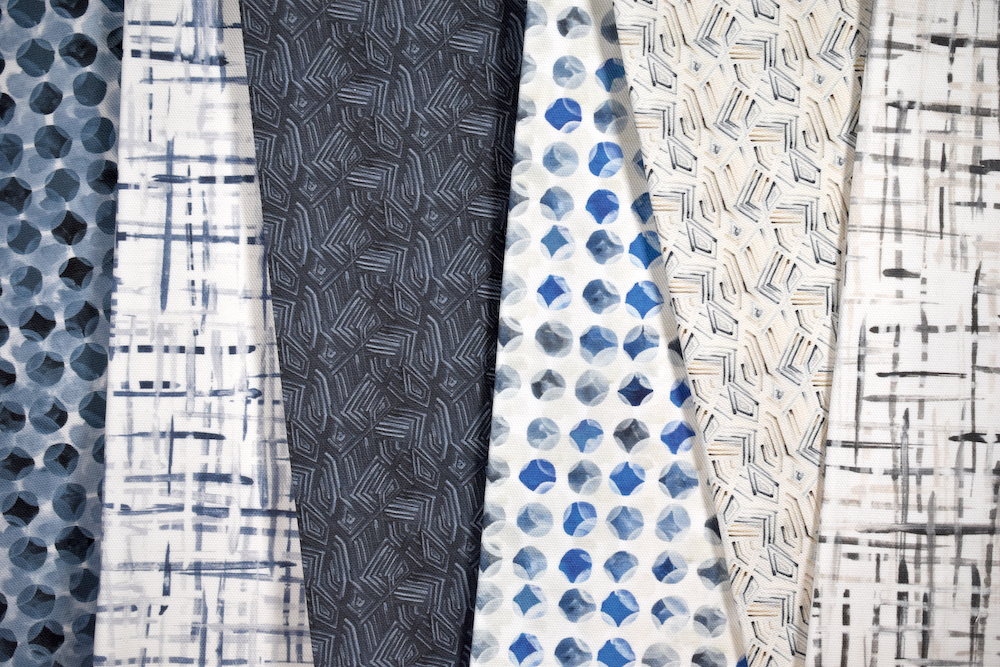
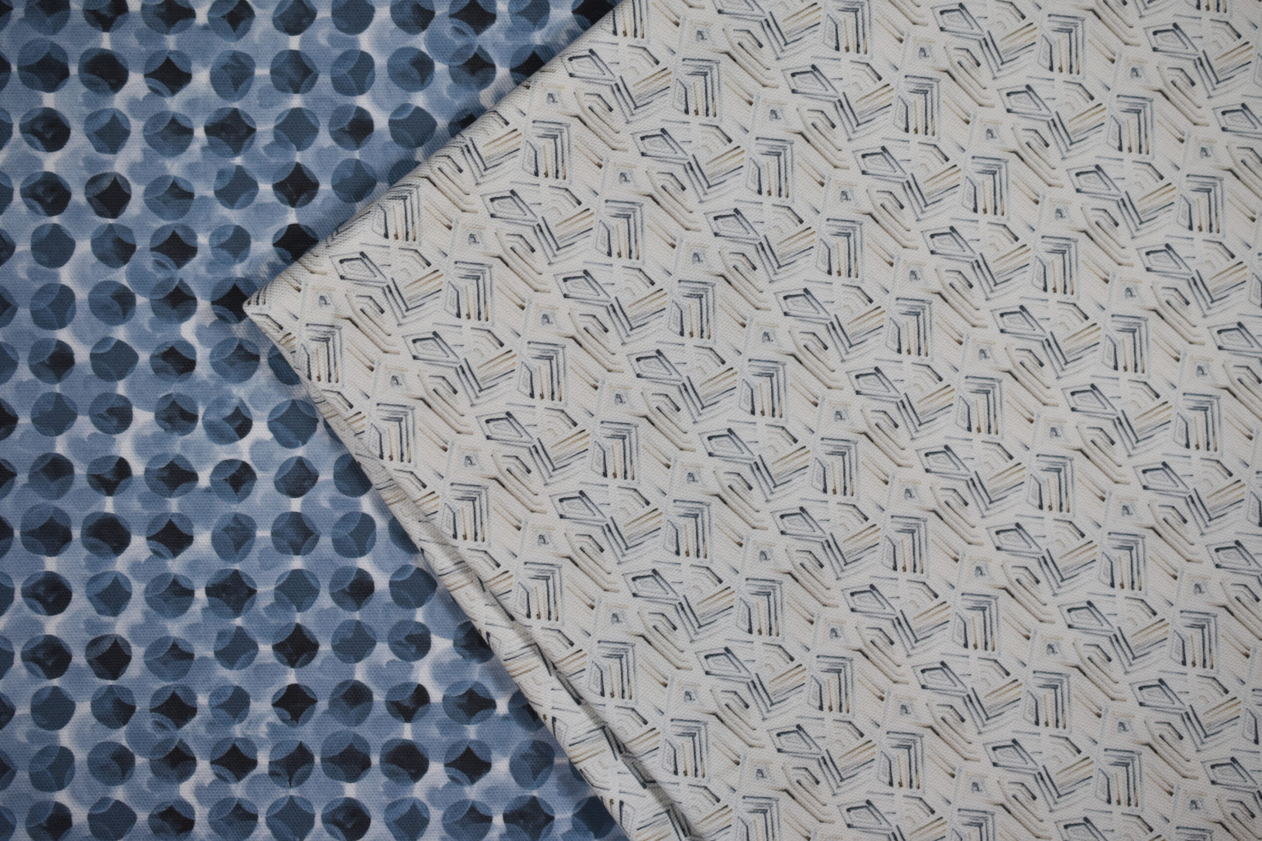
Sarah Von Dreele is challenging herself to create outside of her comfort zone with her latest collections. Launching this spring, Traverse and Envelop are small-scale, neutral designs painted using a single brush width — a departure from Von Dreele’s previous collections.
Take a look at how Von Dreele explored new horizons while creating products that still look and feel like her.
Raymond Paul Schneider: When did you first start developing this new collection? What was the overall timeline from conception to final design?
The paintings used in the collection were developed several years ago, but our typical development time for a collection is about 18 months from paintbrush to sample. While that seems like a luxurious amount of time, it is actually quite aggressive. This edition of patterns re-envisions several works through my present lens, and the development process was not as time consuming. This allowed me to reflect in a targeted way, exploring very specific capacities for these works.
RPS: What was your initial inspiration, and where did the idea(s) come from?
I like to reflect on the context from which a work is painted. The Ascend pattern is an expansion of my Marie-Thérèse pattern, which was painted after visiting the Eglise Saint Germain des Prés in Paris. I prefer to paint after an experience, and I trust that experiences will manifest themselves through my work. Five years after my brand’s inception, my focus is building upon the foundational footing, which feels really good. As the collection grows and expands, I’m nurturing the cohesiveness of my collective work. Discovering and amplifying connections within the greater body of work is paramount. My work has always been experiential and relational, and I am really paying attention to how my collection relates within itself.
RPS: Describe your overall creative and design process.
Oscillating between the intellectual and experiential, the conversation between my left and right brain is quite busy! Some days I just paint to see what happens, other days I have very intentional elements that need to be rendered from a technical perspective. While I reserve time to continue to explore as an artist, I have been focusing on transitional elements within the collection, primarily scale and depth. This is a theme which will become very apparent in 2026. Gouache continues to be my medium, and I don’t see that changing anytime soon. It still provides me with the tools to fully explore an idea iteratively. Although, I was really blown away by the Olga de Amaral exhibit in Paris this winter and feel motivated to get back into dimensional work. (Many moons ago I did an artist’s residency on Nantucket and created these natural fiber studies that have been calling my name lately. Stay tuned on that one!)
RPS: Did you have a specific audience or theme in mind? Were there any challenges that influenced or changed the final design?
I landed in this industry using painting as a medium to exist through an uncomfortable experience. The result was finding comfort in large-scale, gestural work. It is actually a challenge for me to work in small-scale or neutral palettes. So why not run towards what doesn’t come naturally? I like to create challenges for myself, exhausting what is possible within a set of limitations, fully exploring an idea which leads to rich iteration. Sometimes that means limiting myself to a single tool or exploring colors that I am not naturally drawn to. Both the Ascend and Traverse patterns were limited to a single brush width. My favorite brushes are the really inexpensive ones from the hardware store paint department. They render the cleanest lines and hold the paint really well for extended line lengths.
RPS: What methods, tools, and materials did you use to develop and prototype this design? Did you use any new techniques or technologies to conceptualize or create this product?
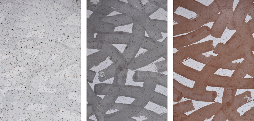
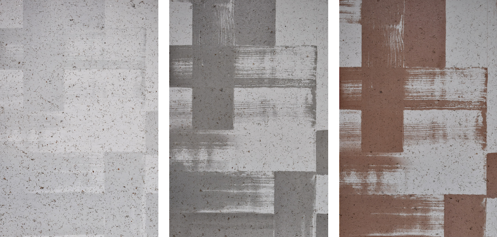
Gouache, a water-based paint, is still my medium of choice for painting. Having recently expanded my vendor relationships, the availability of production methods and ground options has grown for me, which is really exciting in moving forward. The new ground in this collection, a metallic white cork, is such a beautiful texture on its own. Engineered, printed structure juxtaposed on organically placed flecks creates this wonderful, unpredictable dialogue – quiet, serendipitous moments. This kind of layering is top of mind for me right now.
RPS: Describe your brand’s overall DNA and ethos.
I believe that trusting in the lens through which we process experience provides the greatest source of inspiration. For everything else, the left brain can handle.
Like what you see? Get it first with a subscription to aspire design and home magazine.