Spring Street by Pollack has unveiled its fourth collection, expanding the brand’s essence through patterns that blend slightly more traditional motifs with the modern, playful and organic designs of the line. This collection exudes an old-world charm, with each design reflecting artistry, character and refinement.
Design Director Rachel Doriss, who oversees the in-house design team and guides the creative vision for each textile collection, joins us this week to discuss the new patterns.
Raymond Paul Schneider: When did you first start developing this new collection? What was the overall timeline from conception to final design?
Rachel Doriss: We started the development of the Spring 2025 collection in the summer of 2023. We always work 12-18 months in advance of launching a collection.
When we start percolating ideas for a new collection, our Associate Design Director, Peyton North, and I sit down and study what we have already launched and what we think the collection is missing. It takes us 6 months to a year to design a fabric from start to finish. This includes creating artwork, specifying the pattern and weave construction, and developing a color line. It then takes another 9 months for production, sampling and photography before bringing a fabric to market.
RPS: What was your initial inspiration, and where did the idea(s) come from?
RD: For this collection, we wanted to embed the designs with some old-world flavor. We looked at antique books and interesting book bindings for a tailored aesthetic with a hint of vintage detail. We always envision the rooms where we want our fabrics to live and create a fantasy environment in our minds before we begin.
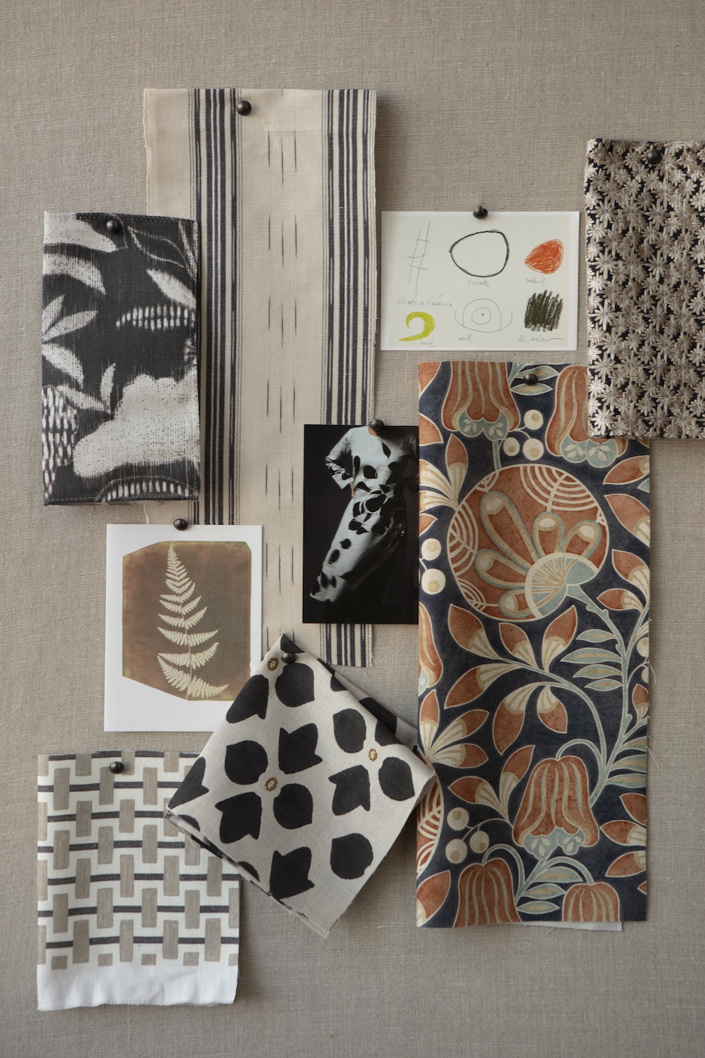
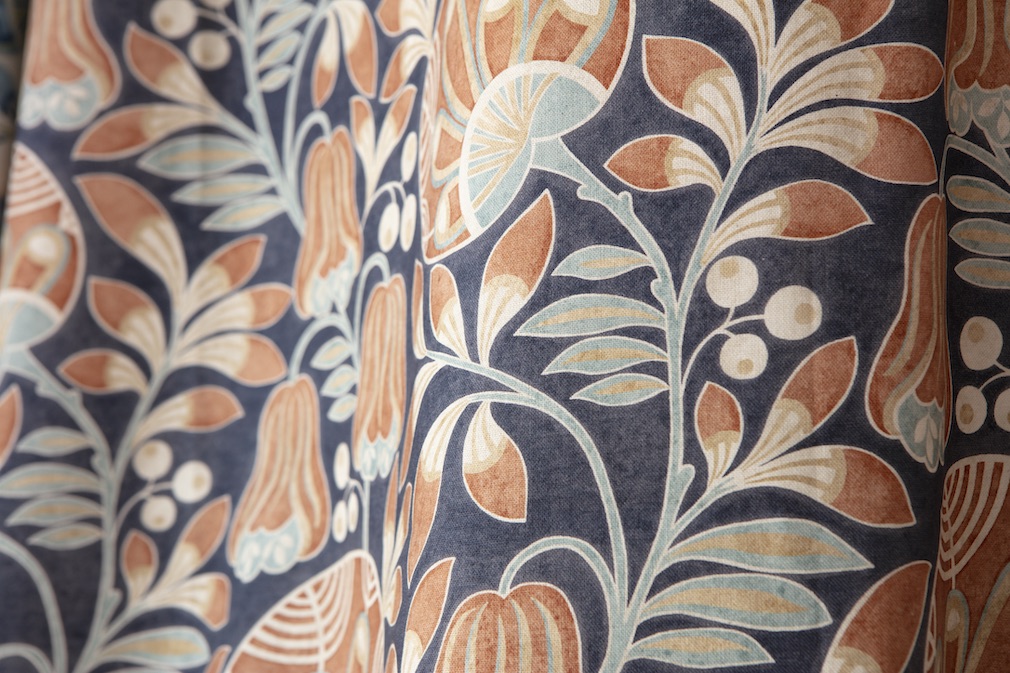
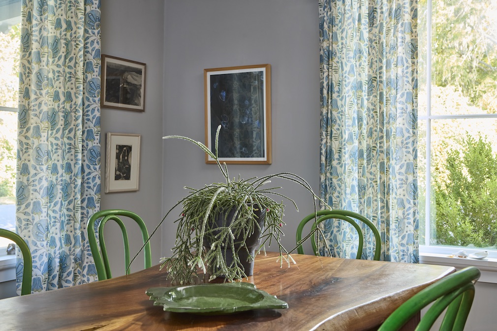
For example, the pattern for Persephone is from a hand-painted French document. We were able to print this fantastical floral in the U.K. and achieve the mottled effect of the original painted artwork.
Anthropology is an ikat. This is where the vertical yarns are tied and dyed, creating a dashy effect in the stripe. The colors have a slightly casual or faded look to them, as if they were dyed with natural pigments. You could find these colors in antique books in a library.
Charlotta was inspired by a hand-stenciled wall pattern that I discovered on a tour of a castle in a medieval village in the Czech Republic. The original pattern was literally stenciled on the stone wall.
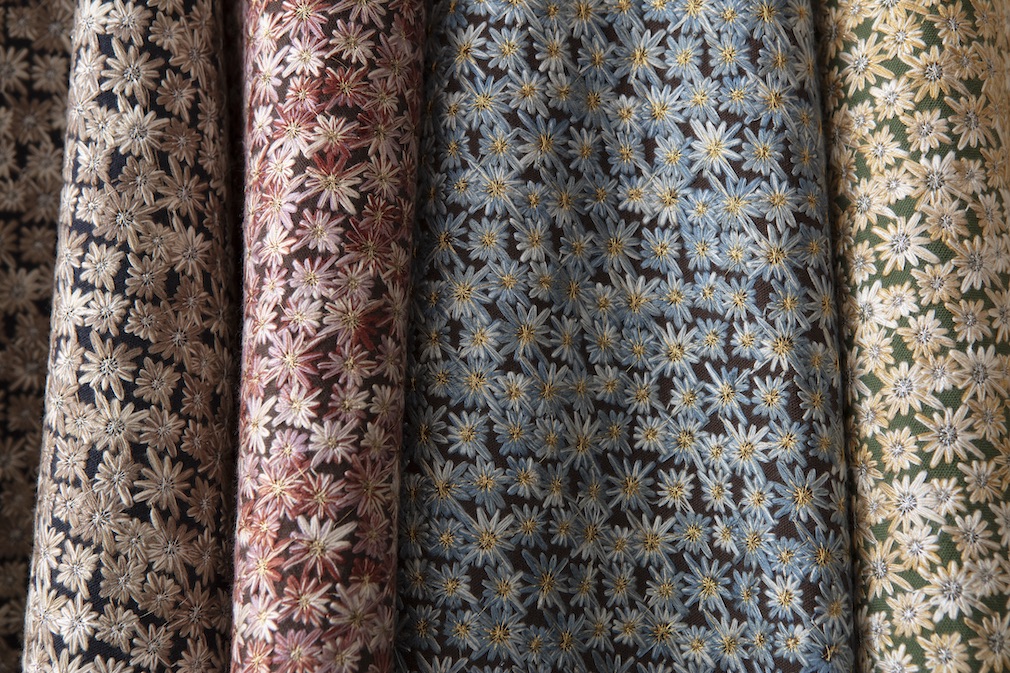
The embroidery, Corsage, looks like a fine embellishment that could be found on the collar of an antique coat, or even perhaps on your grandmother’s cigarette case.
RPS: Describe your overall creative and design process.
RD: The majority of the fabrics in Spring Street are printed or embroidered. We work with different boutique manufacturers around the world to achieve the effects we want. At the very beginning of our design process, we create hand-made painted artwork and drawings, we look at archival documents, and we discuss different types of material and cloth that we would like to use. We are marrying the pattern with the cloth from the beginning. For Spring Street, we start building the collection of patterns to include a signature floral, something tactile, something hand-drawn and a casual stripe or geometric — we want a variety that can either be used together, or mixed in with other patterns and plains from our Pollack collection (or any brand’s collection!).
In the Spring collection, I love the fact that there are three florals that are very different from each other: Persephone, Charlotta and Corsage.
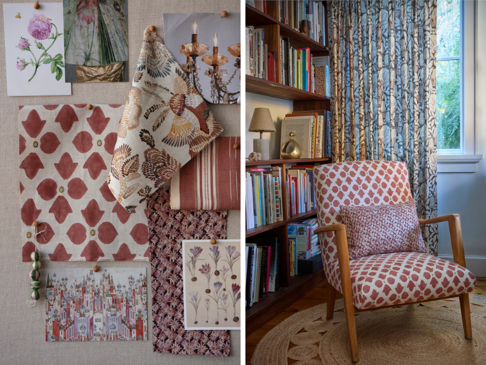
Persephone is the most traditional floral since it’s based on an antique French document. Charlotta is a much simpler flower and slightly masculine as the petals reference shields or crests. It’s even more interesting because we combined a handblock print with machine embroidery. Corsage uses a beautiful space-dyed yarn to give a multicolored look to fine flowers with a pinpoint of metallic Lurex at the center. The embroidered flowers are so dense that they almost entirely cover the ground cloth.
RPS: Did you have a specific audience or theme in mind?
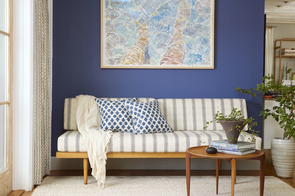
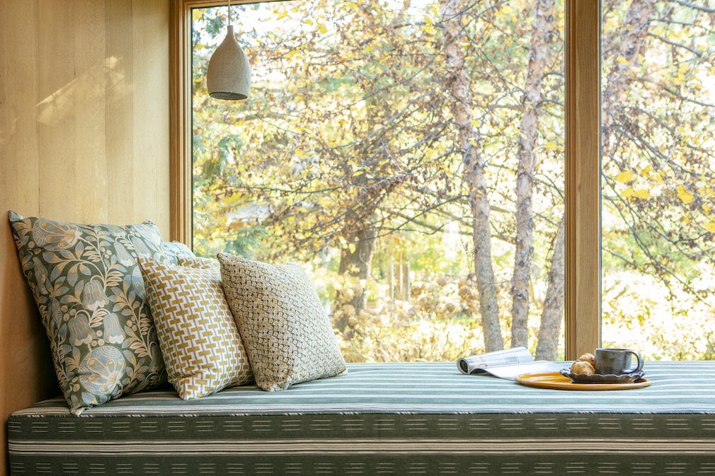
RD: Although this collection has a touch of old-world charm it can work well in traditional and contemporary settings. There is a softness to the mark-making that makes it appropriate for residential interiors. These fabrics are most at home in an eclectic interior that shows an appreciation for surface, color and detail.
RPS: What methods, tools, and materials did you use to develop and prototype this design?
RD: Persephone is a digital print made at a 100-year-old mill in the U.K. This manufacturer specializes in recreating hand-painted details in antique documents — that’s why we chose to work with them for this traditional pattern. The all-cotton ground cloth has a crisp but casual drape.
Anthropology is a hand-woven ikat that we produce in the south of India. The yarns are tied and dyed by hand before being handwoven on wooden looms. The variation and character of the dashed ikat lines in this pattern give it a lived-in casual appearance, as does the dryness of the cotton and linen yarns.
For Charlotta, it was a thrill to combine the handmade with the high-tech. First, the cotton/linen ground cloth is machine embroidered on a state-of-the-art embroidery machine, which creates the fine detailed ovals that look like jewels. After embroidery, the cloth is taken to a boutique hand-block-printing facility. We asked the artisans to carve a wooden block of 4 petals. Each flower is created by taking the wooden block, dipping it into pigment, and hand stamping it onto the cloth — all the while making sure to register the embroidered jewel in the center of the flower. This fabric is refined in the embroidery and simple with a casual mottled effect in the petals. I love this juxtaposition.
For Corsage, the star of the show is from the dyeing process. The embroidery yarn creating the flowers is space dyed—which is basically like tie-dyeing—so that it changes color. You can see all the variations of color within each flower. The metallic Lurex center is the icing on the cake.
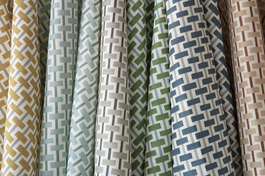
Although Brick Lane is a simple graphic, if you look closely, you can see that the dashes and lines are hand-painted, which gives variation to the geometry. This pattern is digitally printed on a linen/cotton ground.
RPS: Describe your brand’s overall DNA and ethos.
RD: The idea for the line came after I moved from a city apartment to a house in the country. For many, including myself, the relationship to “home” has evolved: it’s a workspace, a gathering space for family and friends, and a refuge from a chaotic world. My shifting priorities and surroundings led to a creative streak that pushed the Pollack aesthetic into a new realm and as a result, and together with Peyton North, Spring Street was born.
Peyton and I applied this refreshed design sensibility to prints in order to allow for a more fluid style of mark-making; Pollack’s signature geometry and bold color is softened into Spring Street’s organic shapes and nuanced yet surprising color combinations. It is still modern and lively, but with that softer approach.
Like what you see? Get it first with a subscription to aspire design and home magazine.