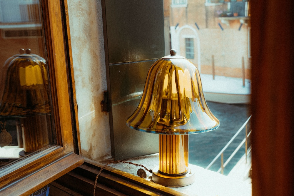
With transportive designs that embody modern heritage and nostalgic coastal life, the Lido collection from Ward + Gray expresses a sentimentality for pieces made by hand and the city’s old-world connection to the sea. The collection takes its name from The Lido, a barrier island in the Venetian Lagoon, where locals set out on their boats each summer and home to the Venice Film Festival. The storied beach town and emblematic Venetian archetypes serve as muses, translated into functional lighting pieces through familiar silhouettes and nuanced detailing.
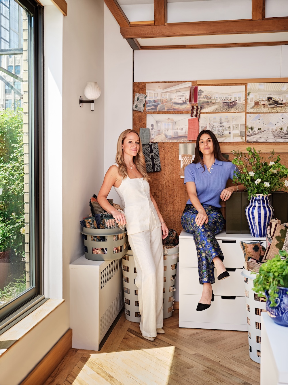
Christie Ward and Staver Gray, co-founders and principals of Ward + Gray, join us this week to discuss the design process.
Raymond Paul Schneider: When did you first start developing this new collection?
Christie Ward: Conceptually, Lido has been in development for years. We’re constantly designing custom lighting for our hotel and residential projects, so a lighting collection felt like a natural evolution.
RPS: What was the overall timeline from conception to final design?
Staver Gray: Our first thought was to work with the family-run company from Venice who we’ve collaborated with for years on custom pieces for residential and hospitality projects. So, it’s been a long relationship and many years of collaboration that naturally led to this collection.
RPS: What was your initial inspiration, and where did the idea(s) come from?
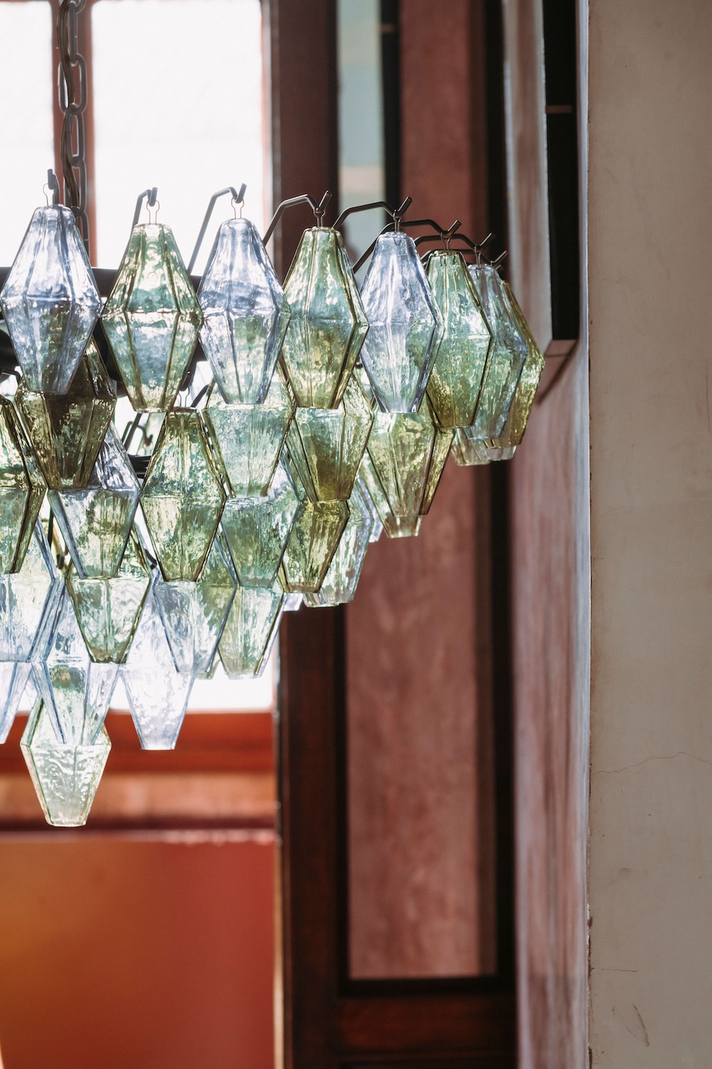
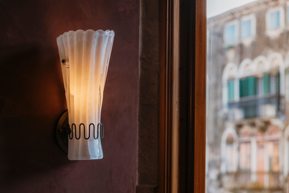
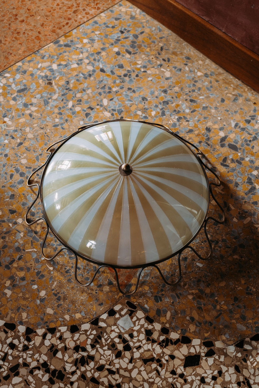
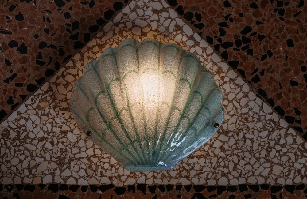
CW: We’ve always been drawn to the thoughtfulness behind custom lighting and how materials, proportions, and forms interact, and have developed a deep appreciation for the craft of handblown glass. We were inspired by Lido’s juxtaposition of coastal style and historic charm. It’s this barrier island made up of beaches and beach towns, where locals take their boats on summer weekends, and also where the Venice Film Festival is held. Venice also has this old-world connection to the sea because it’s on water, and scenes of shells and mermaids are motifs throughout the city, carved on the facades of historic buildings. We wanted to capture those coastal elements and everything that feels warm and beachy. Those shapes inspired the organic profiles and imperfect edges you see throughout the collection. There’s always been this nostalgic happiness tied to the shore, and we wanted to translate that feeling into functional lighting pieces.
RPS: Describe your overall creative and design process.
SG: Our process began with translating familiar silhouettes and nuanced details from Venetian archetypes into functional lighting pieces. We’re both collectors and love taking inspiration from the things we see traveling or at flea markets, so we brought those sensibilities into the design process. We worked closely with artisans to craft each piece using traditional glassblowing and brass metalwork techniques, with everything beautifully hand-patinated to feel antiqued and worn over time.
RPS: Did you have a specific audience or theme in mind?
CW: The overarching theme is coastal Venice. There’s an underlying maritime language in the forms, finishes, and overall mood of each piece. They feel right at home in both residential and hospitality settings, which reflects our studio’s work. We design for clients who value pieces made by hand, appreciate timeless craft, and want interiors rooted in a sense of place.
RPS: What methods, tools, and materials did you use to develop and prototype this design?
SG: All of the lighting is produced in Venice at a generational, family-run factory who have been in operation for decades. The glass is handblown using traditional techniques Venice is known for, and the metalwork is brass that’s been carefully hand-aged to achieve a rich, nuanced patina.
RPS: Did you use any new techniques or technologies to conceptualize or create this product?
CW: We relied on the traditional craftsmanship of Venetian glassblowing techniques. What was new for us was translating those methods into a cohesive product collection rather than designing one-off custom pieces. Partnering with a workshop we know so well allowed us to fully trust the process and the quality.
RPS: Were there any challenges that influenced or changed the final design?
SG: One of the biggest challenges was balancing that relaxed, sun-worn feeling with the precision handblown glass demands. We wanted the pieces to feel soft and nostalgic, but achieving that ease requires a lot of refinement. Working closely with Venetian artisans helped us push the material just enough, testing silhouettes and finishes until they felt timeless.
RPS: Describe your brand’s overall DNA and ethos.
CW: Our ethos centers on creating spaces that feel authentic and lived-in. Staver and I found an immediate common ground in our approach to materials and craft when we first met, and that appreciation for heritage, patina, and craft continues to guide our work.
SG: Our aim is to create richly layered, collected interiors with a strong sense of place. We focus on the nuances of each project and specialize in fully bespoke environments.
Product photography by Augusta Sagnelli. Headshot by John Daniel Powers.
Like what you see? Get it first with a subscription to aspire design and home magazine.