
When Canadian-born print and pattern designer Elizabeth Olwen moved to sunny Portugal six years ago, her world and work erupted with color. Her Color Dream collection, released in partnership with Felt Right, sees the melding of those warm and vibrant hues with Olwen’s love of groovy geometrics.
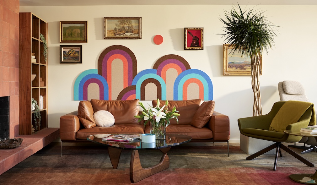
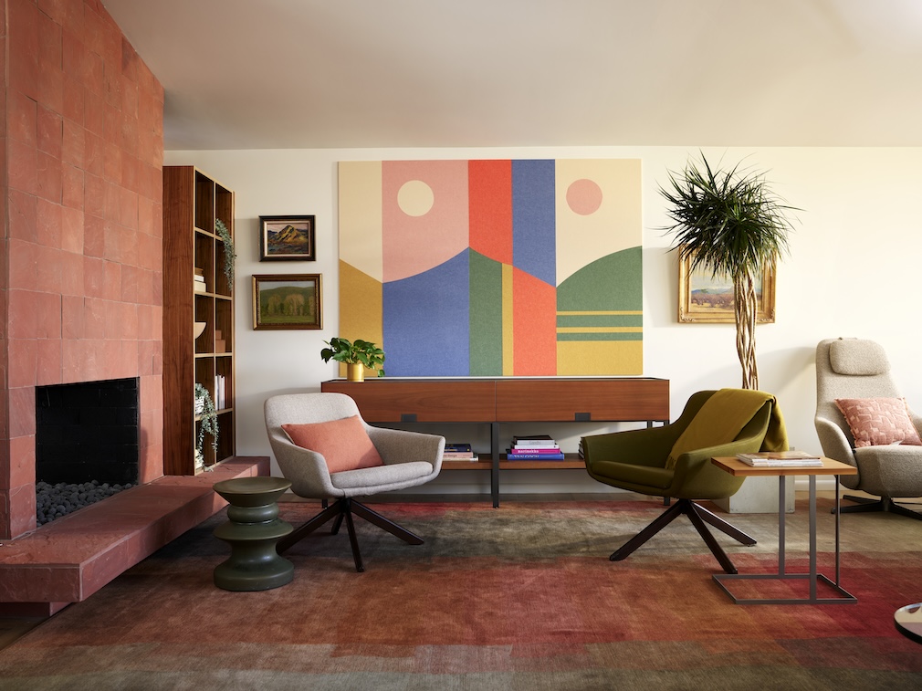
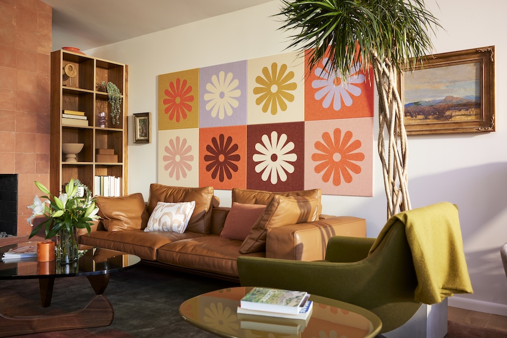
With a focus on elevating interior spaces while addressing acoustic needs, this collection features four distinctive designs: Color Curves, New Horizons, Daisy Checker, and Shape Play. See how the collab came together in this week’s Anatomy of a Design.

Raymond Paul Schneider: When did you first start to develop this new collection?
Elizabeth Olwen: The Color Dream collection started to percolate at the end of 2023. When I met Felt Right, it was clear that we were aligned on many levels — we approach projects with the same degree of passion for beauty and sustainability, and a nimble, can-do mindset. So it didn’t take us long to pull our ideas together and bring the vision to life.
RPS: What was your initial inspiration, and where did the idea(s) come from?
EO: About 6 years ago, I left Canada and moved to Lisbon, Portugal. My “home away from home” home has become such a sanctuary space for me. Building a new life here was a fresh opportunity to consider how I want my home to feel — joyful, soulful, beautiful, playful and inspiring. And for me, the invitation was obvious: bring on the color! Color really has the ability to uplift the mood, an idea supported by the recently-coined movement ‘Dopamine Decor’. In addition to color, I have an inspired relationship with shape — I’m continually attracted to pared-down modern shapes that give subtle nod to the 60s and 70s. When you bring it all together, you get the Color Dream collection, a celebration of shape and color, and a warm invitation to bring joy and beauty into our homes and commercial spaces.

RPS: Please describe your overall creative and design process.
EO: I’m continually interested in the playful relationships between colors and shapes, and I’m always inspired by nature. I gather inspiration from all angles, always having my antennae actively scanning for what makes my heart swell. From these gatherings, I put together moodboards which I use to build out my ideas. After much sketching on paper, and digital play on my computer, motifs shapes and colorways begin to dance and wiggle themselves into a piece of artwork that fits my soul’s vision. And then, to my good fortune, I get to partner with great companies like Felt Right, who bring these ideas to life in mediums that I feel connected to, in a sustainable and ethical way.
RPS: Did you have a specific audience or theme in mind?
EO: I really feel that our collection can appeal to so many people, but I suppose this collection might appeal strongly to those that are open to exploring their relationship to color, inviting it into their world with a touch of boldness and curiosity.

RPS: Please describe the methods, tools, and materials you used to develop and prototype this design. Did you utilize a new technique or technology to conceptualize or create this product?
EO: I created the artwork digitally and then Felt Right began prototyping, cutting each piece of the design out of felt with their highly-precise cutting machines, which can cut any design or pattern. The felt is made from single-use plastics — a really remarkable process that turns waste into beauty. I must emphasize, the felt is truly delicious and luxurious — when I received the samples of colors to choose from, I truly wanted to eat them! And not only are the panels beautiful but they’re also sound-dampening, and function as pinboards. Plus, the panels are hung with adhesive strips that are super easy to remove, so the pieces are movable and are great for renters and owners alike. It’s beauty meets function, technology and sustainability — it’s truly a dream project for me.
RPS: Please describe any challenges that affected the design and perhaps steered you to an entirely new final design?
EO: We really wanted the collection to be as waste-free as possible, so we needed to use the felt really efficiently. So in some cases, we tweaked a design to maximize the felt usage and reduce waste. We also wanted to work with Felt Right’s existing color options as much as possible, so that we weren’t creating the need for new materials. So, in some cases, I adapted the colorways to mix and match well within the existing Felt Right palette. I’m a designer at heart and sometimes these small restrictions can be really inspiring and push me to find a great solution and ultimately, build out a collection that looks as though there were no limitations at all.

RPS: Describe your overall brand DNA and Ethos.
EO: My work is all about celebrating beauty and spreading joy through print, pattern and color. I consider myself a creative in a really broad sense of the word — I love to bring my artwork together with fresh ideas about product design, sustainability, storytelling, branding and other creative play forms. I think creativity plays a powerful role in the heart-centered life so I also teach, through online classes and hosting retreats in Europe. I collaborate with like-minded brands to create feel-good, intentional products that are additive, and bring joy and beauty to our everyday lives. Since moving to Portugal, its majestic coastlines and natural abundance have deeply inspired my work and my life, and sustainability has become an essential component of my brand collaborations. I love working with partners who share these values.
Click here to see more of our “Anatomy of a Design” series.
Like what you see? Get it first with a subscription to aspire design and home magazine.