
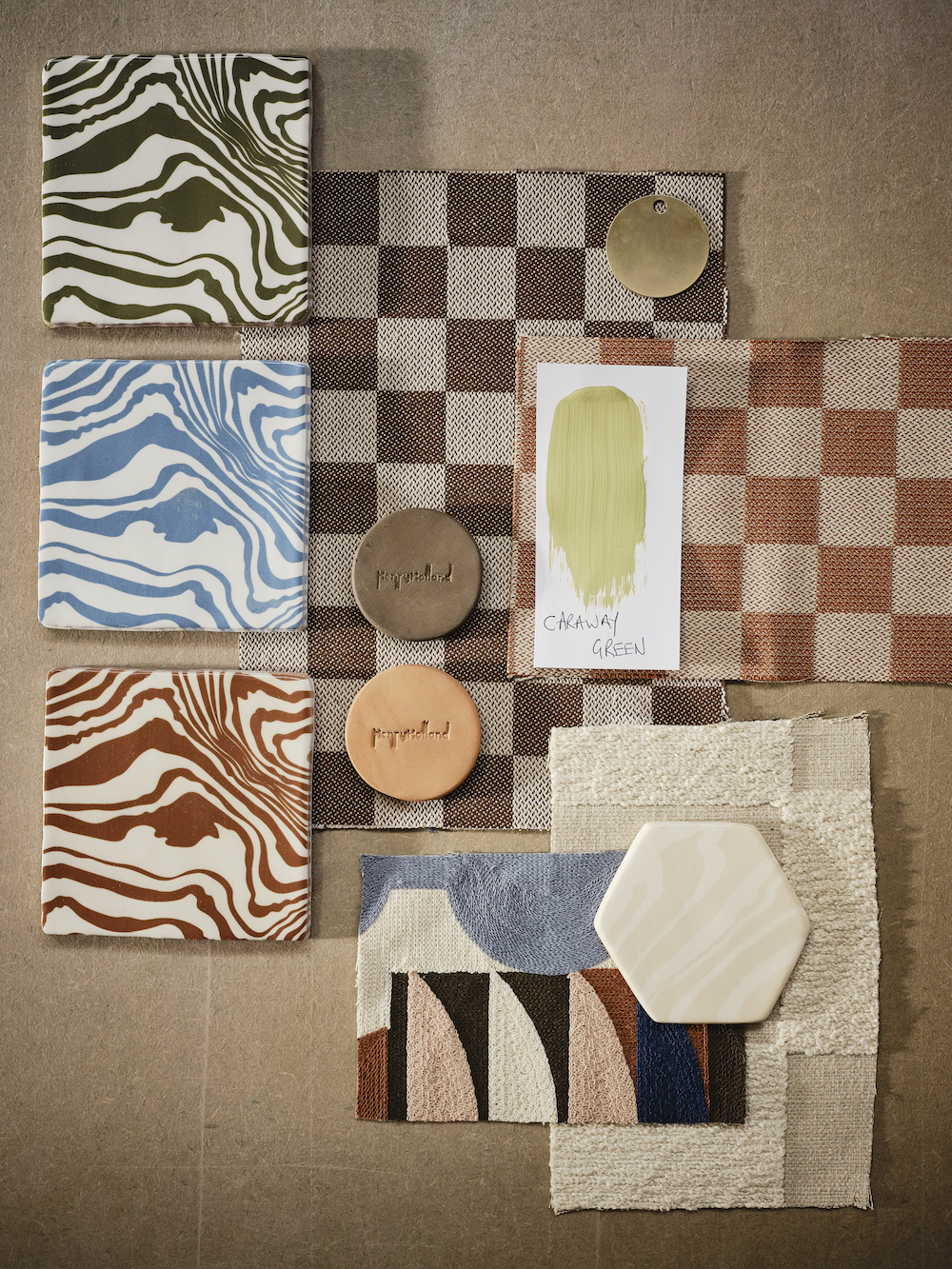
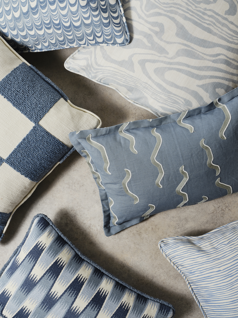
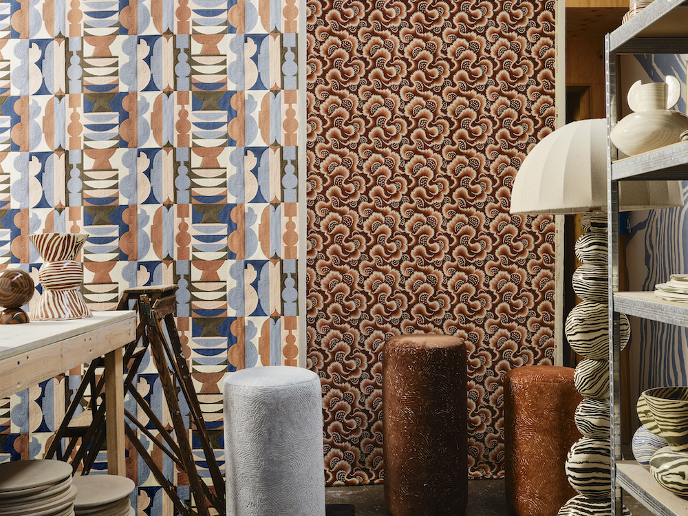
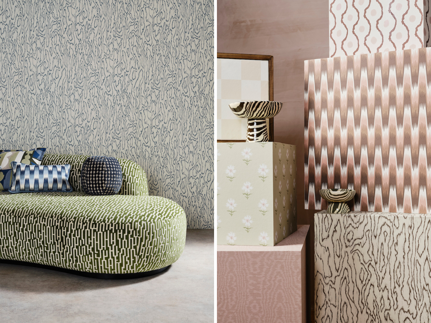
Organic forms and earthy color combinations come together in the Harlequin x Henry Holland collection of fabrics and wallpapers. Drawing inspiration from his ceramic work, his career as a designer, and personal memories like his wedding day, the collection is a deeply personal look into the creative mind of Henry Holland.
We spoke with Henry here to discuss how the collaboration came together.

Raymond Paul Schneider: When did you first start to develop this new collection?
Henry Holland: I started working with the Harlequin design team and Claire Vallis, the SDG creative director, around 18 months ago. I had some really clear thoughts and starting points on where I wanted the collection to go and what I wanted to achieve. For me, this collection was about evolving and developing our aesthetic beyond just the patterns that we create through our ceramic collections and also a way of working on a textural story that created depth and layers to the story. Allowing me to achieve things that are just not possible in ceramics in the same way.
RPS: What was your initial inspiration, and where did the idea(s) come from?
HH: As this was my first collection working in fabrics and wallpapers, I had my whole life in interiors to draw from. The result is a collection that is incredibly autobiographical and personal to me. I have drawn from all of the homes that I have lived in from my childhood home and even through to naming one of the fabrics after a street that I would like to live on in the future – a way on manifesting if you like! My mum was very interested in interior design and was passionate about the way she decorated the various homes I lived in as I grew up – I have drawn from this and referenced it throughout. I also knew that I wanted to include a moiré fabric as this is what my wedding suit was made from. It was a custom-made mint green moiré silk suit and so, again, I have really been able to infuse so many personal life moments into the collection.
RPS: Please describe your overall creative and design process.
HH: We started with the palette, and this is very much directly based on my ceramic work. Keeping the palette concise is a key factor in creating a collection that truly reflect my aesthetic but then pushes it beyond the boundaries of ceramics. We built the palette in two different layers based on my ceramics when they were bisque fired (more pastel in tone and subtle) and then ‘Glazed’ (much brighter and bolder tones of the same colors) this has allowed us to create a decorating story that allows most of the pieces to be used together and complement each other in any decorating scheme.
RPS: Did you have a specific audience or theme in mind?
HH: The great thing about working in homeware is that the pieces are there for people to use them in a way that reflects who they are in their own homes. I have a strong concept of who my ceramics customer is however I think that the audience for the fabric and wallpaper is much wider as we are simply providing the tools for people to build a scheme for their home that is personal to them and something that creates a space that they feel themselves in.

RPS: Please describe the methods, tools, and materials you used to develop and prototype this design.
HH: We worked with both the UK-based Sanderson factory and also some international mills which, again, has allowed us to experiment with some really progressive weaves, embroideries and techniques to build a collection that is layered and rich in texture and variety. All of the printed fabrics and wallpaper are made in the UK and as a UK-based maker that was really important to me.
RPS: Please describe any challenges that affected the design and perhaps steered you to an entirely new final design?
HH: The only challenges we had were in editing the collection down and keeping it concise and cohesive as we all were so thrilled with all of the samples that we received as we were developing the collection.

RPS: Describe your overall brand DNA and Ethos
HH: The Henry Holland Studio brand is all about craftsmanship, handmade pieces and slow craft. We are a London-based company and small team of makers that is infused with joy and playfully bold patterns and motifs. We make pieces to bring joy to people and into their homes.
Like what you see? Get it first with a subscription to aspire design and home magazine.