
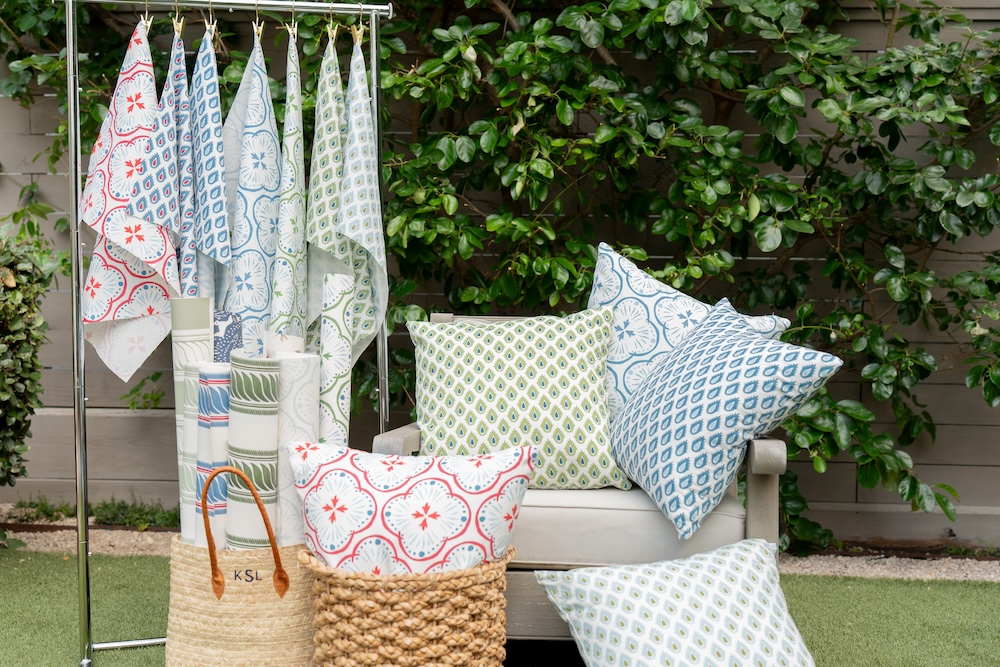
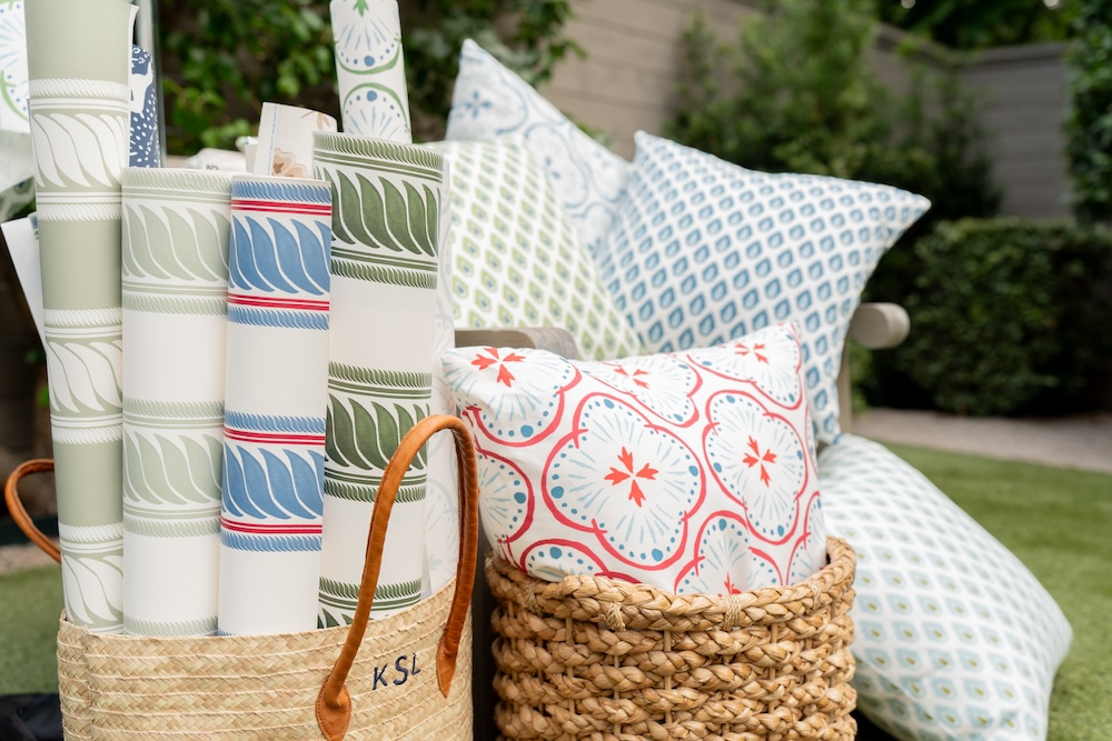
Designed as a love letter to tradition and “the timeless textures that shape our memories,” the Heritage Collection from Kristen Leigh blends coastal Americana with hand-painted artistry.
Kristen joins us this week to discuss how she designed this collection of fabrics and wallpapers to bring warmth, soul and storytelling into any space.

Raymond Paul Schneider: When did you first start developing this new collection?
Kristen Leigh: I began developing the Heritage Collection early last year, though the ideas had been quietly simmering for a bit longer. I kept coming back to this feeling of “home” — the textures, colors and nostalgia of where we come from — and eventually realized it needed to become a full collection.
RPS: What was the overall timeline from conception to final design?
KL: From the first loose sketches to final print-ready designs, the process took about 14 months. I spent the early months exploring color stories and watercolor sketches, then moved into refining the motifs, testing scale and perfecting the repeats. The final stretch involved sampling, adjusting color calibrations and making sure every pattern captured that worn-in, sun-washed charm.

RPS: What was your initial inspiration, and where did the idea(s) come from?
KL: The collection was born out of a love for the quiet comforts of home: linen shirts soft from years of wear, woven baskets tucked by my grandmother’s porch, hydrangeas in every shade of blue. I wanted to create patterns that felt familiar in the best way — like finding a family photo tucked into a recipe book. The inspiration came from moments that feel rooted, safe and timeless.
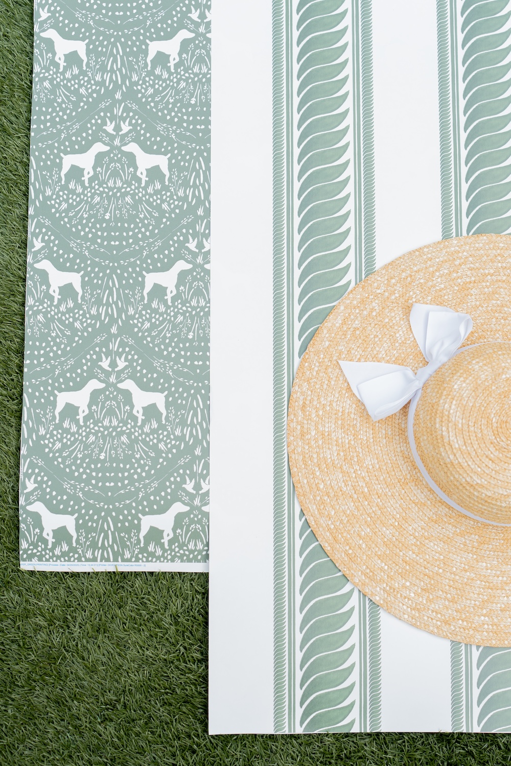
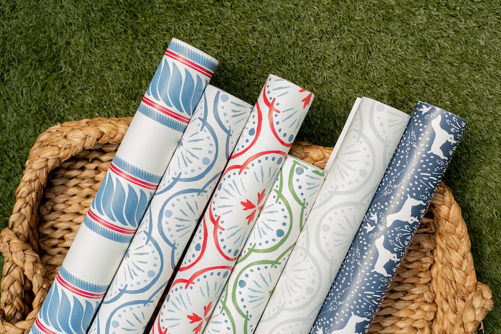
In this collection, I adapted one of my most popular fabric patterns, the Dixie, as a long-anticipated wallpaper. I also introduced the Maison Stripe, which I originally created for the Le Petite Maison Dollhouse Gala last fall, and adapted it to actual scale.
RPS: Describe your overall creative and design process.
KL: It always begins with watercolor. I sketch and paint by hand — loose florals, stripes, coastal motifs — then scan everything to refine the shapes digitally. From there, it becomes a dance of adjusting scale, building repeats and exploring color palettes that feel authentic to the story I’m telling. I test the designs on both textured and smooth grounds to see how they “live” on different substrates. Everything is slow, intentional and rooted in texture.
RPS: Did you have a specific audience or theme in mind?
KL: Absolutely. I designed this collection for the people who crave that wrapped-in-home feeling. Homeowners, designers, coastal dreamers — anyone who loves spaces that feel collected, lived-in, and effortlessly warm. The theme was always “heritage”: honoring where we come from while creating pieces that feel elevated enough for modern interiors.
RPS: What methods, tools, and materials did you use to develop and prototype this design?
KL: My process always starts with traditional watercolor paints, cold-press paper, and far too many brushes. Once the artwork is scanned, I use digital tools to clean up the edges, perfect the repeats, and experiment with scale and color. Prototyping happens through printed strike-offs, wallpaper swatches and fabric samples so I can study how the texture and color translate in real life.
RPS: Did you use any new techniques or technologies to conceptualize or create this product?
KL: For this collection, I focused on blending traditional painting with more refined digital color-matching than I’ve used before. I also incorporated texture mapping to help the watercolor look more dimensional on woven and paper weave grounds. It allowed me to keep that hand-painted softness while ensuring the final product prints consistently and beautifully.
RPS: Were there any challenges that influenced or changed the final design?
KL: Definitely. The biggest challenge was preserving the organic, imperfect charm of watercolor while moving the designs into technical repeat formats. Some motifs needed to be repainted multiple times to get the right fluidity. I also adjusted scale along the way — as dreamy as small florals can be, they sometimes lose their personality when printed large, and vice versa. Every hurdle ultimately made the collection more intentional.
RPS: Describe your brand’s overall DNA and ethos.
KL: My brand is built on the belief that home should feel like a refuge — warm, personal, and rooted in story. Everything I create is grounded in hand-painted watercolor, natural textures, coastal influences. I aim for a look that feels elevated yet approachable, honoring heritage while embracing a modern, sun-washed simplicity. At its core, the brand is about connection — between past and present, art and home, memory and material.
Like what you see? Get it first with a subscription to aspire design and home magazine.