
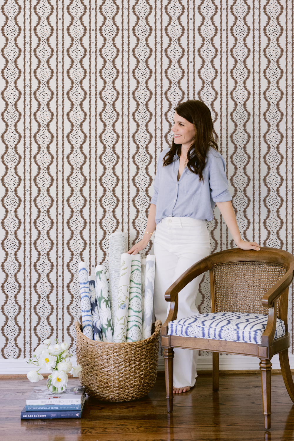
Houston-based artist and pattern designer Kristen Leigh Steen, of Kristen Leigh Studio, combines classic elements with whimsical watercolor for her wallpaper and textiles line. The resulting collections are bright and lively, while holding a connection to traditional motifs.
The recently released Metamorphosis collection aptly represents a shift in Steen’s design style, embracing a sophisticated new palette and larger-scale patterns. We caught up with Steen to hear all about what went into creating this fresh new collection:

“Playing off of June, an ikat print in my inaugural collection, Birdie adds more dimension and visual interest.”
Raymond Paul Schneider: When did you first start to develop this new collection?
Kristen Leigh Steen: My journey into this collection began in early 2023, a testament to my unwavering dedication to the creative process. Patterns like Crillon had been simmering in my mind for a while, waiting for the perfect moment to be brought to life on paper. Each piece was meticulously crafted to embody my vision, a testament to the quality and thoughtfulness of my art.
RPS: What was the overall timeline from conception to achieving the final design?
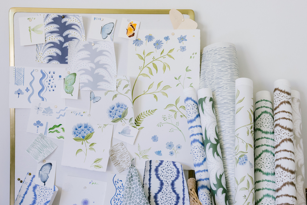
KLS: The overall timeline was about 18 months from the first stroke of watercolor to the final product. I began painting most of the pieces in early 2023, pouring my heart and soul into each stroke, before putting them into Photoshop for editing and making the seamless repeats. I played quite a bit with scale and colors, going through what felt like endless strike-offs. There’s so much back and forth for me when deciding on all the factors that make a great pattern. Where do I see this pattern? What colors are going to jump out? It might look great in my sketchbook, but how will that translate into someone’s home? It ultimately has to be a marriage between what I love creating and what people will love having in their homes for years to come.

RPS: What was your initial inspiration, and where did the idea(s) come from?
KLS: Much of my inspiration for this collection came from an eye for detail and an appreciation for that. I went on a transformative trip to Provence years ago, and I was in awe of the ornamental art and the detailing that went into the millwork, the furniture, and the tapestries. I feel like the art of detailing has been a little bit lost lately, and there’s been a shift towards minimalism. I really wanted to bring back the beauty of handmade pieces and an appreciation for pieces that artisans spend countless hours perfecting.
RPS: Please describe your overall creative and design process.
KLS: My design and creative process certainly is dynamic. I always start with an idea that I’m imagining or sketching on notepads. I’ll usually get excited about it and start painting immediately before arranging the motifs in Photoshop. I always overwhelm myself with the dozens of color options I create and request strike-offs. I hang the wallpaper samples around my home so I can walk past them daily and decide if it’s something I would live with and enjoy. I go back and forth hundreds of times when deciding which patterns make the cut and which don’t. With every collection, I’m trying to bring something fresh, unique, colorful, and joyful. Still, I’m also balancing that with a level of sophistication and a bit of timelessness, so nothing feels dated.
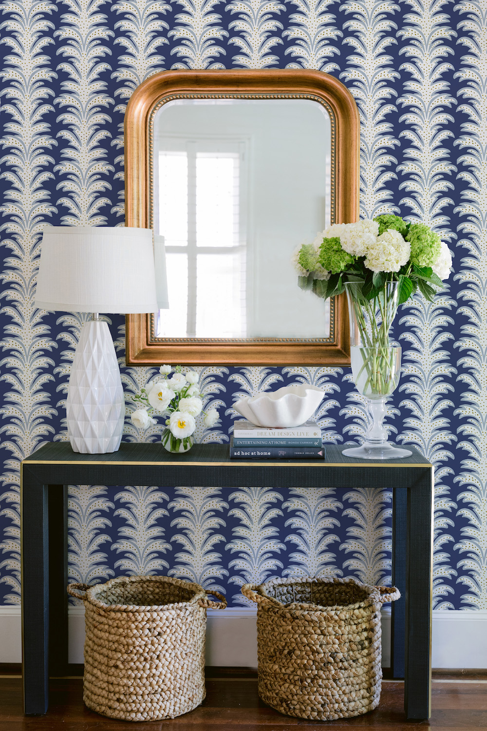
The layered, ornate decor of Provence inspired the “Crillon” design.
RPS: Did you have a specific audience or theme in mind?
KLS: For this collection, I really wanted to push myself to create patterns that felt more versatile. So often, my patterns are used for nurseries and children’s rooms — I have small children of my own, so I absolutely get it — but I wanted to push past that and create pieces that could just as quickly be used in dining and living rooms. I also wanted to use a different range of colors than I have in the past. I’ve always leaned heavily on bright spring colors, but for this collection, I wanted to bring in hues I hadn’t tried before, like deep browns and gray.
RPS: Please describe any challenges that affected the design and perhaps steered you to an entirely new final design?
KLS: When creating the Lennox pattern, I originally intended to be a half-drop repeat so that the transition between panels seemed obscure. However, once I started working with the files and trying to arrange the scale just right so it could fit on the paper widths, I was advised it may work better if I sold the pattern as individual panels instead of by the continuous yard. I grappled with that decision for a while but ultimately changed the design back to a straight repeat so it would be an easier installation for workrooms and designers.
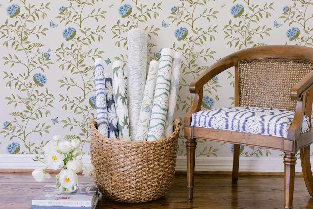
In “Lennox,” meandering vines, playful butterflies and majestic dragonflies all weave together, bringing that special magic of spring rebirth to life.
RPS: Describe your overall brand DNA and Ethos.
KLS: I believe in creating hand-painted, quality pieces that bring not just beauty but also joy to people’s homes. As a mom of three, I understand the home is where we make our memories, and I want my pieces to fit perfectly into that joyful, vibrant, ordinary everyday life. My goal is always to think creatively and apply my patterns to different mediums, like a tabletop. To challenge myself and to have fun. In fact, at this year’s Lenox Hill Neighborhood House Spring Gala, I hand-painted two prototype plates, one with a dragonfly and one with a butterfly, to play off of “Lennox.” I am so happy with the outcome that you never know when my tabletop collection will fully take flight!
Photography by Kelli Durham Photography.
Like what you see? Get it first with a subscription to aspire design and home magazine.