

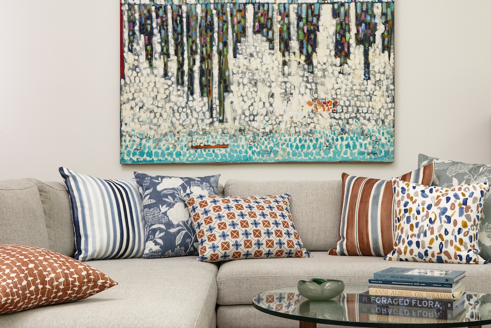
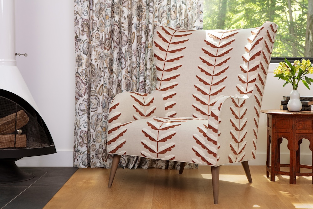
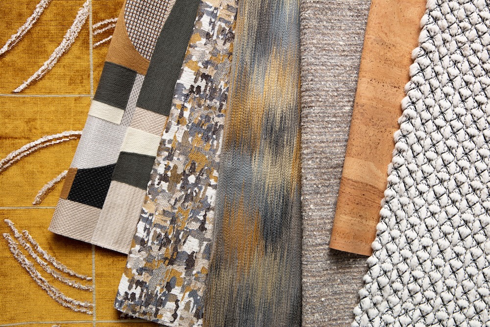
Raise a glass to Pollack’s Fall 2024 collection Happy Hour! Drawing inspiration from the Art Deco period, several fabrics nod to the stylized forms, symmetry and planarity that define this era. Sumptuous surfaces are paired with signature patterns, which play a vital role in this offering with 11 iconic designs.
Rachel Doriss, design director at Pollack, joins us to discuss how the collection came together.

Raymond Paul Schneider: When did you first start to develop this new collection?
Rachel Doriss: I work way in advance when developing collections. For our Fall 2024 collection, Happy Hour, I started percolating ideas and making artwork in early 2023. It takes at least 6 months to develop a fabric from concept to the final woven textile. This involves creating the artwork, weaving trials, performing tests on the fabric and developing colorwork. After that, production and sampling take another 9 months. All in, it takes about 1.5 years to bring our ideas to market.
RPS: What was your initial inspiration, and where did the idea(s) come from?
RD: I wanted this collection to be rich with pattern and signature. I adore plains and textures, but I felt that we had many ideas that needed to be shared with the world. There is a lot of pattern in the collection, but the designs have a softer approach which helps you appreciate the beautiful and tactile surface. Several designs have arched lines and softened geometry. I was going for an Art Deco vibe in several designs. Specifically, in Collograph, Phantom, Ankara and Columnist. Some of the patterns are more abstract like Claude and Adrift — they really capture the spirit of the artist’s hand.
RPS: Please describe your overall creative and design process.
RD: I work with a small team of three other designers in my Soho studio. We continuously brainstorm and sketch ideas at our meetings; we call it our “hive mind.” Subconsciously, we are affecting and inspiring each other. Many of our ideas build on our successes, but I push each designer to try new things and experiment with materials, weave construction, pattern and color. We often have “art days” in the studio where the day is dedicated to creativity and making art, not necessarily with an end result in mind. It’s making and being creative for the sake of creativity, not commerce. That can really help set you free in the design process and come up with unexpected results.
RPS: Did you have a specific audience or theme in mind?
RD: I think there are a lot of sexy fabrics in this collection. I can see them used in high-end interiors with comfort and some glamour sprinkled in, having a good ol’ time together. This collection is more refined than rustic with an attention to hand and softness. It’s about experiencing the fabrics in all three dimensions.
RPS: Please describe the methods, tools, and materials you used to develop and prototype this design.
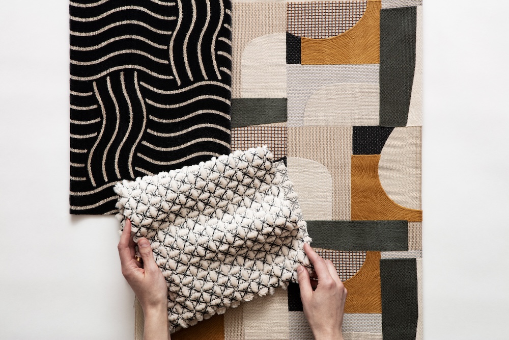
RD: There are four embroideries in this collection, but they all bring totally unique surfaces to the table. Celestial is embroidered on a supple chenille ground that has a special luxe hand. Collagraph uses stitches that look like layered screens with a dry crewel stitch that gives it a three-dimensional surface. Happy Hour has such fine embroidery stitches that look like pencil lines crossing one another — as if we were sketching with stitches. And lastly, Farfalle Fur is an embroidery of Farfalle (bow tie) pasta shapes on a faux fur ground. In the fat parts of the bow tie, the fur fluffs up on the face of the fabric, abstracting the outline and creating the most luxurious surface.
RPS: Did you utilize a new technique or technology to conceptualize or create this product?
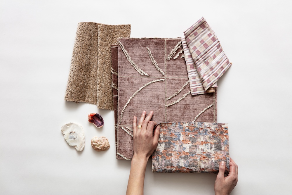
RD: We are constantly on the hunt for new and interesting yarns. After all, yarn can really make or break a fabric, and we used several fantastic types in this collection.
Levitation uses a wool boucle slub yarn that creates beautiful exaggerated floating dashes, which can be appreciated in silhouette at the window.
Weather Report is our first outdoor velvet! There are two colors of mélange velvet making an exaggerated basket weave pattern in this voided velvet jacquard. For an extra special touch, we used a textural boucle yarn in the voids. This fabric is so rich in surface.
In Phantom, there are raised clipped lines of velvet floating above the flatter velvet ground. We achieved the two different heights of fringe by using a spun yarn and a filament yarn.
And lastly, Columnist uses a technical shrink yarn that floats on the back. When the fabric is first woven, it is completely flat. Then it is heated up on a machine and that yarn permanently shrinks, causing the face of the fabric to pucker. This is a weaving trick we used to give the vertical columns a 3-D effect.
RPS: Please describe any challenges that affected the design and perhaps steered you to an entirely new final design?
RD: Most fabrics have an inside story to their development. For Highland Plaid, I developed the fabric at a small boutique mill outside of Edinburgh, Scotland. It took me days to plan out my colors because I had to consider how well each one would mix together — not just how each stripe coordinated with the ground color, but also how the yarns mingle to form new colors as the vertical and horizontal stripes intersect in the plaid. I had one chance to weave the color trials just right because the loom setup for this pattern is very time consuming, especially for a small mill. Originally, I specified all the yarns using Shetland wool, which has a woolly (some might say scratchy) hand. After I sent the specifications to the mill, I had a mini panic attack, fearing that the fabric might feel too scratchy for the American market. I called the mill and asked them to change the vertical warp yarns to a Merino wool to soften the hand. The Merino yarn color options were different than the Shetland palette I had used in my original colorwork, so I put my trust in the mill to choose the closest match in color. In the end, the final fabric — part Shetland, part Merino — is much softer, and the colors are perfect!
RPS: Describe your overall brand DNA and Ethos.
RD: At Pollack, we are textiles architects, designing our fabrics from the ground up. We are also artists, usually beginning a design with hand-drawn artwork. We take into account everything that goes into the cloth — of course pattern and color, but also what fiber to use, the spinning of the yarn, the construction, the machinery, the durability, performance and end-use. Everything is considered for every single fabric development, every time. We are obsessed with creating fabrics that are beautiful, but also with making sure they are highly useable for their application. We strive to make textiles that can be used and enjoyed in the real world.
Like what you see? Get it first with a subscription to aspire design and home magazine.