
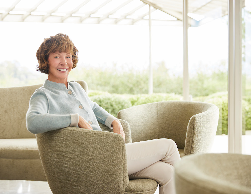
Los Angeles-based designer Barbara Barry looked to her own backyard in designing her textile and wallcovering collection with Hartmann&Forbes. Drawing her inspiration from the illuminating light of Southern California and the forms of her natural surroundings, the Barbara Barry Collection is as peaceful as it is powerful.
We sat down with Barbara to learn all about her creative process.

Raymond Paul Schneider: What was your initial inspiration, and where did the idea(s) come from?
Barbara Barry: All my ideas come from nature. I live in a world of infinite greens: the green of palm trees, agaves, olives, and pines. The nuances of how these all work together are brought to life in the clear and bright light of Southern California.
RPS: Please describe your overall creative and design process.
BB: I always begin with watercolor as it allows me to tease my ideas alive in a quiet and exploratory way. I begin with a certain color combination in mind and see where that leads. Once I have that decided on, the collection seems to take on a life of its own, coming together in almost a magical way.
RPS: Did you have a specific audience or theme in mind?
BB: I have rooms in mind. I try to picture the mood of a room, thinking about the different architecture of different spaces and how the layers of wallpaper and window coverings can work to create calm moods, whether in a traditional or modern sensibility.
RPS: Please describe the methods, tools, and materials you used to develop and prototype this design.
BB: I watercolor a million values of the few hues I am working with and play with different combinations to see how the cool tones work off the warm ones and how they can balance each other to create harmony. I search for objects, textiles, woods, ceramics and bits of glass; anything that helps bring the colors to life. I clip greens from the garden or pick up a fallen leaf and marvel at how nature’s palette is always elegant.
RPS: Did you utilize a new technique or technology to conceptualize or create this product?
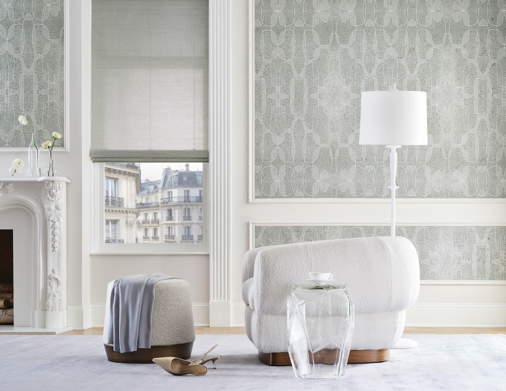
BB: Once a pattern is established, I like to see it in a few scales. I find that if I pin them up and look at them over time, the right scale will reveal itself. Then, it is a matter of creating patterns in different scales for different rooms. With this collection, we have the tiniest but impactful pattern, named TRANSCEDENCE, that is a galaxy of small dots. Even though it is subtle it has a mesmerizing effect perfect for a Powder Room, a hallway, or a child’s room.
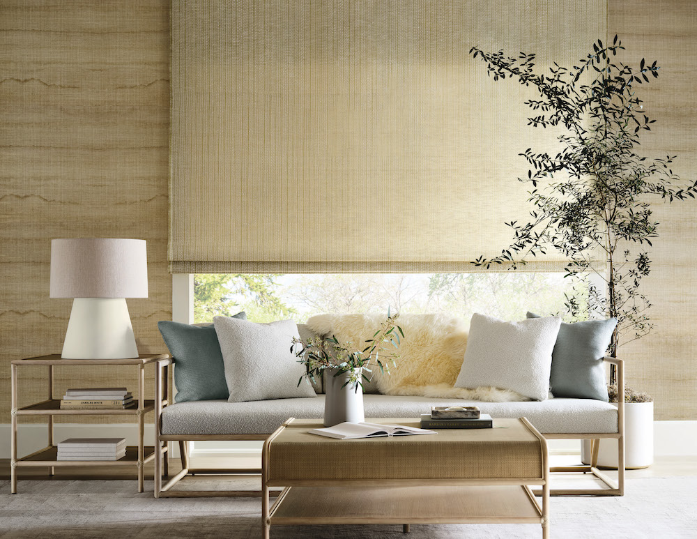
AQUARELLE is a midsize horizontal stripe that I first hand-painted, then enlarged, and printed on handwoven paper. I love how it weaves and wanders across the wall, enveloping the space in quiet tonal variations.
The largest pattern, UTOPIA, makes a statement with the size of its organic loops printed on hand-placed cork with bits of metallic peeking through. I think it might be perfect in a Living Room, a Dining Room, or a Primary Suite.
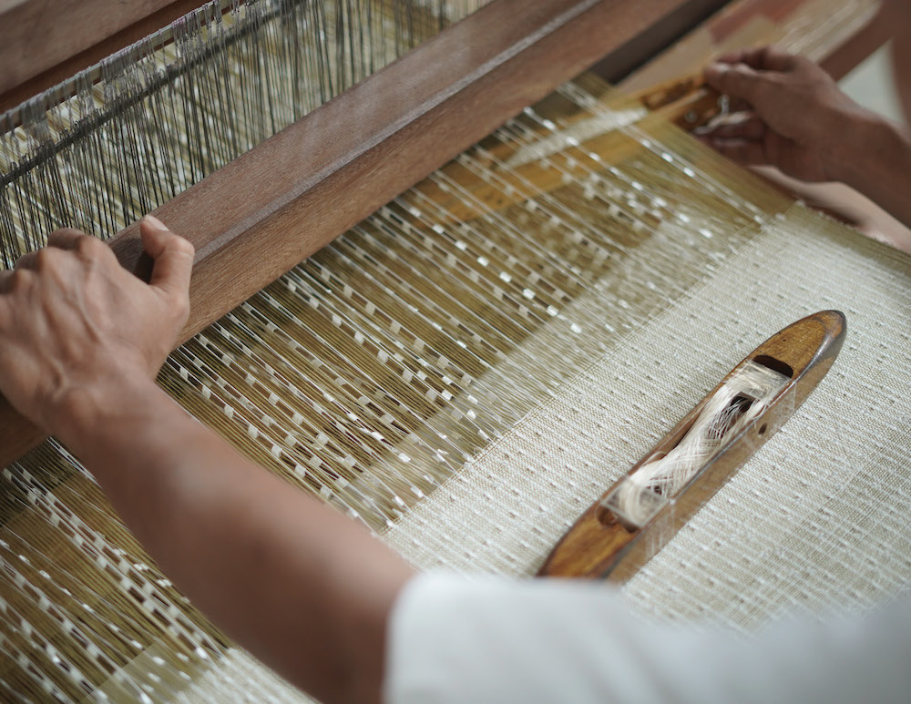
Working on the handwoven window coverings to complement the wallpapers was sublime because they added a beautiful and subtle layering of soft color to the rooms. Of course, they also work on their own and offer such a breadth of possibilities. But the real beauty is how they all work together circling back to the harmony and symbiosis in nature.
RPS: Please describe any challenges that affected the design and perhaps steered you to an entirely new final design.
BB: Yes, oddly enough, UTOPIA was going to be half the size, but the printer mistakenly printed it twice the size, and I loved it. I would not have had the courage or the vision to do it so large, but I think it works beautifully.
RPS: Describe your overall brand DNA and Ethos
BB: I am always searching for calm, for harmony… to quiet the mind and the body as a refuge from overstimulation. So, I design quiet forms and pleasing colors that can live easily together… just like in nature.
Like what you see? Get it first with a subscription to aspire design and home magazine.