

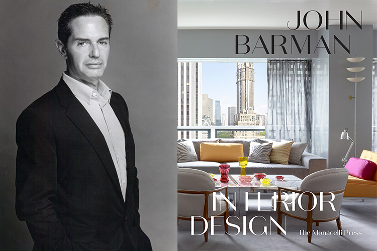

aspire design and home is mourning the passing of interior designer John Barman, who died of cancer last week.
Born and raised in New York City, Barman graduated from the Wharton School of Finance at the University of Pennsylvania before going on to study Interior Design. Spanning 20 years, his career in the design industry was defined by his clear-cut, sophisticated style, bold new ideas, and a strong point of view.
Both a classicist and modernist Barman confidently stimulated the senses with crisp lines, an unrestrained use of strong, resonant color, and the successful marriage of functionality and fine detailing.
Recognized as one of the innovative giants in this field, Barman has been continually honored as one of the “AD100″ by Architectural Digest magazine, “The City’s Best 100 Architects and Decorators” by New York magazine, and “Top 50 New York Designers” by New York Spaces. His work has also been published in books including City Living, Design in the Hamptons, Understanding Modern, Contemporary Glamour, House & Garden: Book of Style, and his monograph John Barman Interior Design.
Below, please join us in remembering John with this spirited conversation we shared with him in 2017.


There is no interior design without the use of color,” proclaims John Barman. Of course, he is speaking of canary and rose, aqua and pumpkin, and thousands of other shades, but it all depends on a person’s definition of the word. To some, “A tremendous number of people,” In his experience, a colorful interior means beige with pops of taupe and swaths of cream. Happily, he sees this mindset changing.
The New York-based designer, an eminent figure in the decorating world for more than 20 years, knows of what he speaks, specializing in high-end residences throughout the country, from mountain retreats to seaside mansions to city spires, most of them alight with color.

COLOR PAST AND PRESENT | While the “Beige Era,” as he calls the early 1990s, which morphed into the “Gray Era” of the early naughts, was not his favorite, Barman says with a smile, “I see much more color being featured in magazine editorials these days, particularly in the homes of youthful, trend-setting residents. Many colors are being used, from pale and muted to bright and brash, but all-beige is identified with a passing era and seems a little uptight, austere and cold today.”
He adds, “With that generic look everywhere, in public spaces as well as private homes, people have had enough. Now they want their abodes to reflect who they are, their personalities, and it makes them happy.”

LEARNING TO LOVE COLOR | It goes without saying that if it’s beige a person wants, Barman will do it, beautifully, but for those who want to “test the water,” he often starts them off with a few colorful accents, accessories and pillows – small amounts that allow them to become accustomed to it. It usually doesn’t take long. “A few pops of color in a neutral environment go a long way,” he tells, and it can be the start of something new and wonderful.
“Clients often think they won’t like color in their furnishings,” he states, “even though they wear color. I often make reference to this to start a conversation about those particular shades and how we can incorporate them into the interiors.” Add a splash of the blue a client favors for her sweaters to the living room and it’s amazing how quickly she’ll say she loves it and “let’s use more.”
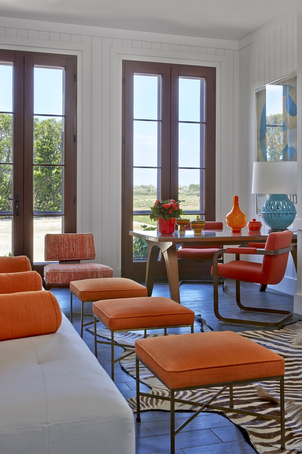

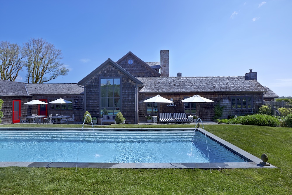
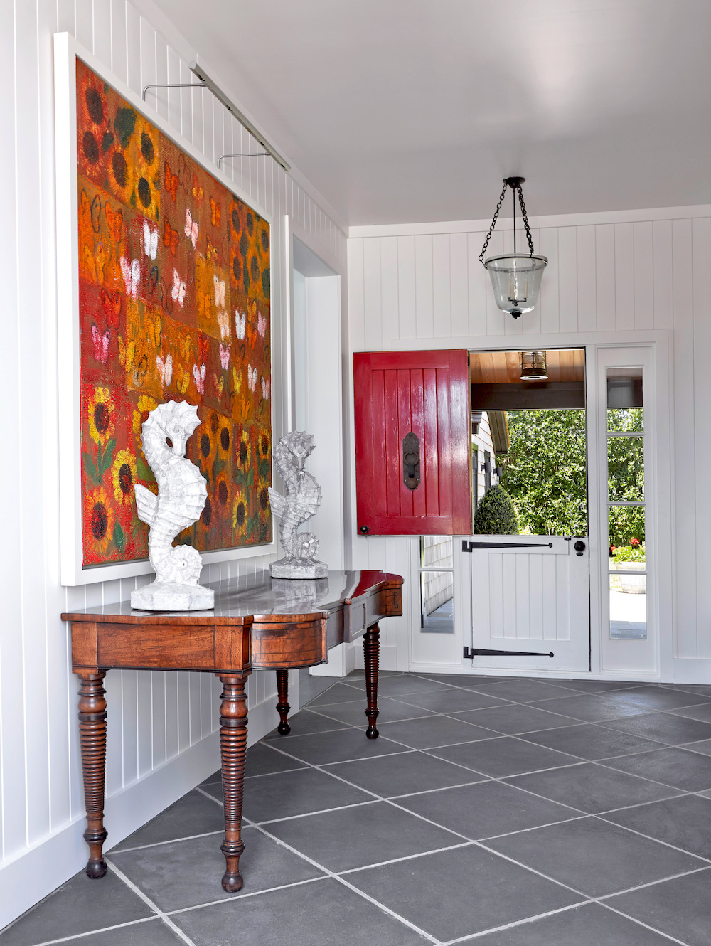
USING COLOR | Color does not come organically during Barman’s design process. It takes “conscious effort because it is challenging to coordinate.” That said, whether in upholstery, lighting, walls or furniture, as illustrated in the photos on these pages of a house he did in the Hamptons about 10 years ago, the way the color is employed appears to be effortless and natural.
The concept for the interiors was a “Moroccan-influenced country look,” propelled by the lush, red-and-purple patterned yellow cotton upholstery seen on a number of chairs and pillows. Certain things have changed over the years, most of them small, as in the dining room, where a dark, traditional chandelier was originally selected because the owners thought something overtly Moroccan would be “too much.” A while ago, it was replaced with the bright red, patently Moroccan one hanging there now. Primarily, however, it’s the art that has changed, becoming larger in scale, brighter and more contemporary.
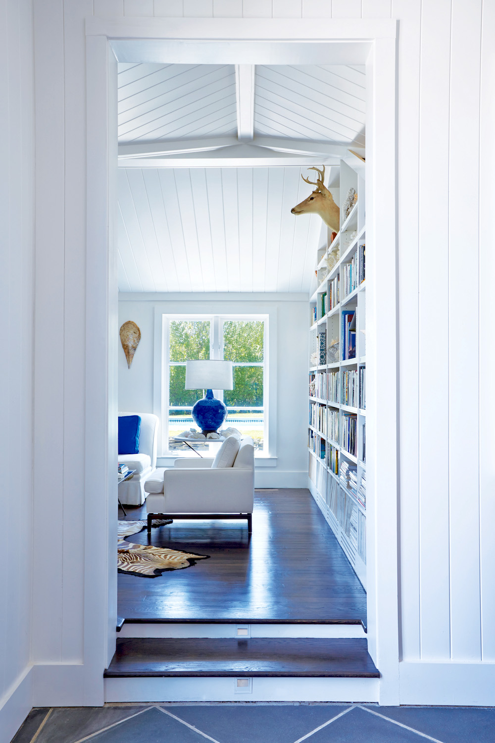
CREATING TIMELESSNESS | While Barman explains that creating a timeless look for a home requires the designer to be “ahead of the curve, with a sense of what’s to come without being obvious about it,” there are other things that help to create a timeless, yet appealing interior. Key in this home is the lack of any visible electronics, no televisions for instance and recessed lighting.
Durability is the second element. Note the simple, white slipcovers on the sofa–machine-washable to retain a crisp edge. Third is the use of a melange of furnishings, seen here with everything from the 19th-century fireplace mantle in the living room to the low-slung, midcentury chairs scattered about to the African bed-turned coffee table in the living room.


Photography Courtesy of Anastasio Mentis.
Like what you see? Get it first with a subscription to aspire design and home magazine.