


“As much as I love color, there is something so classic and timeless about a black-and-white design scheme. I’m actually drawn to it in my own spaces. Working with color and taking in so much visual information every day, coming home to a black- and-white space is soothing to me. It’s a bit like a gallery, and that’s a beautiful way to live, changing your surroundings every now and then and letting your spaces EVOLVE.” – Melinda Trembly, Owner and Creative Director, RINCON RD
aspire design and home magazine’s annual black & white issue is an opportunity to discover the inherent beauty and resonance in the starkness of contrast. Get a special glimpse at what’s in store for this issue, and grab a copy for yourself in the coming weeks.

LINDA HAYSLETT of LH.Designs: “Black is always grounding, and white is opening when it comes to feeling larger. I gravitate toward these colors to highlight or have less noise in a space. Depending on how much and where you use them, black helps create defining outlines, while white can really make a space feel larger than it is. You want to use these characteristics to your advantage in areas such as small spaces or awkward rooms. The two opposing colors can help with the layering of patterns while making sure there isn’t too much chaos in the flow.” Photos by Lauren Taylor.
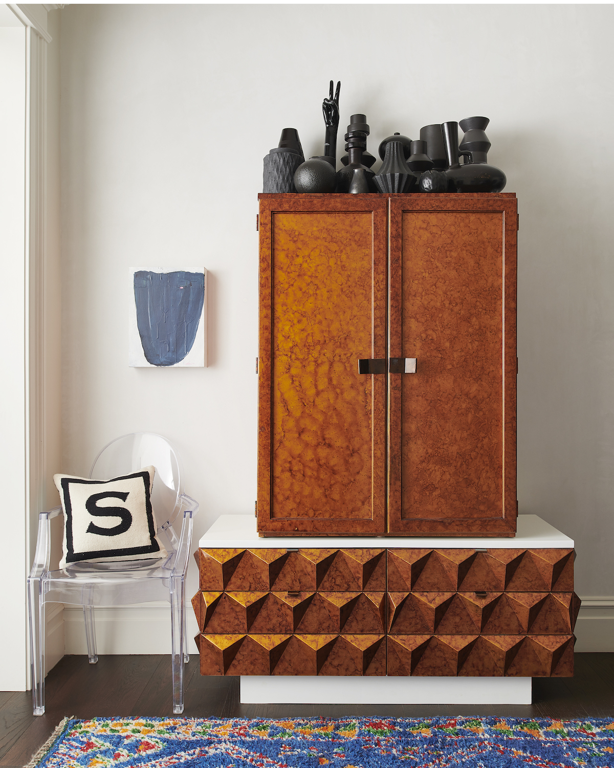

HEATHER PETERSON of Heather Peterson Design: “With a tight palette, you need to layer for interest. This collection of black pottery lends itself to a graphic pattern.” Photo by Josh Grubbs.

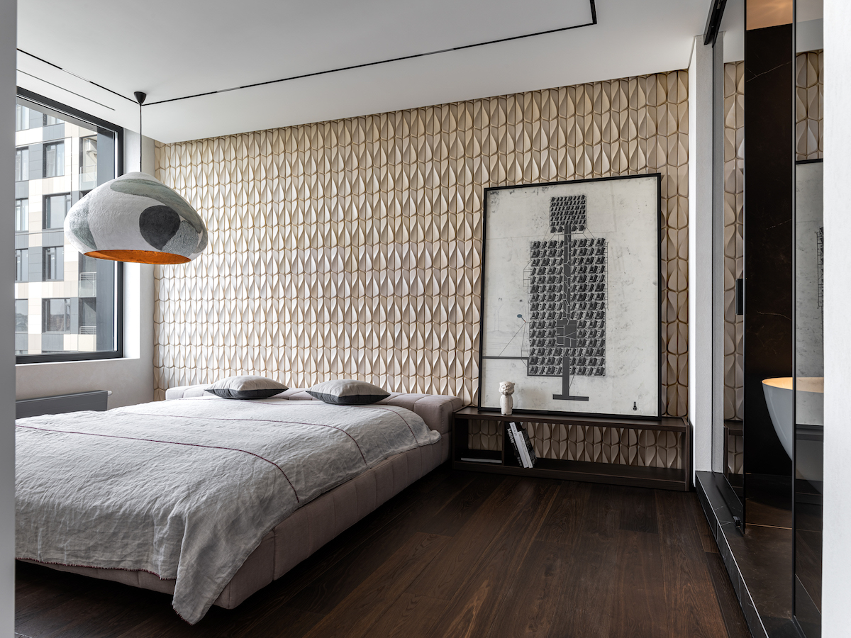
JOHN IKE, Partner at Ike Baker Velten: “When designing baths and kitchens, I always consider how to work with the finishes of plumbing fixtures and kitchen appliances. I think that black and white are good color options because of the dramatic contrast between them, while also offering a matte finish to balance the shiny elements.” Design by Kligerman A&D / Photo by Richard Powers.
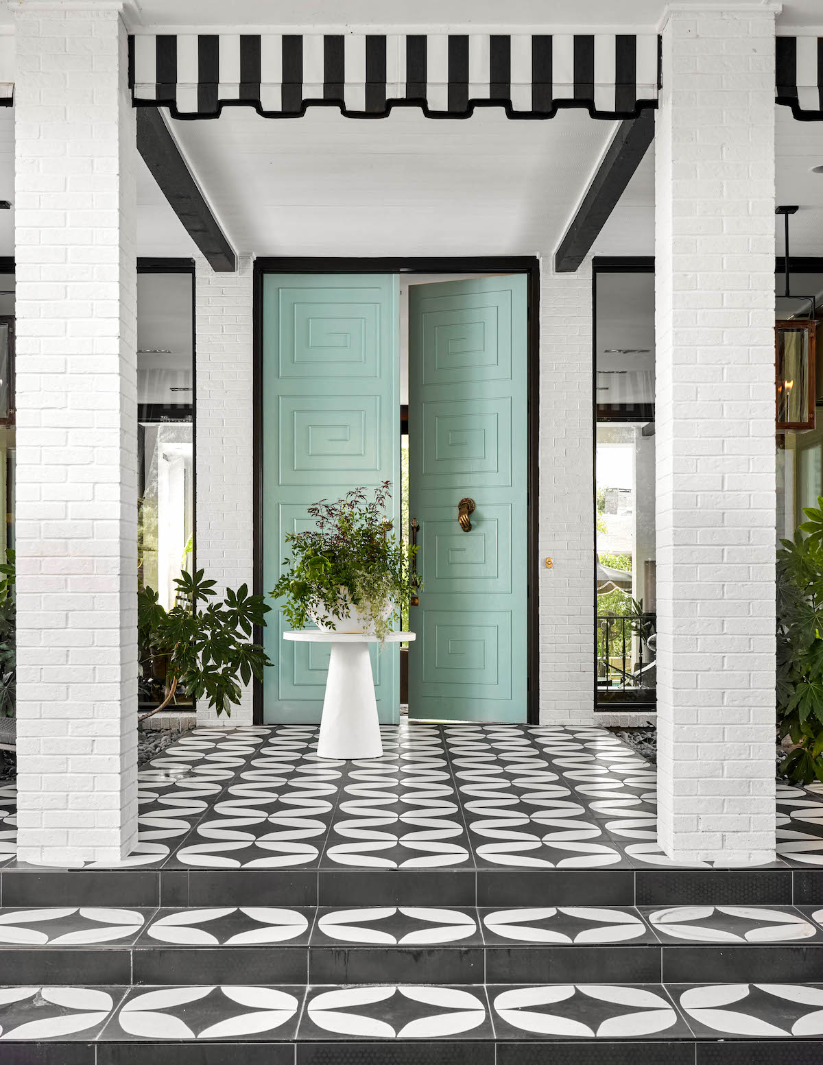

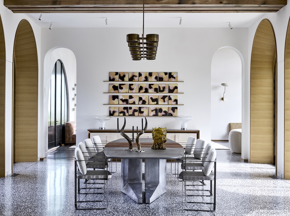
EDDIE MAESTRI of Maestri Studio: “Black-and-white design is a classic, timeless staple great for switching accents to taste. The bold balance allows for added pops of color, texture and pattern.” Photo by Nathan Schroder.
Like what you see? Get it first with a subscription to aspire design and home magazine.