

A difficult-to-navigate layout, disconnected rooms and shoddy renovation errors were holding back this Annapolis, Maryland home. To give it new life, the homeowners brought in Farnady Interiors and The Drawing Board, Inc. to turn it into the waterfront gem of their dreams.
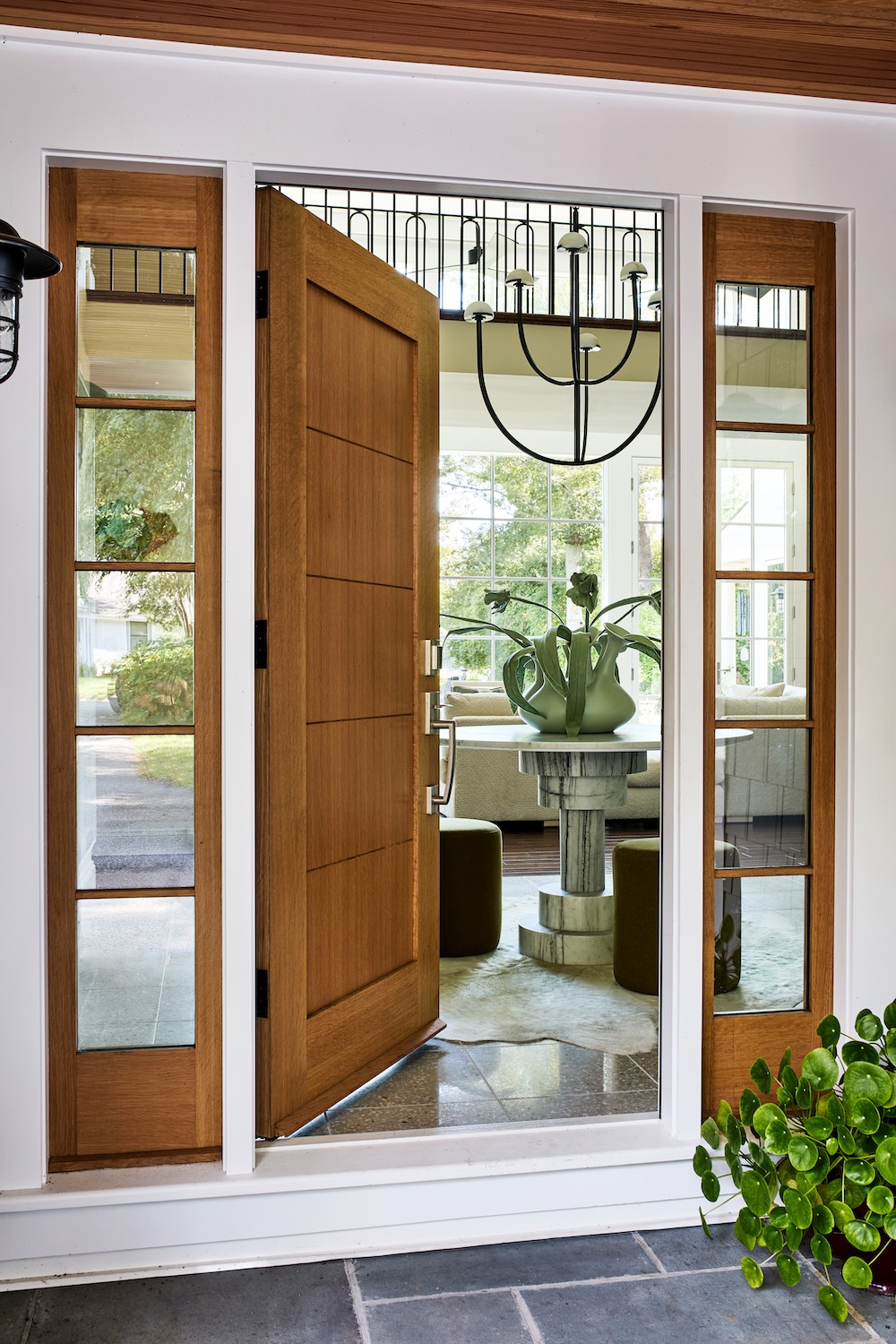
Circulation through the spaces was inefficient, with columns awkwardly splitting up rooms that led to dysfunctional spaces and furniture layouts. The height of the main living room was not captured, as regular low-height doors were used along the waterfront wall, cutting off the home’s magnificent waterfront view. Awkward changes in ceiling height resulted in uncomfortable and ill-defined spaces throughout the rest of the first floor.
“When I was first hired by the homeowners, I immediately brought in Peter Miles of The Drawing Board, Inc. because I knew how much potential this house had,” says Katalin Farnady, owner and interior designer of Farnady Interiors. The main goals were to correct previous renovation mistakes, which included closed up areas, decorative columns, and large molding details. Farnady also wanted to open up the walls and add large windows to capture the waterfront views.
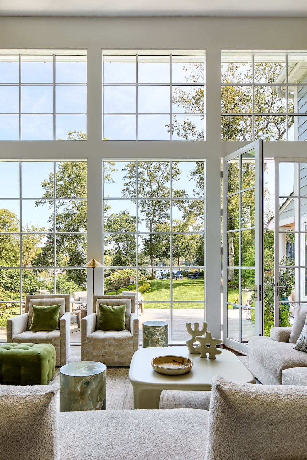
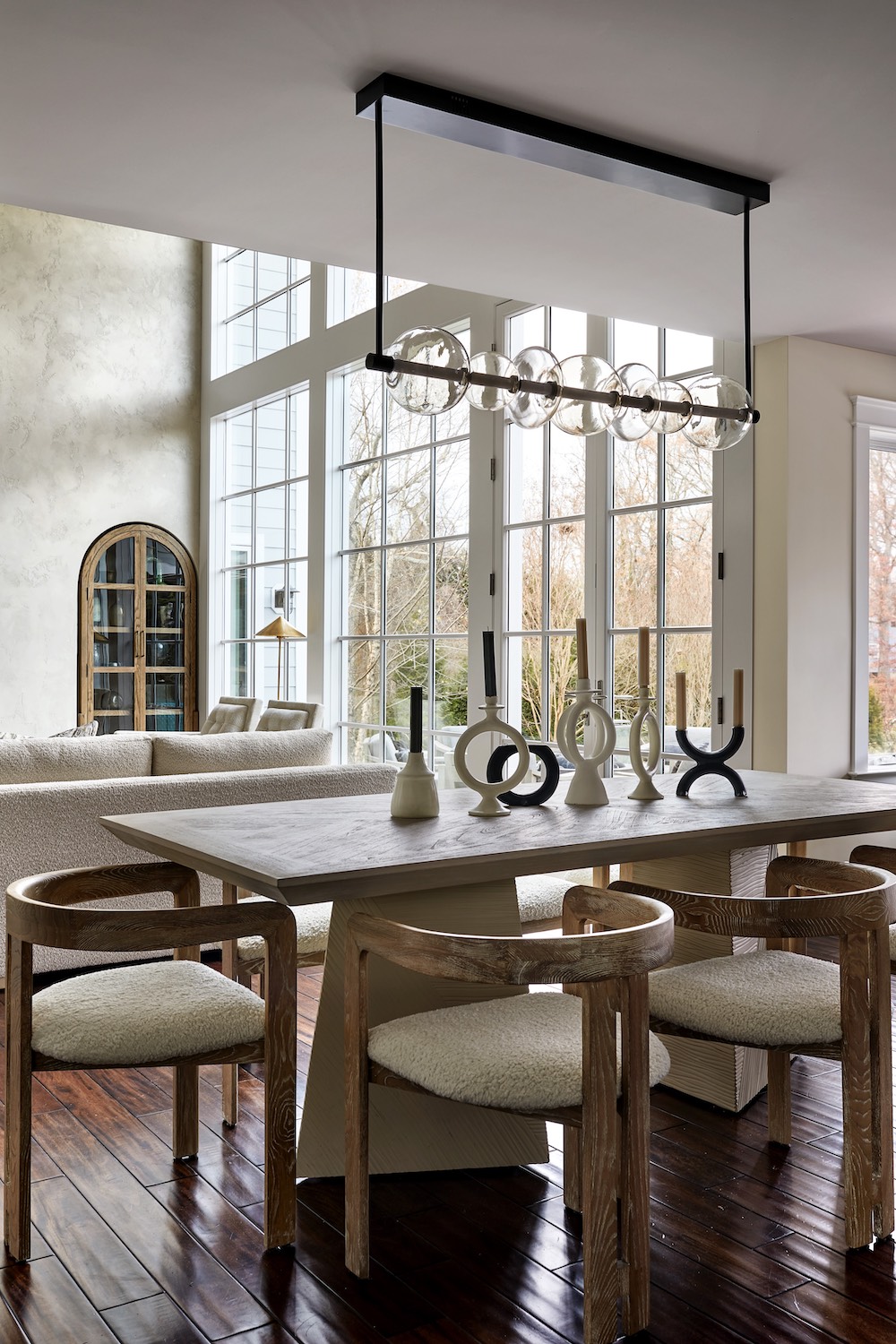
In addition, Peter Miles, architect and principal, The Drawing Board, Inc., sought to bring order to the overall space. The team first re-engineered the existing structure with large steel beams to minimize the number of columns, placing them in appropriate locations to define the spaces. As the team worked to create a better flow in the floor plans, they also evened out ceiling heights throughout to better define the spaces. In the living room, they installed new 10-foot-tall doors that extend beyond the adjacent ceiling. The oversized doors have the effect of drawing your eye up and out, highlighting the grand scale of the living room. The mudroom and garage entry were also reconfigured to provide a laundry room and storage for the family.
Below, Farnady and Miles discuss how the project came together:

How did you heighten and/or even out the ceilings to allow for better waterfront views?
PM: We installed several large steel beams to remove columns and create better flow between rooms. Height and scale in architecture are relative, from one space to another, and from a space to the human body. By carefully managing changes in scale, one can create the illusion of more height. The double-height space is approximately 17 feet tall, the rest are 8 feet. The renovation did not change any of the ceiling heights; we just better managed the transitions between rooms.
Discuss the furniture placement in the living room and where it is from. Was the armoire in the niche custom-made for the space?
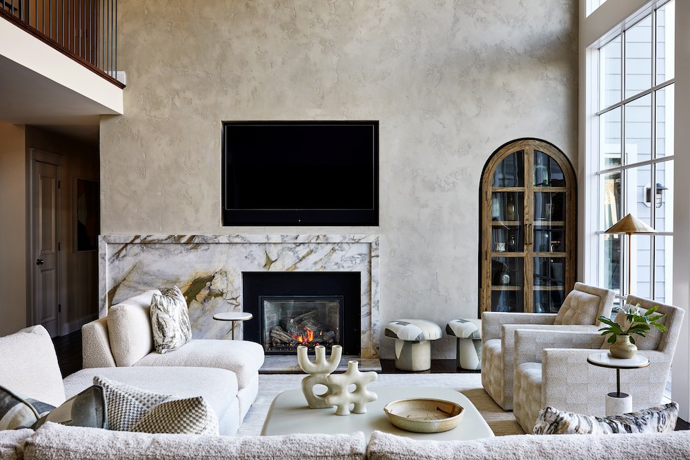
KF: The owners have a large family and entertain a lot, so they needed a large sectional, which is custom by Bernhardt. I purposely broke up the continuous seating and added an ottoman in between to open up the space a bit. The Donghia swivel chairs add flexibility by turning towards the TV/fire or to the people sitting on the sofa. The pop of green color was added to bring nature inside. The coffee table is made out of concrete, and the white oak curio cabinet is a ready-made piece, but the opening with the arch was custom made to fit it in. That way, the niche doesn’t take away from the room’s footprint. The fireplace surround is custom designed, and the stone is Montoro Marble by In Home Stone.

How did you eliminate the disconnected spaces on the main floor? What were the main rooms that were opened up to one another?
PM: We connected the foyer, living room, kitchen, and music room/bar. There were several columns, archways, and low walls that were removed. We then slightly reconfigured the floor plan to create defined spaces for circulation, so the rooms flowed.
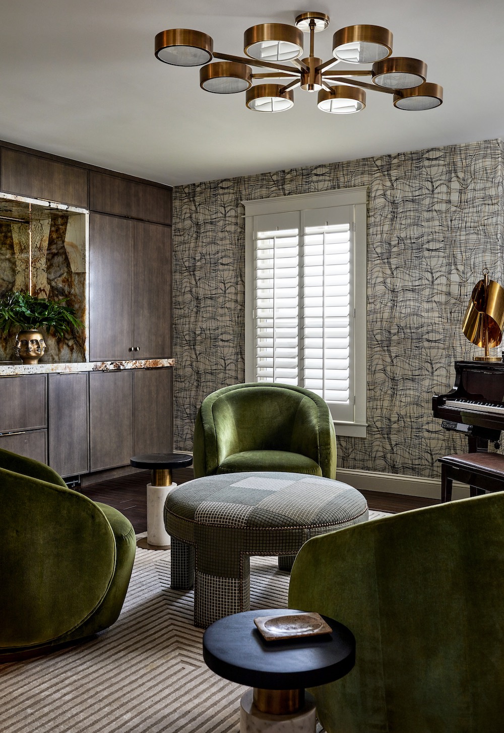
Is the family musical, hence the music room?
KF: The husband loves writing music and wanted a dedicated music room. One special feature in this space is the back-lit Patagonia stone on the built in. Lee Jofa wallpaper and Kravet swivel chairs are among other standout elements. I was excited to make this space a bit moodier in an otherwise light-finished home.
Do you always suggest oversized doors when there is a water view? What are your go-to doors or types of doors in this situation?
PM: It really depends on the situation. In this instance, we wanted the top of the doors to be taller than the adjacent ceiling, which would help emphasize the height of the family room. It was just as much about drawing your eye up into the tall interior space as it was about extending the view outside. The doors should match the style of the home: if it’s a traditional home, I’m a fan of regular hinged doors; in a modern home, a slider or multi-slide is the way to go. If the door is used on a daily basis, I prefer a hinged door to a slider. Much easier to operate.
What was the kitchen like before? How did you change it? Favorite element in the kitchen?
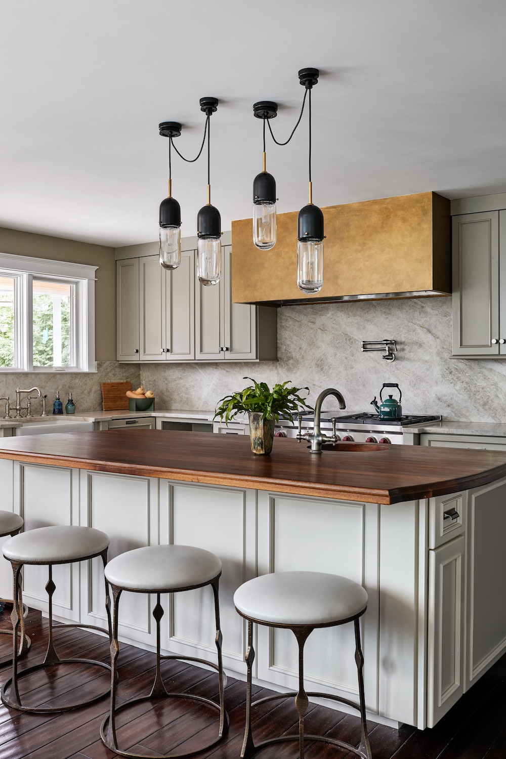
KF: We kept some existing kitchen elements, especially the solid wood cabinets, and just gave it a full facelift, such as adding some new doors, hardware, paint, countertop, plumbing fixtures, and appliances. If the bones are good, as they were in this kitchen, I prefer repurposing items. Favorite elements include an added coffee station, a bar, and all-new storage cabinets off to the side that help keep the spaces organized and items off the countertop.
What is your favorite space in this renovation and why?
PM: The living room; it’s a great example of how small changes can really elevate an underperforming space.
Photography by Stacy Zarin Goldberg.
Like what you see? Get it first with a subscription to aspire design and home magazine.