


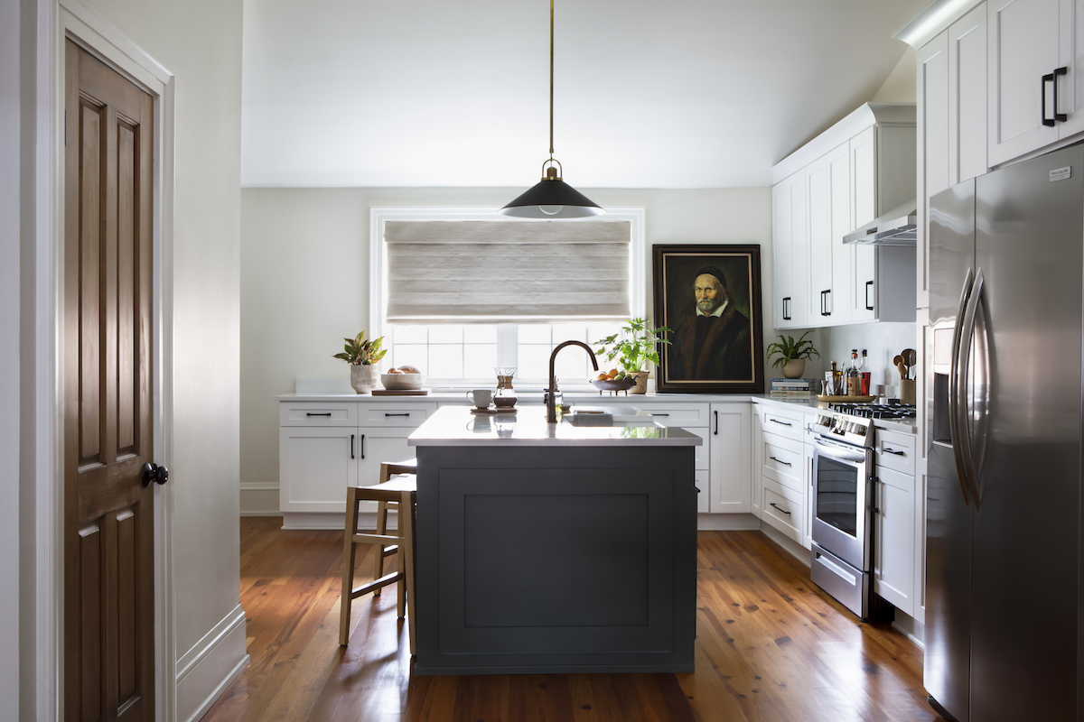
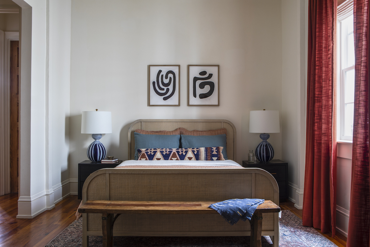
New Orleans-based designer Hattie Collins of Hattie Sparks Interiors just completed an elaborate project in the city’s lively Irish Channel neighborhood. Adding color and personality to the homeowner’s builder-grade flip was a challenge Collins quickly embraced, producing vibrant spaces full of interest, warmth and locally-sourced art. The gracious layout balances bright white walls with rooms clad in deep jewel tones, interspersing vintage accents throughout. The dazzling interior also showcases a who’s who of New Orleans artists: a colorful Mary Ball painting in the living room, a moody Frank Relle photograph in the office, a poetic green-hued painting from Mallory Page in the primary bedroom, and a guest room featuring a whimsical polka dot painting by Logan Ledford and Josie Azuma’s curvy graphic renderings. Collins reveals how she accomplished a look that encapsulates the owner’s unique personal style and love of art.
Gwen Donovan: What were your client’s goals for this re-design project?
Hattie Collins: This is a second home for the owner, and he wanted the space to reflect the vibrancy of New Orleans and pay homage to local artists. So we utilized color, texture and bold pattern where we could, and sourced striking pieces from several New Orleans artists.

GD: How did you source the artwork? Are you involved with the local artistic community?
HC: I am fortunate to have a lot of personal connections with artists in New Orleans, thanks to years of collecting for my own home and involvement with the museum and art community here. So when sourcing art for projects, they are usually the first people I turn to!
GD: What did you focus on to give the ho-hum interior a new life?
HC: We worked around contractor-grade flip finishes and made them feel custom: changing out lighting, plumbing hardware, painting cabinets, switching out ceiling fans, using new cabinet hardware. These swaps all infused personality into the home. Additionally, we created a second guest room by adding a custom CLAD Home sleeper sofa to the office.


GD: Do you have a favorite room in the home?
HC: I love the office! The shade of blue we selected, Farrow & Ball De Nimes, is one of my favorites, and I love the contrast of the goldenrod velvet sofa against it. The Frank Relle photograph above the sofa is a meaningful piece to my client, which makes that room feel extra special.
GD: Were there any surprises during this project?
HC: There were a few structural challenges on the top floor because of the slope of the roof; it created an awkward nook in the primary bedroom that we didn’t know how we’d utilize. Eventually, we decided it would be a perfect entertainment area and we set up a media console, rug, television and sound bar that makes it easy to lie in bed and binge Netflix!

GD: Describe a few design elements that optimized the floor plan:
HC: We had a custom hi-top dining table fabricated to create a dining space in the open concept expanse downstairs. A traditional dining table just wouldn’t work, and the client really wanted a space to entertain friends for dinners; that created a lot of functionality in an otherwise dead zone. The sleeper sofa in the office created extra space for guests, and the sofa in the living room is almost the size of a twin bed with the pillows removed, perfect for someone who doesn’t mind crashing on the couch. We added blackout Roman shades as well as blackout drapery to every room, ensuring not only privacy but light-blocking for those mornings after a late night out!
Photography by Jacqueline Marque.
Like what you see? Get it first with a subscription to aspire design and home magazine.