
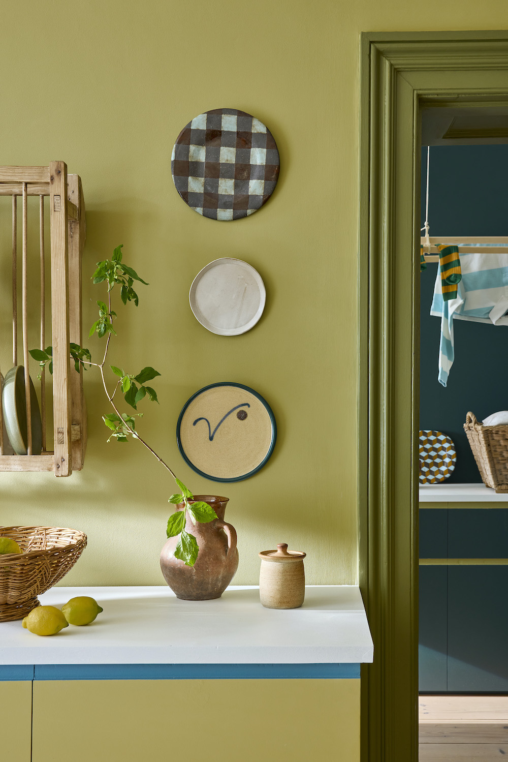
Last week, Little Greene launched the new Colours of England and Colour Scales collections featuring 26 new paint hues. With color confidence central to the Little Greene ethos, the new cards incorporate colors that span over 300 years of historic interior design alongside a palette of contemporary shades which embrace modern interior design aesthetics and provide a multitude of opportunities to introduce depth, character and a considered use of color.
“Our Colours of England and Colour Scales collections evolve in line with changing approaches to colour in our homes,” comments Ruth Mottershead, creative and marketing director. “The popularity of colors changes over time; it’s an evolution rather than a revolution, with a movement towards different colors feeling like a natural transition. It’s fascinating to look back to see how color use has changed throughout history, and to look forward to predict and then create the favourite colors of the future.”
Take a look at the new shades below:
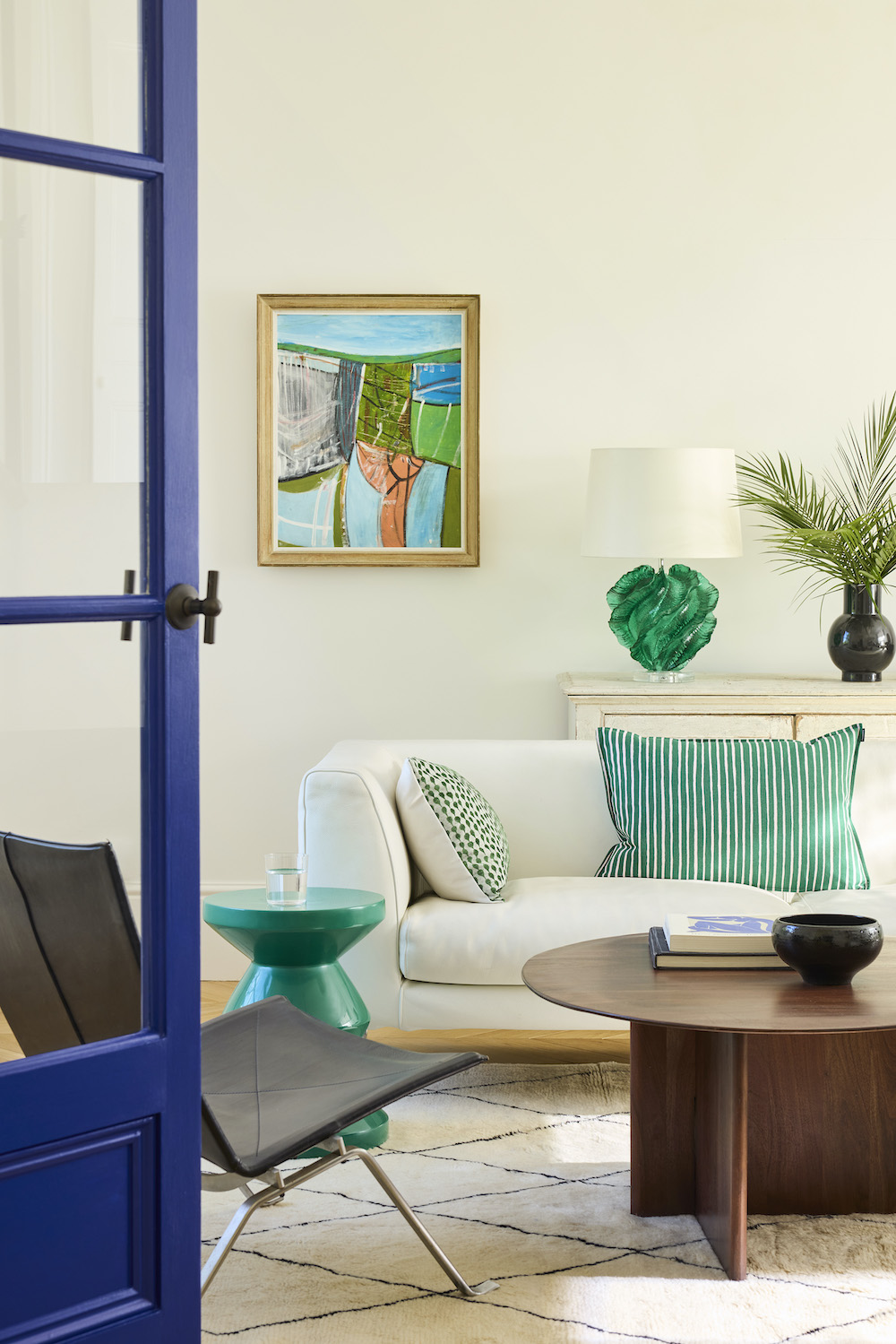
Haye White 346
With a suffused brightness, Haye White was created in pursuit of a great “everywhere white.” A softer, warmer alternative to umber-toned Slaked Lime, Haye White features a small amount of ochre, creating a warm, easy-on-the-eye white rather than a cream.
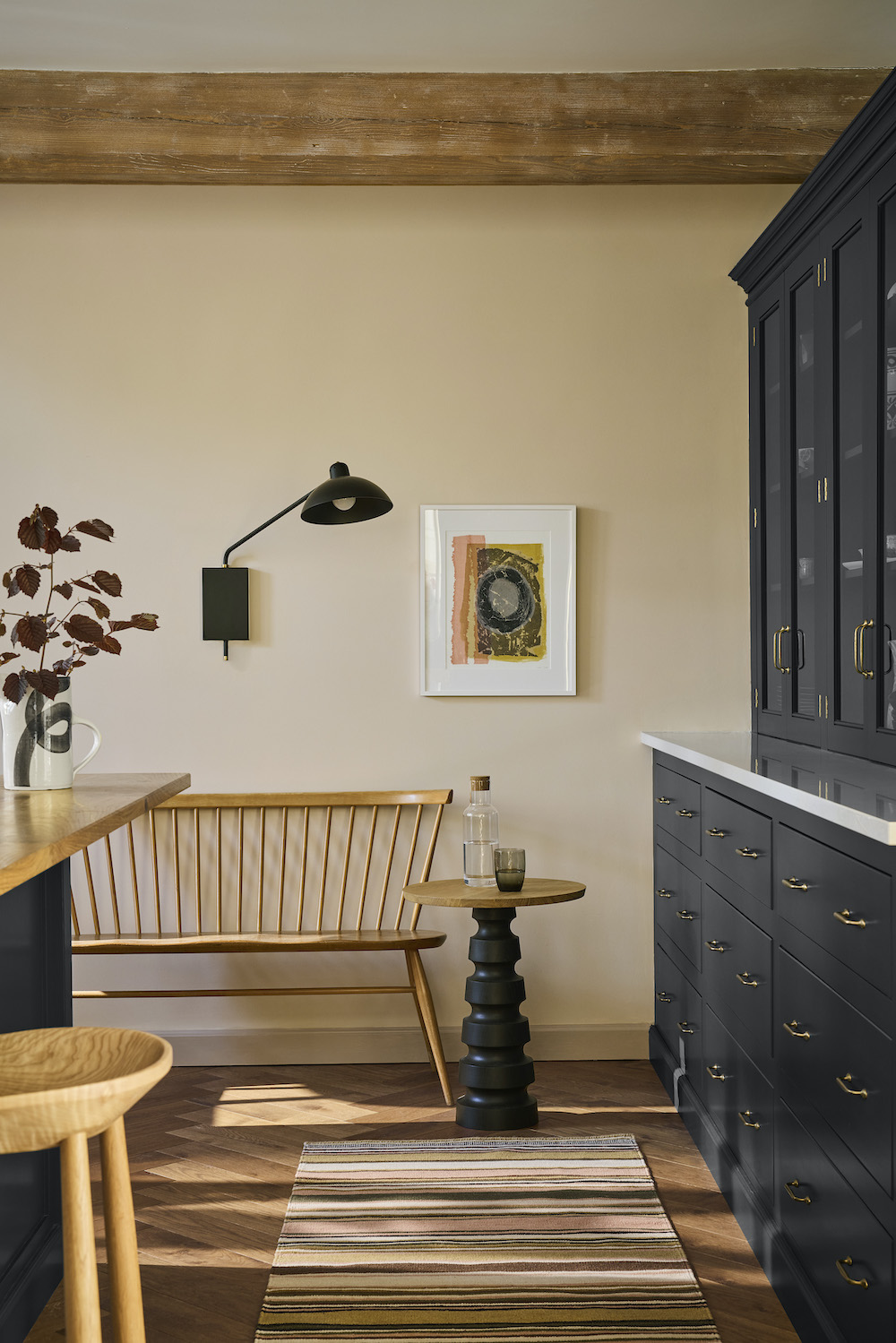
Parlour 347
A delicate, warm and stoney plaster hue, Parlour is a pinkish off-white similar in tone to Castell Pink, but with a lighter and fresher feel. Once used in a north-facing reception room known as the Slop’t Parlour at Dyrham Park near Bath, so called because of its view directly onto a dramatic, sloping landscaped bank from which a decorative fountain would hydrate the air (and guests) on hot days.
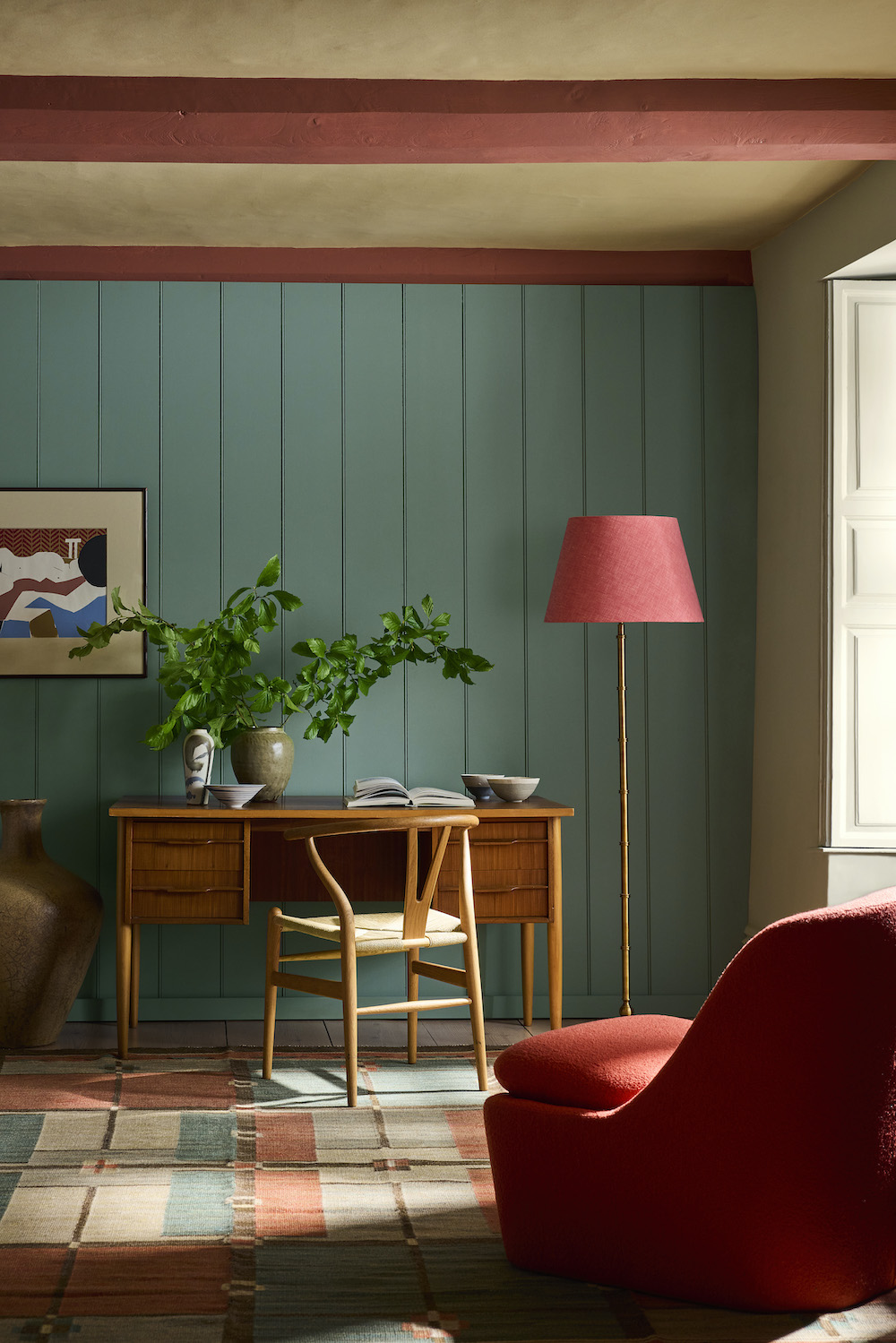
Perpetual Blue 348
Similar in tone to Celestial Blue but with more depth, Perpetual Blue is a color taken from a surviving paint palette of Sir Winston Churchill in his studio at Chartwell in Kent.
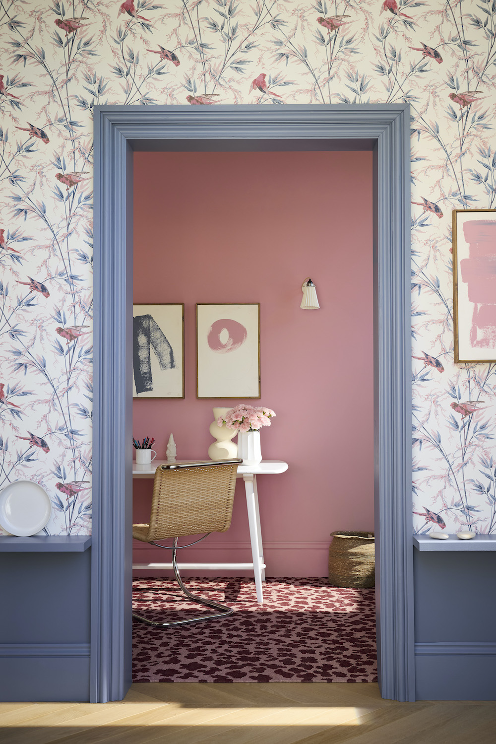
Floss 349
With the same undertone but with half the intensity of the stronger pink Carmine, Floss will drive a confident pink scheme when used on walls or in a color-drenched scheme, or sparingly as a versatile accent within almost any combination of more subdued colors.
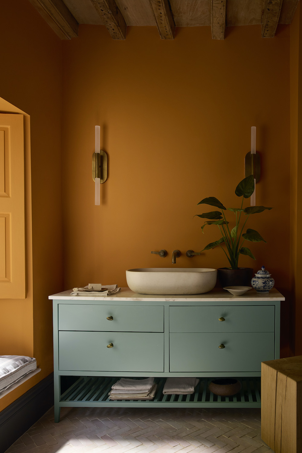
Ashes of Marigold 350
Whilst true, bold orange Marigold with its 70s connotations and intense depth is often reserved for smaller color highlights, Ashes of Marigold is a softer, blackened version of the cherished late 20th-century shade that is both extremely usable and bursting with personality.
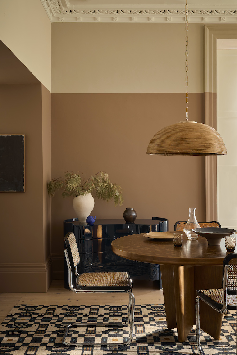
Hammock – Color Scales Family 351–353
A much-loved warm neutral with umber undertones, unbleached calico Hammock has been extended to offer a family of Colour Scales of varying strengths. Neutrals with this weight were typically used in the place of white, on ceilings and fine plaster moldings in historic country houses. Hammock provides a timeless backdrop to decorate from.
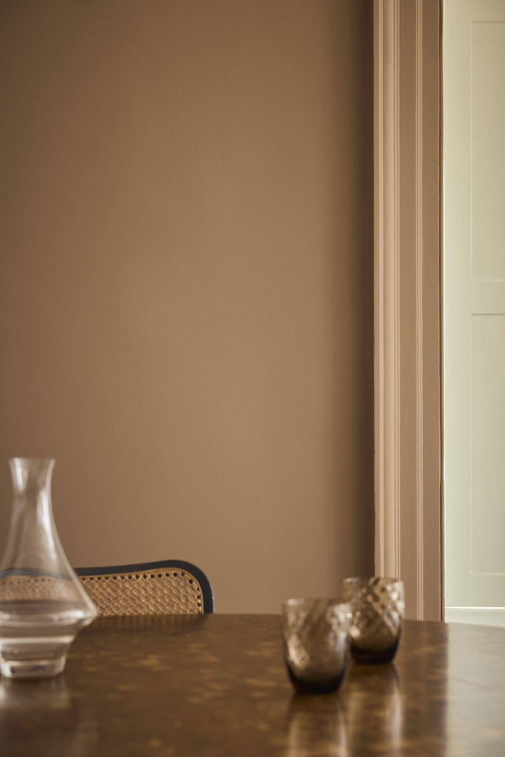
Flight Pink 354
Found on the upper walls of the great staircase at Wimpole Hall in Cambridgeshire, providing an exquisite backdrop to the intricate joinery and gilt detailing which accompanies the generously proportioned flight of stairs; Flight Pink is a slightly more neutral version of Split Pink.
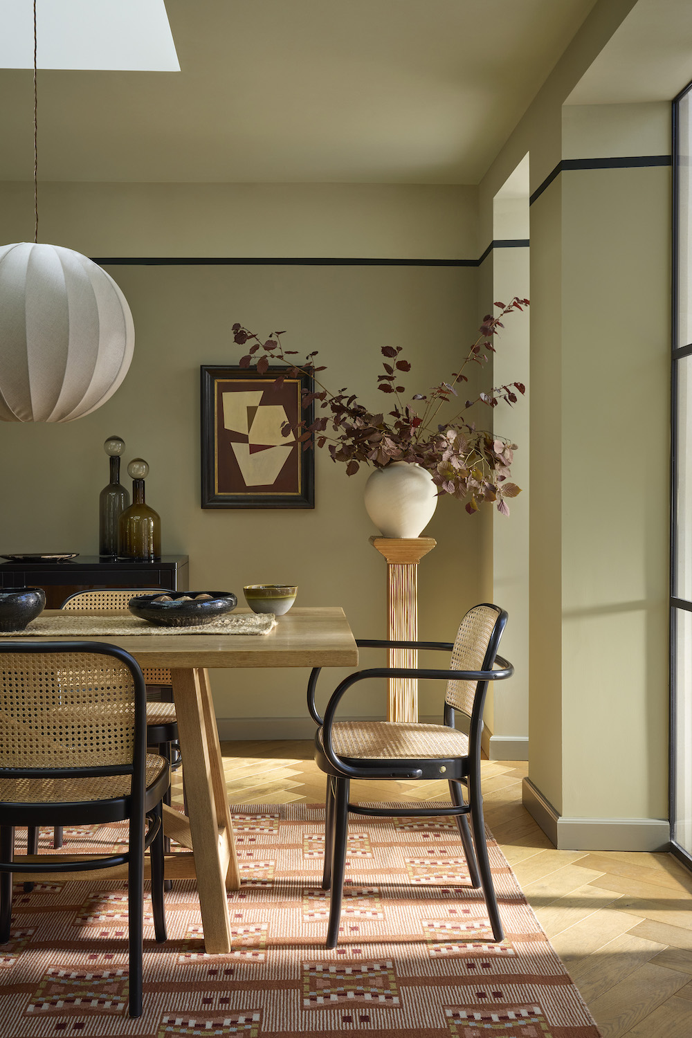
Marle 355
A luxurious mid-tone brown shade with comforting warmth, Marle is heavy on yellow ochre but has plenty of black to desaturate and soften. With its touch of red oxide to offset the greening of these two pigments, Marle is a perfectly balanced, easy-to-use brown that feels intimate and cocooning.
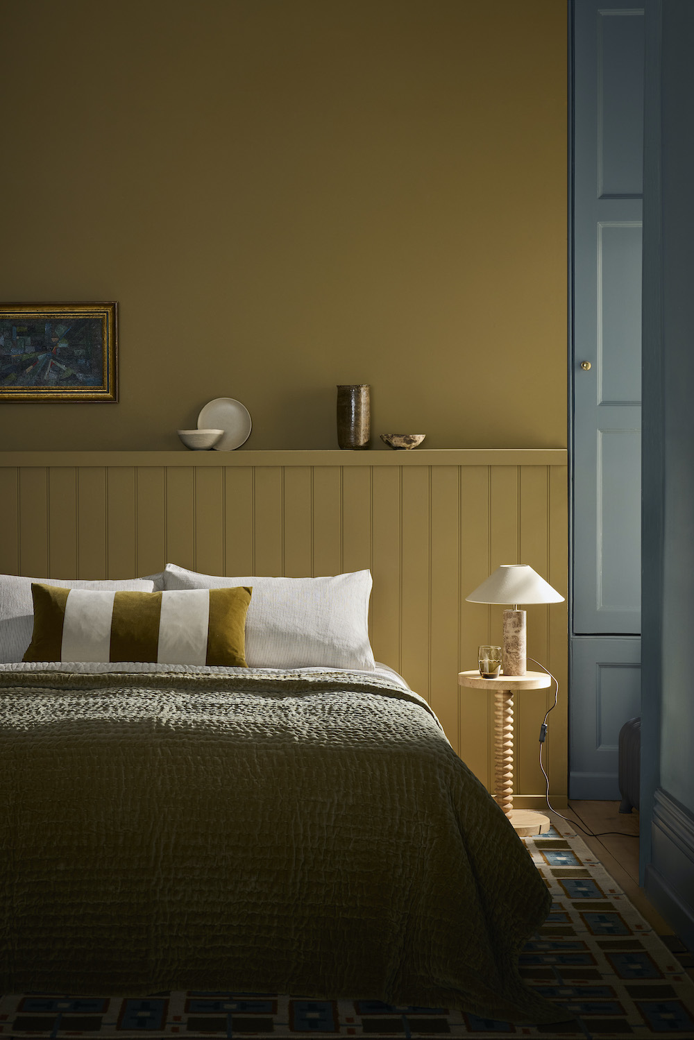
Elysian Yellow 356
Adding another yellow to an increasingly popular color category, Elysian Yellow is a balanced neutral yellow that is warm but not so obvious in hue. It is one of several colors used in the intricate decoration of The Chinese House at Stowe in Buckinghamshire; a small timber pavilion that once stood on stilts in a pond near the estate’s Elysian Fields.
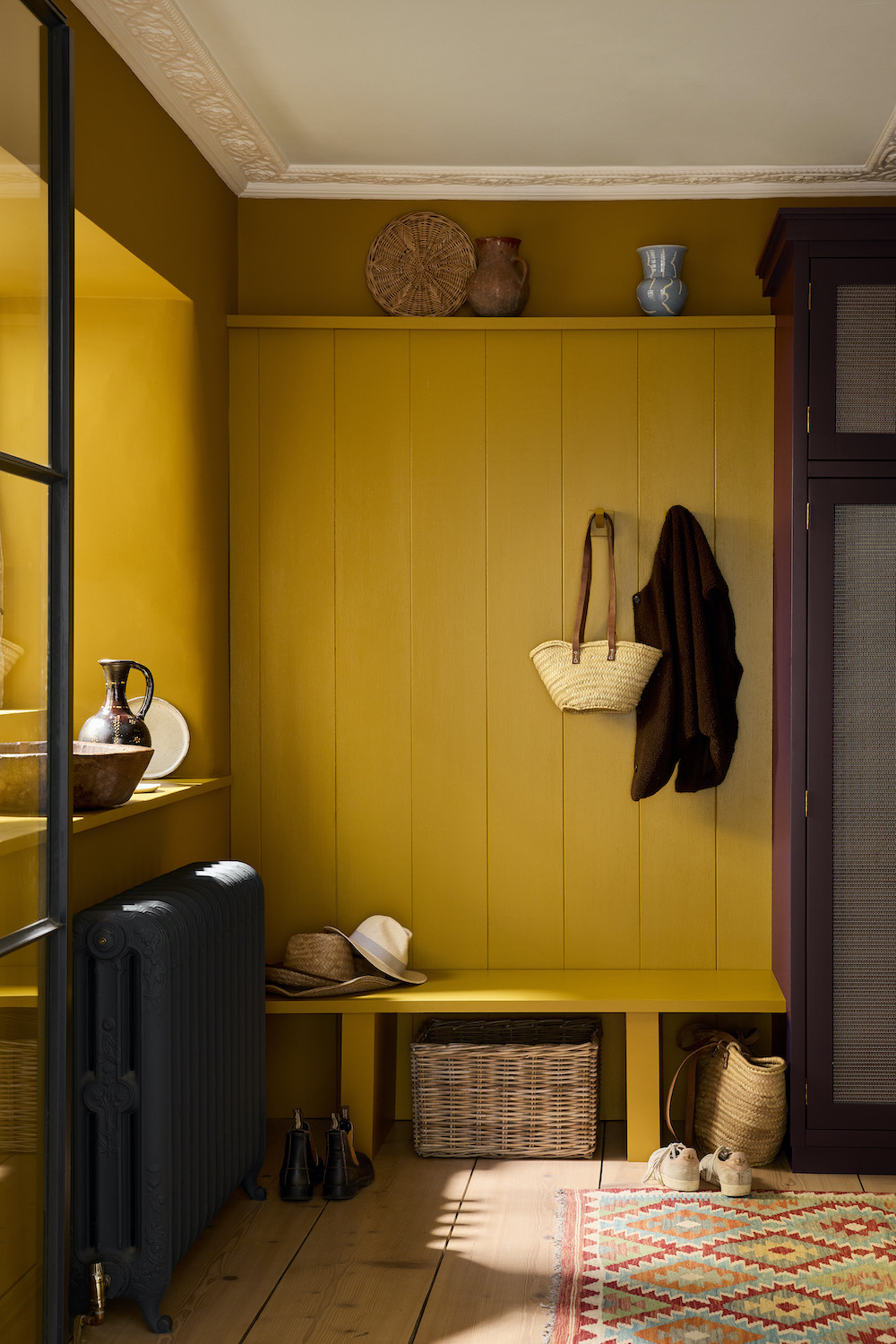
Brûlée 357
A delectable, caramelized yellow, Brûlée will act as a deep neutral when schemed alongside brighter, bolder yellows, or it will bring design impact as an enigmatic signature color among darker shades.
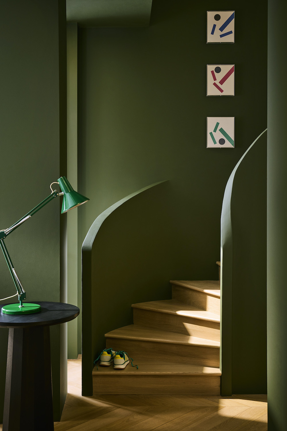
Oilcloth 358
A characterful green, Oilcloth provides an excellent alternative to grey in an all-over color-drenched scheme, or black when used within a neutral scheme.
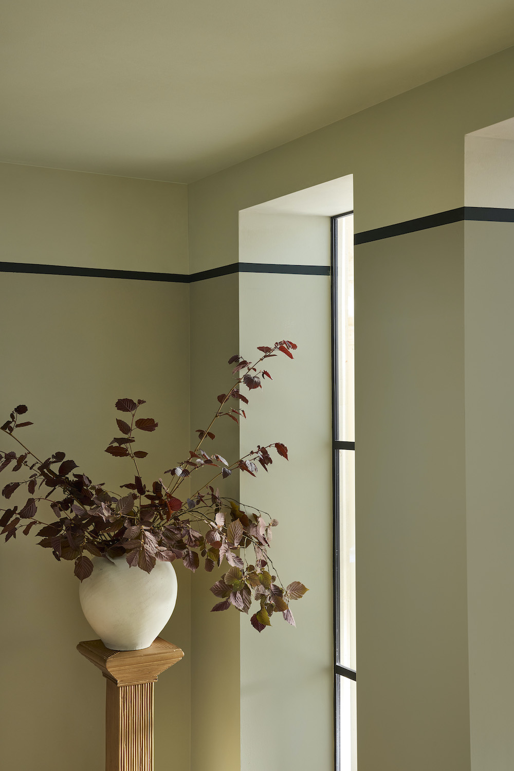
Barge Stone – Colour Scales Family 358–361
A highly complex, easy-to-scheme neutral, Barge Stone is an evolution of the much-loved Portland Stone’with a cooler green undertone. It is a green without any green or blue pigment.
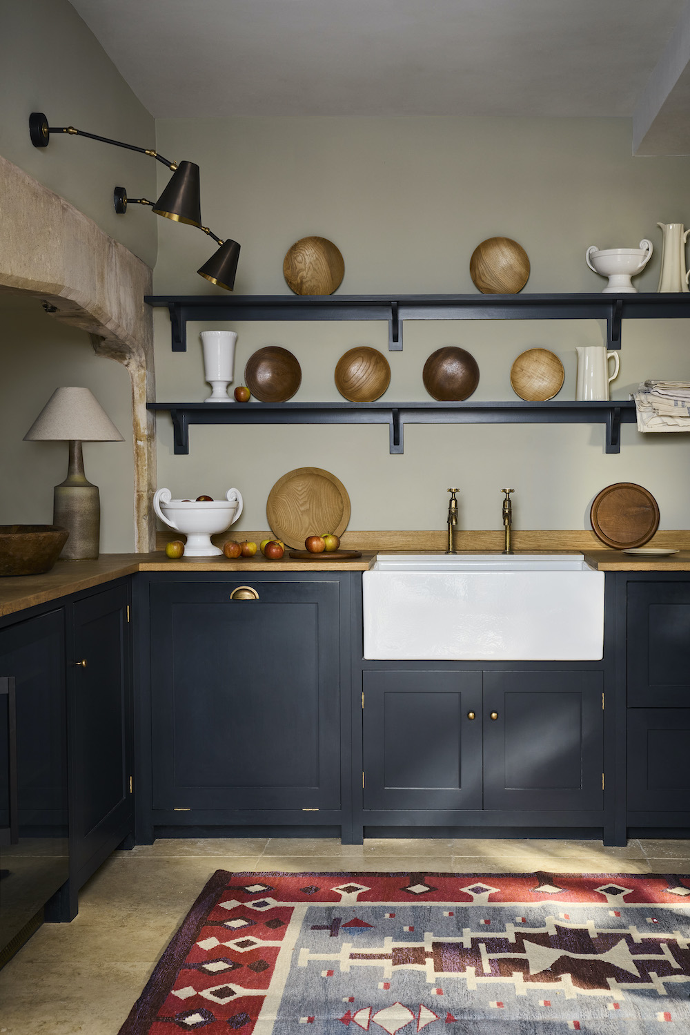
Cobble 359
Understated, subtle and very neutral, this clever grey coordinates effortlessly with cooler, modern schemes. Much like the easy-to-scheme French Grey, which combines a touch of both red and blue pigment, Cobble offers a cooler, more green-based grey.
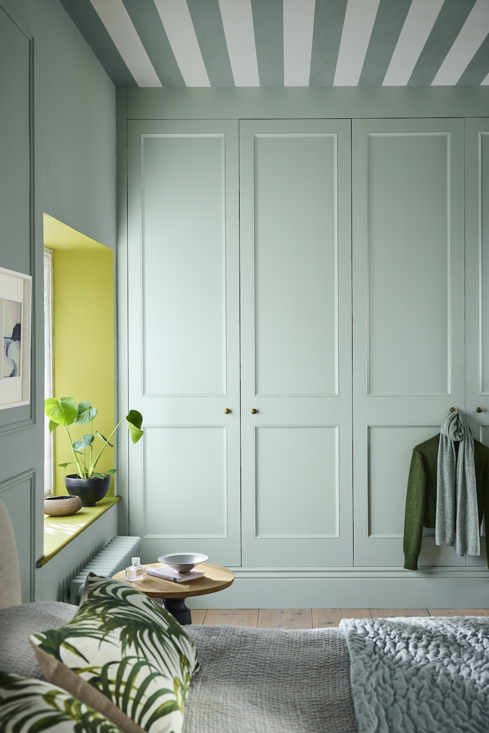
Celestial Blue – Colour Scales Family 364–366
The charming and highly versatile Celestial Blue, which can appear blue, green or grey depending on the light, is now available as a graduated family of colors. A dusky variant of Sky Blue found on a rare surviving paint color card of 1807, the Celestial Blue Colour Scales family now offers an easy-to-use palette of subtle color variation for harmonizing in a room.
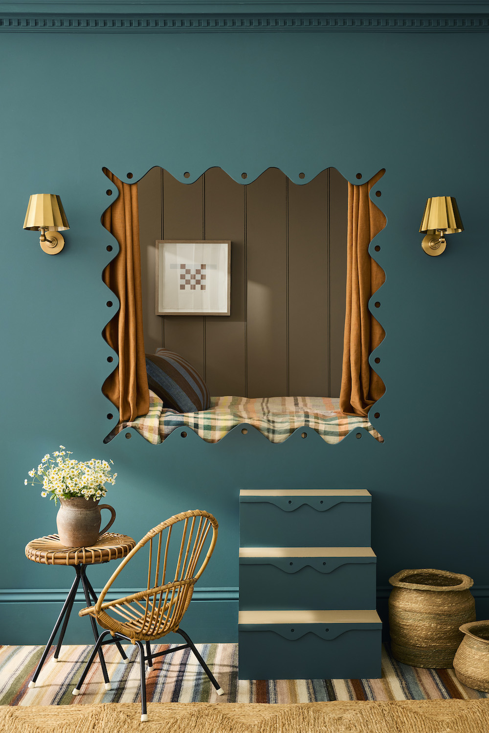
Rome 367
A deep, sophisticated blue, Rome embraces its green undertone without verging on turquoise. Rome sits close to the iconic Hicks’ Blue but offers a greener quality.
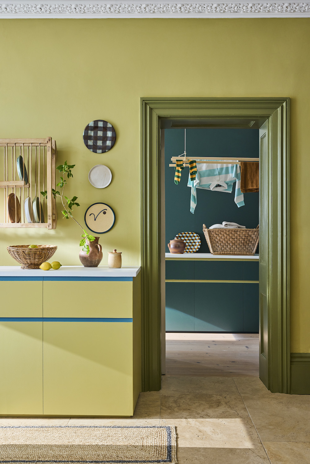
Boxington Family – Colour Scales Family 368–370
Reassuring, soothing and elegant, Boxington is a reduced lime, with added red oxide of iron. Extended to offer both lighter and darker variations within the Colour Scales collection, this family of color will provide a relaxing and elegant backdrop in dining rooms, hallways and living rooms.
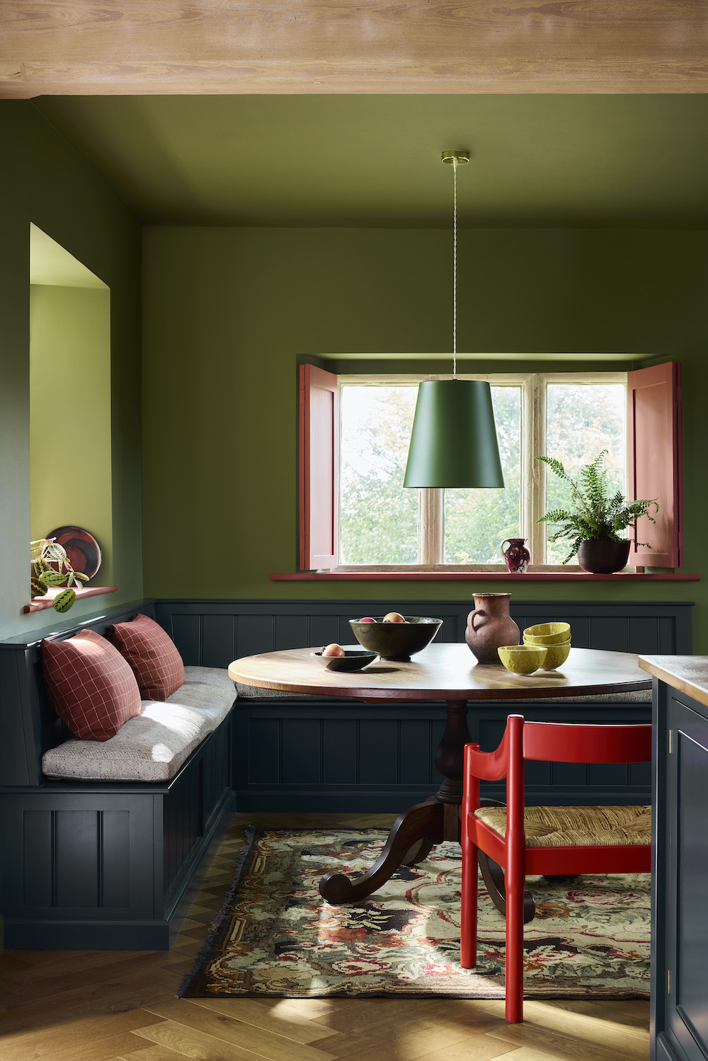
Hillside 371
A warmer version of Sage Green, Hillside is the perfect green for adding warmth to cool living rooms and functional kitchens. Hughenden Manor in Buckinghamshire, the 19th-century home of British Prime Minister Benjamin Disraeli, was inherited by his nephew Coningsby, who converted Disraeli’s drawing room to a library, where this color was used on small sections of plaster wall, among well-stocked bookshelves. In the 1940s, the library housed a secret wartime Intelligence base that supported a covert RAF initiative, codenamed Hillside.
Like what you see? Get it first with a subscription to aspire design and home magazine.