

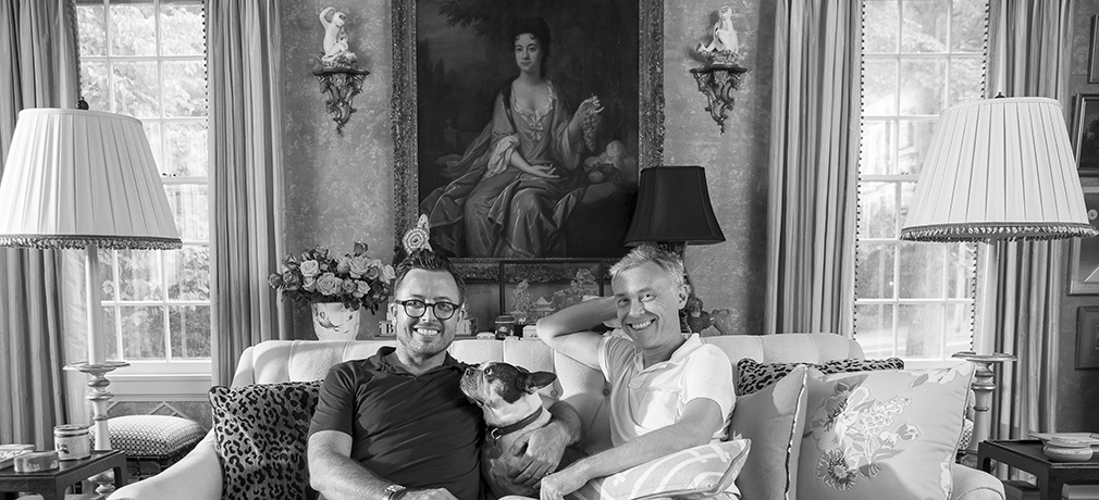


Although known for an exuberant use of prints, patterns and, yes, color, the highflying gents from interior design firm Madcap Cottage are more than happy to strip down to the bare black-and-white essentials. Here, Madcap cofounder Jason Oliver Nixon drops trou.
When the editor at ASPIRE DESIGN AND HOME rang up to suggest photographing our home in black and white, my partner and Madcap co-founder, John Loecke, and I were intrigued. Our firm, Madcap Cottage, has carved out a niche in the prints-and-patterns space, so I thought, “what fun it would be to see how the various, exuberantly hued and patterned rooms would look stripped bare!”
But before you ogle the goods, let’s consider the backstory and how our home came together.
Five years ago, John and I decided that it was time to leave New York City after a two-decade run, and the reason for the departure was simple. We were becoming “Seinfeld” characters who mumbled and cursed at “those damn pedestrians” on Fifth Avenue. Everything had become a chore – from grocery shopping to attending the movies. Our pound rescue pups were tense, we were tense and big-city living had lost the fun that so energized us in, say, our twenties and thirties. It was time to live, live, live in a new way.


And so John and I started searching for the right physical locale to bring our next chapter to life, a new home base. After much conversation and deliberation, we settled on High Point, North Carolina, the so-called Furniture Capital of the World. Why not, we figured, we love the south and had spent a great deal of time coming to Market in High Point and had made several friends who lived in the area. Besides, we could always move on if HP wasn’t the right fit. As mother always said, “If you don’t like the book, just pick up another.”
Hence, John and I packed the pound-rescue pups into the Subaru for a road trip-cum-house hunting weekend in High Point, and we ended up purchasing the first pile we toured, a 1930s-era Georgian-Regency white brick number on two acres with a stream. (And for a price far less than a Brooklyn studio walk-up!)


Goodbye, Park Avenue! Hello, Green Acres! (As some of our New York City-centric friends intimated, rolling their eyes.)
With the moving truck loaded up and our Brooklyn brownstone sold to the head of PR at Vogue magazine, the Madcaps bid farewell to NYC and headed south of the Mason Dixon.
First stop, Cracker Barrel.
And then the real work began, aka, the renovation.
The goal was to take our new home – now named the House of Bedlam (we love giving homes storylines) – back to its 30s-era roots but with an English country house, layered vibe that would capture a spirit of sophisticated fun. A yearlong renovation began that would remove the bisque-hued kitchen with “Brady Bunch”-styled “daylight” lighting. We lavished the bathrooms with black-and-white tile and enclosed the garage to become a stone-clad mudroom. It was goodbye to a guest bedroom, and hello to an oversized, English-style dressing room meets master bath. New wiring and plumbing weren’t the sexiest of tweaks, but the panels of custom latticework trim commissioned for the living, dining and sunrooms certainly excited us. As did the handpainted foyer floors and walls and ceiling that channeled the spirit of great English country estates.
Meanwhile, as the renovation progressed, John and I huddled together with the dogs in the housekeeper’s former bedroom above the former garage. It was very “Barefoot in the Park” meets glamping. We washed dishes in the sink and became masters of cooking atop an IKEA hot plate. Each evening we would review the ever-evolving design schemes and ever-changing furniture arrangements, all mapped out on myriad Post-its. Every piece of furniture in the House of Bedlam would be vintage – albeit recovered – and much of the wallpaper that would adorn the walls would be antique, too, culled from eBay. Ah, the checklists!
There were trips to the upholsterer, meetings with the wallpaper installer and the decorative painter, and endless updates with our crackerjack project manager who ran the renovation like a take-no-prisoners CEO (and yet constantly kept us laughing with her witty banter).
Eight months soon flew by.
And then, miraculously, the renovation wrapped up, and we moved into our new, grown-up home.


Fast forward to today, and John and I could not be happier. The House of Bedlam is heaven – the perfect respite from a harried, technology-driven world. It’s a small slice of England plunked down in the south. Packed with prints and patterns, the House of Bedlam brings a storyline to life and captures an easy-breezy glamour where antiques marry swimmingly with modern art. We entertain like crazy and welcome houseguests with open arms. And, yes, the pound-rescue pups have free rein.
But back to the ASPIRE DESIGN AND HOME photo shoot and daring to go bare.
John and I think that the House of Bedlam looks amazingly crisp and clear in black and white. There’s a mystery. A clarity. A vintage glamour.
Or to quote Ginger Rogers, “Perhaps I am old-fashioned, but black-and-white films still hold an affectionate place in my heart; they have an incomparable mystique and mood.”
Mystique. Exactly. And a timeless chicté.
Photography Courtesy of Bert Vanderveen.
Like what you see? Get it first with a subscription to ASPIRE DESIGN AND HOME magazine.