
As Jennifer Farrell’s Interconnected Changeable Environments House continues to take shape, the conversation naturally turns from structure to sensation — from how the homes are built to how they are experienced. Across the three environments, materials begin to reveal their quiet power: color sets emotional tone, texture invites touch, textiles soften scale, and art brings moments of pause and personality. At this stage in the journey, Jennifer reflects on how these elements work together to give each house its own identity while weaving a cohesive story throughout the property.

In the early stages of designing Interconnected Changeable Environments, how important were materials in shaping the emotional and experiential story of the three houses?
Materials were never an afterthought in designing the Interconnected Changeable Environments — they were the starting point. Before floor plans were finalized or furniture was selected, we were already talking about how each house should feel emotionally. Materials became the language through which that story was told.
Each of the three houses needed its own identity, its own rhythm, and its own sensory experience, and materiality is a powerful way to achieve that.
When you think about “materiality” in this project, what role does it play beyond aesthetics — how does it influence how the spaces feel, live, and age over time?
Materials shape how a space lives day to day — how it absorbs light, how it responds to touch, how it sounds, even how it smells over time.
A hand-troweled plaster wall, for example, doesn’t just look beautiful; it softens acoustics, reflects light differently throughout the day, and develops a patina that tells a story as the house is lived in. Textiles introduce warmth and movement, while natural materials ground the spaces in something timeless and human.
We were very intentional about selecting finishes that would evolve gracefully rather than feel dated or precious. These houses weren’t designed to be frozen in time — they were designed to shrink and grow, to mature, to collect moments, and to serve the homeowner instead of the homeowner serving the home. In that sense, materiality becomes emotional infrastructure — it supports comfort, longevity, and authenticity.
Ultimately, materials are what make a house feel like a home. They invite you in, they hold you there, and they quietly shape your experience long after the visual impact fades.
How did you approach color differently across the three houses, and what narratives were you hoping each palette would convey?
Color was one of our most intentional storytelling tools across the Interconnected Changeable Environments House environments. Each house has its own emotional narrative, and color became the quiet cue that guides how you experience the space the moment you walk in.
Instead of thinking in terms of “palettes,” we thought in terms of mood and memory. Center House is the most romantic environment; it leans into softer, more atmospheric tones — colors that feel calming, enveloping, and restorative. Indy House is the most contemporary space; to balance that energy, it embraces warmer, grounded hues that convey comfort and connection. Extension House is the most playful of the three homes; bright white walls enhance a deeper contrast and saturation of pink, navy, charcoal, rust, and gold, creating a sense of confidence and energy.
Each palette was designed to support how the house was meant to be lived in, not just how it was meant to be photographed.

Were there any colors or tonal families that became foundational across the project — a kind of visual thread tying the houses together?
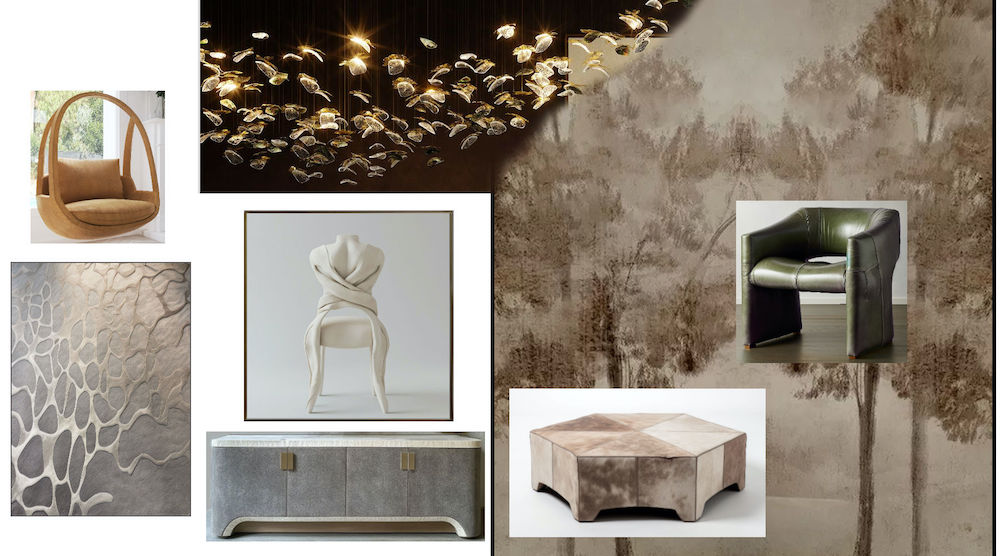
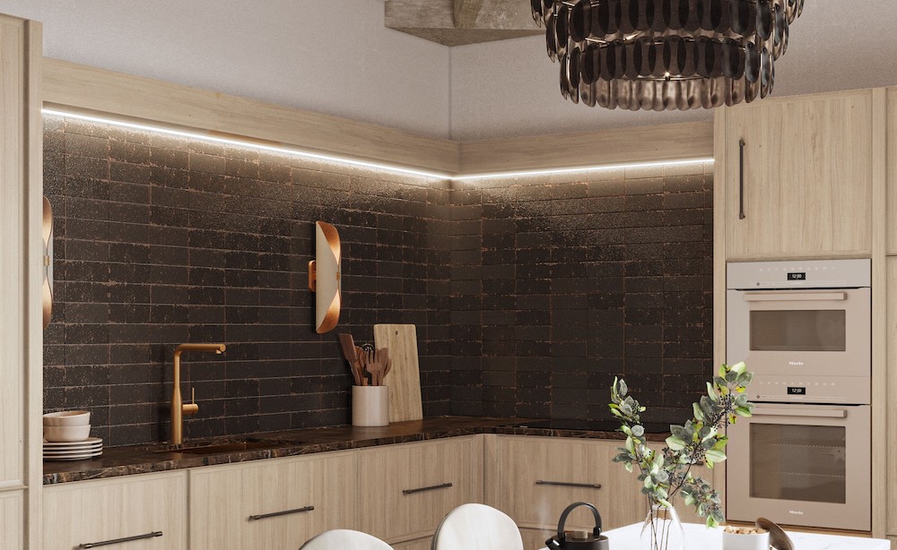
I consistently returned to tonal families rooted in nature — warm neutrals, mineral-based hues, softened whites, and layered earth tones. My own Metamor and Eclissi tile collections with Emser Tile play a prominent part in setting the color story throughout all three environments. These colors act almost like a common language across the project.
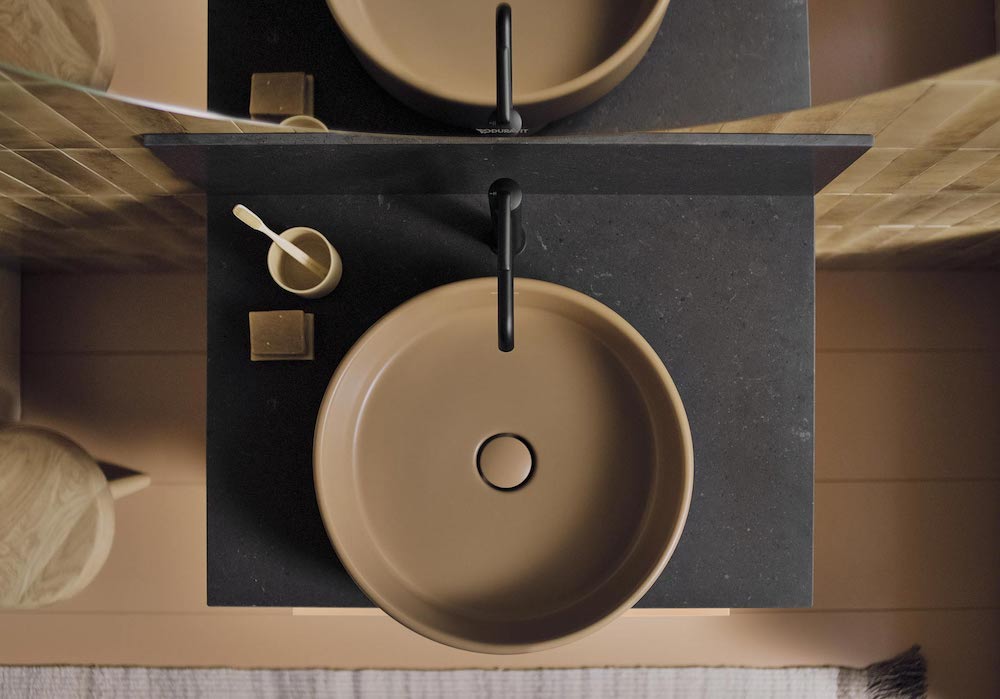
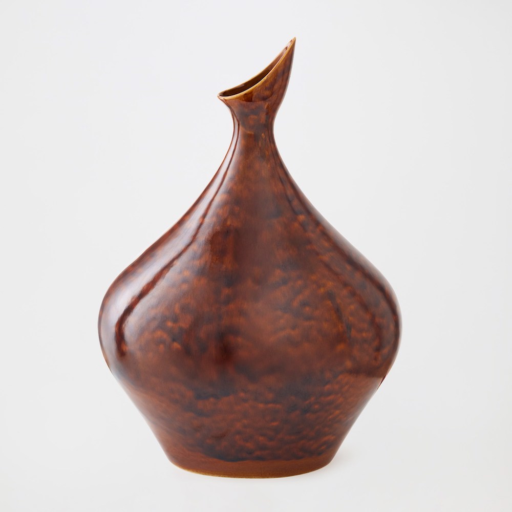
One of my favorite design moments is in the smallest powder room, where we selected a clay-toned sink and toilet from Duravit. The texture of these pieces is so alluring and sensual, and we’ve set them against a backdrop of Eclissi Cotto tile for a delicious tonal layering that makes even the smallest space feel dynamic.
Throughout the spaces, when the expressions differed, the undertone remained familiar, which allowed the houses to feel distinct yet cohesive. It’s that shared foundation that keeps the project from feeling fragmented or overly thematic.
How do you balance restraint and impact when working with color in a space meant to feel timeless rather than trend-driven?
Timeless spaces don’t rely on novelty — they rely on intention. We used color strategically, often allowing it to appear through texture, material variation, or subtle shifts in tone rather than bold statements everywhere.
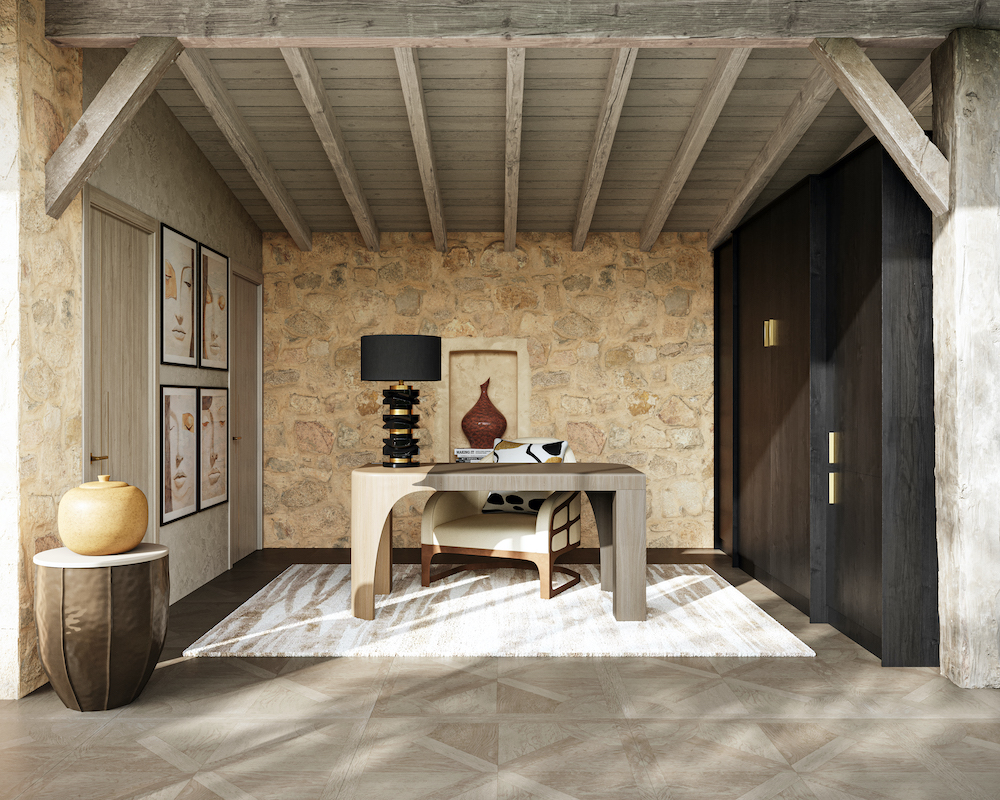
When color is used more assertively, it’s anchored by natural materials and classic proportions so it feels grounded rather than trendy. For example, in the Center House entertainer’s kitchen, the custom La Cornue Château range is a deep, moody teal, harmonizing beautifully with Cosentino’s Parisien Bleu Silestone. Against the earthy tones of limestone walls and Taj Mahal quartzite, the rich, inky tone feels both surprising and timeless.
The goal was never to chase what’s current, but to create spaces that feel emotionally relevant now and still resonate years from now.


Texture seems to be a defining element throughout the Interconnected Changeable Environments. Why was layering tactile surfaces so important to this project?
Texture was foundational to the project, because it’s what makes a space feel human.
You can appreciate color visually, but texture is something you experience physically and emotionally. Layering tactile surfaces allowed the houses to feel lived in, grounded, and inviting rather than overly polished or precious. We wanted spaces that encourage you to slow down, to touch, to notice — because that’s where real comfort lives.
Texture adds depth and nuance in a way that flat surfaces simply can’t, and it creates an emotional richness that elevates the entire experience of the home.
How do hard surfaces like stone, tile, and architectural materials interact with softer textures to create warmth and livability?
Hard surfaces — stone, tile, architectural materials — are essential anchors in the project, but they’re always balanced with softer elements.
Stone brings permanence and strength, tile introduces rhythm and craftsmanship, and architectural materials give structure — but without softness, those elements can feel cold. By layering in upholstered pieces, natural fibers, and subtle surface variations like plaster or brushed finishes, there’s a dialogue between strength and softness. That interplay is what makes a space feel warm and livable rather than static.
Were there moments where texture became more expressive than color in defining a space?
Yes — and often. In several spaces, I intentionally kept the palette restrained and allowed texture to do the storytelling. A knurled antique brass dimmer switch from Corston, or a leather drawer pull from Signature Hardware — small but impactful moments of texture and touch connect human to environment. These intimate points of contact can carry as much emotional weight as bold color — sometimes more. Texture has a quiet confidence. It doesn’t shout, but it resonates.
How did textiles help soften and humanize the architecture across the three houses?
Textiles were essential in softening the architecture and making each of the three houses feel truly livable.
Architecture gives a home its structure and strength, but textiles are what bring in warmth, movement, and humanity. Across the three environments – Indy House, Center House, and Extension House – fabrics helped bridge the scale of the architecture to the human experience, inviting you to sit, linger, and feel at ease.
Layered distressed leathers, hand-beaded and tufted fabrics, and dimensional rugs underfoot create moments of comfort that balance the limestone structures, making the spaces feel emotionally approachable.
What considerations went into selecting fabrics and soft finishes that align with the “forever home of the future” philosophy?
When selecting fabrics and soft finishes, we were always thinking about longevity and real life.
The “forever home of the future” isn’t about perfection — it’s about resilience. We prioritized materials that feel beautiful but also perform well; fabrics that can handle daily living while still aging gracefully.
I did that through my furniture collection with Global Views: performance fabrics, textural weaves, and aged leathers that strike a balance between elegance and durability. These choices ensure the homes feel elevated without being fragile, designed to support how people actually live.
Did you think about how textiles would age, patina, or evolve over time as part of the design story?
Aging is a fundamental part of not only the project design story, but the project concept itself.
We embraced the idea that, like the three environments, textiles should evolve over time — developing character rather than wearing out. A fabric that softens with use, a rug that gains depth through wear — those changes add authenticity and soul to a space.
Just like natural materials, textiles tell a story as they age, reflecting the life lived within the home. That evolution is what transforms a beautifully designed house into a deeply personal one.
Art often brings soul to a space. How did you approach art selection and placement within the environments?
From the outset, we approached art not as decoration, but as an emotional layer — something that adds meaning, memory, and personality to the architecture. Placement was very intentional. We considered sightlines, moments of pause, and how art could quietly reveal itself as you move through the home rather than announce itself all at once.
In many ways, art became part of the architectural rhythm, guiding how you experience each space.
Were the art pieces chosen to stand out as focal moments, or to quietly complement the architecture and materials?
Both. Some works act as focal points, anchoring a room and giving it a sense of identity. Others are more subtle, layered into the background so they enhance the texture, color, and mood without competing for attention. The goal was never to overwhelm the space, but to let art and architecture have a conversation.
Select art and sculptural pieces from my Global Views collection are featured, which makes the art curation process deeply personal for me. These pieces were designed with the same philosophy — timeless forms, thoughtful materials, and a sense of craftsmanship that feels both classic and current. They integrate seamlessly because they share the same design DNA as the architecture itself.
How do art and objects help bridge the historic inspiration of the home with its modern vision?
Personally, I view mirrors and lighting as art. We’re creating a giant, floating sculptural lightwork with Kalco in Center House that acts as a glowing art sculpture — almost hovering against a two-story custom mural that essentially transforms the entire great room into a dimensional painted canvas.
The interplay of these spectacular custom creations acts as connective tissue between past and present. A sculptural form might reference traditional craftsmanship, while its scale or finish feels contemporary. That layering creates depth and authenticity — honoring history without feeling nostalgic, and feeling modern without losing warmth or soul.
Ultimately, art is what personalizes the space — it’s what transforms a beautifully designed house into a home that feels lived in, collected, and deeply human.
With three distinct houses, how did you ensure material cohesion while still allowing each one to have its own identity?
Designing three distinct houses within one project is really about finding that sweet spot between consistency and individuality. From the beginning, we approached the three environments as chapters of the same story rather than completely separate narratives. Material cohesion came from establishing a shared foundation — common values around craftsmanship, authenticity, and timelessness — while allowing each house to express those ideas in its own way.
The architecture set the framework, and materials became the connective tissue that ensured the homes felt related without feeling repetitive.
Were there any materials, finishes, or artistic elements that became recurring signatures throughout the project?
Nature-inspired organic shapes and materials play a central role — stone, wood, textural tile, and thoughtfully selected metals appear across all three houses, but they’re interpreted differently each time.
Certain finishes, tonal families, and artisanal details became familiar touchpoints, creating a sense of continuity as you move from one house to another. Even in the art and sculptural elements, there was a shared sensibility — pieces that felt collected, intentional, and rooted in craftsmanship rather than trend.

How did you decide when to repeat a material versus introduce something unexpected?
Repetition creates comfort and cohesion — it gives the eye something to recognize and trust. But surprise is what keeps a space engaging, particularly when you’re designing three homes on one property.
When a material had already established itself as part of the project’s visual language, I felt confident introducing a new texture, finish, or artistic moment to shift the energy. Like with our GROHE kitchen and bath fittings — beautiful sculptural pieces that have the same ultra-contemporary through-line in all three environments but with surprising finish changes that range from a cool brushed brass to a matte black to this extraordinary polished graphite I’m madly in love with.
Those unexpected elements were always grounded by the familiar, so they felt intentional rather than disruptive. That balance is what allowed each house to have its own identity while still feeling undeniably part of the same design family.
What do you hope designers and homeowners take away from this project when it comes to choosing materials for their own spaces?
What I hope designers and homeowners take away from this project is the importance of choosing materials with intention rather than impulse. Materials should support how you live, how you move through a space, and how you want it to feel years from now — not just how it looks today. Timeless design isn’t about playing it safe; it’s about making thoughtful, informed choices that prioritize quality, longevity, and emotional connection.
When materials are chosen well, they do the heavy lifting for you — they create beauty, comfort, and meaning without needing constant reinvention.

Looking back, what material choice most clearly captures the spirit of the project as a whole?
When I look back at Interconnected Changeable Environments as a whole, the material choice that most clearly captures its spirit is the use of layered, natural surfaces and handcrafted artisanry — particularly with tile and stone.
Those materials embody everything the project stands for: authenticity, craftsmanship, and a sense of permanence. They’re not flashy or trend-driven, but they’re deeply expressive. They respond to light, they invite touch, and they evolve over time. That quiet confidence is really the soul of the project.
If materials could “tell a story,” what do you think the house is ultimately saying?
If materials could tell a story, I think Interconnected Changeable Environments is saying that true luxury lies in intentionality, authenticity, and humanity. It’s a story about honoring the past while living fully in the present, about creating spaces that feel grounded yet forward-thinking. Ultimately, it’s saying that a home should be felt as much as it’s seen — and that the most powerful design stories are the ones that unfold slowly, beautifully, and over time.
Like what you see? Get it first with a subscription to aspire design and home magazine.