


Project Details
Interior Design: Sam Donnelly of Mercantile and Merchant
Location: Los Angeles, California
Client Review: The homeowners are a young couple in the music industry. They’re creatives and wanted to make this project really special.
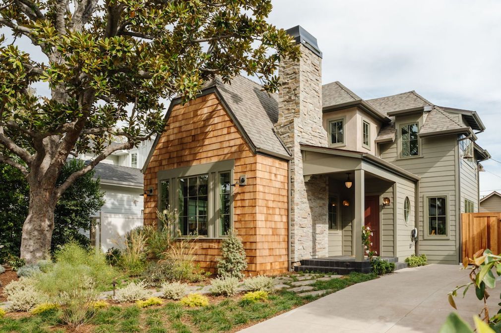
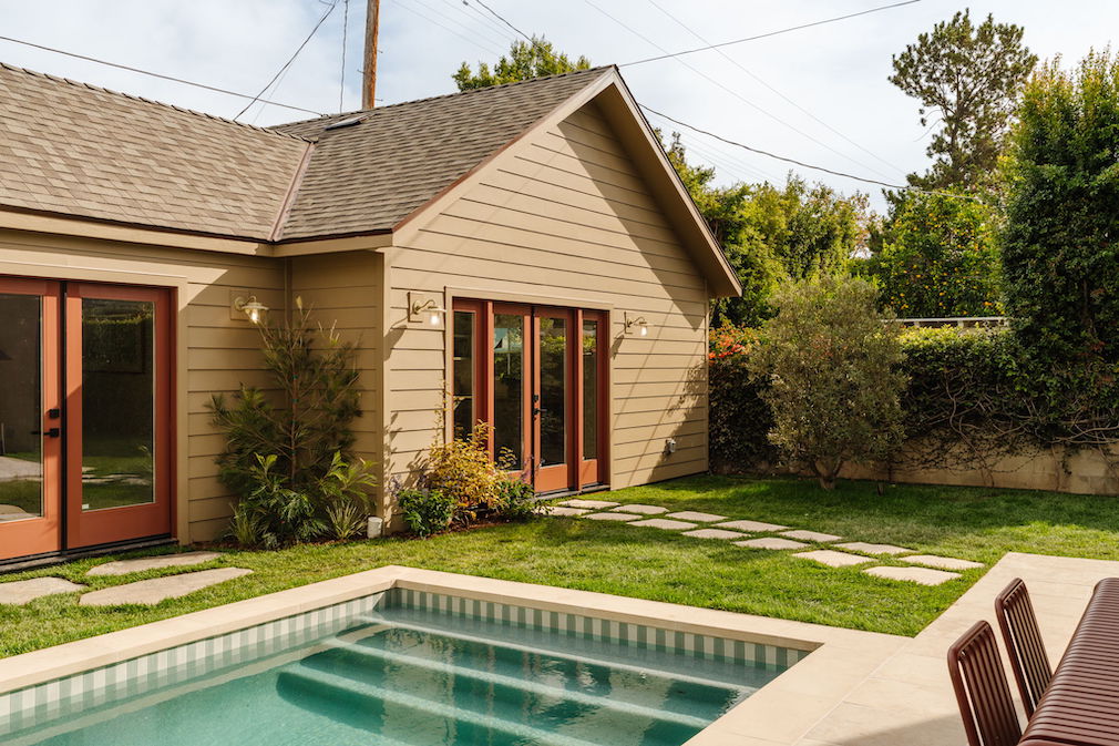
Do you know when you talk to someone for the first time and they completely understand what you do, and you understand what they want? It was such a great synergy. My clients loved the fact that I’m very much into color. They wanted the antithesis of the modern farmhouse. They didn’t want white walls and cold spaces with huge volumes. I’m all about the house being easy to live in: We must live in [our residences] in a modern way, but they shouldn’t be cold, clinical, and miss all the charm and whimsy of traditional homes. I always work with Ryan Perella, who is a dear friend, on architecture. When we landed on that design, it was important to me not to have a garage. In fact, there’s no garage in the whole project. It was a better use of space to have a killer ADU and a really great house.
Design Aims
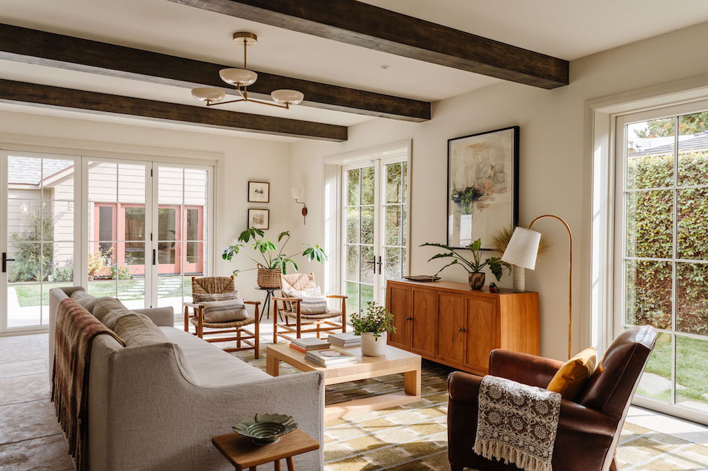
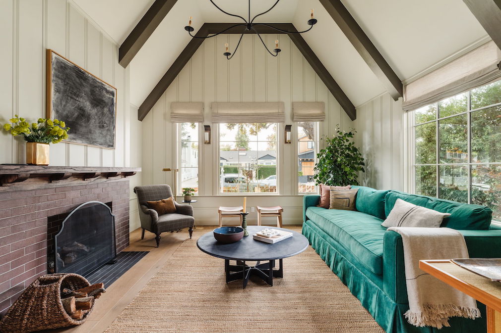
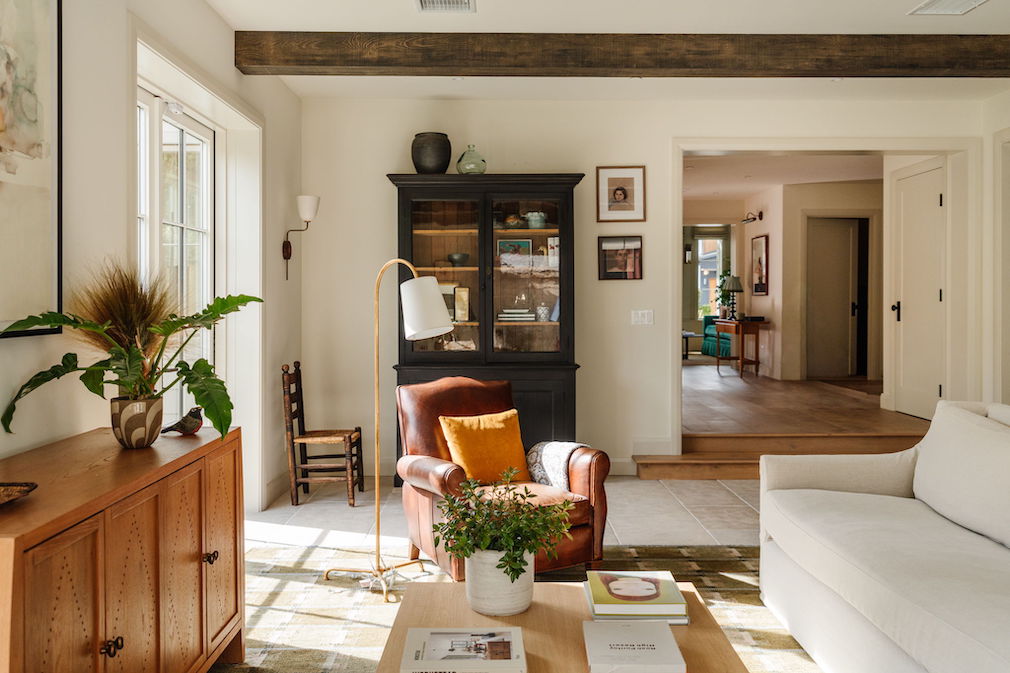
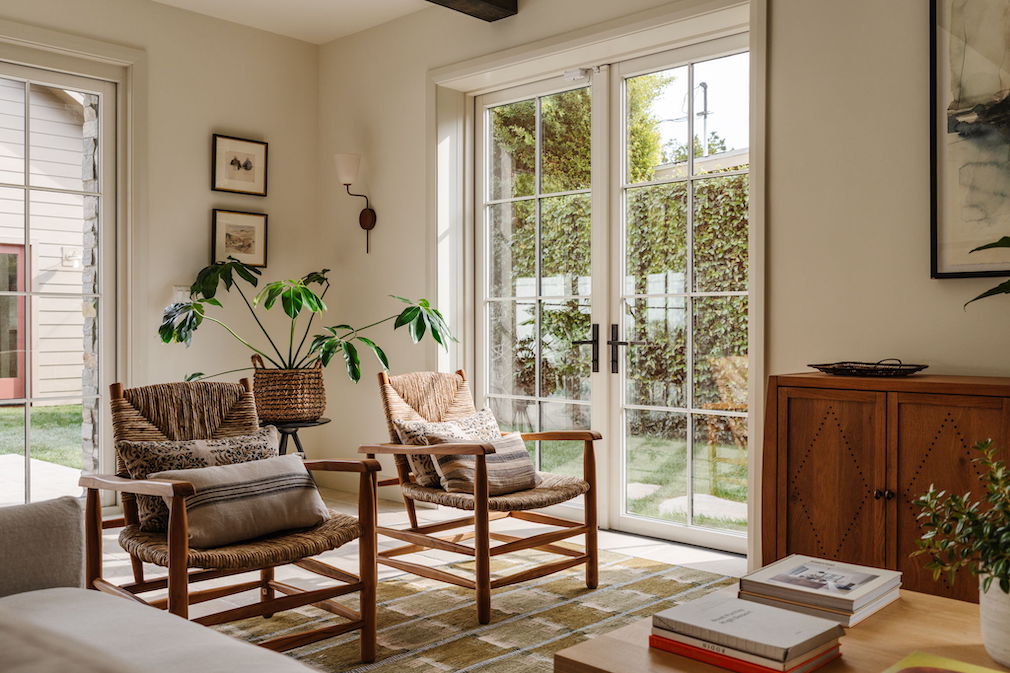
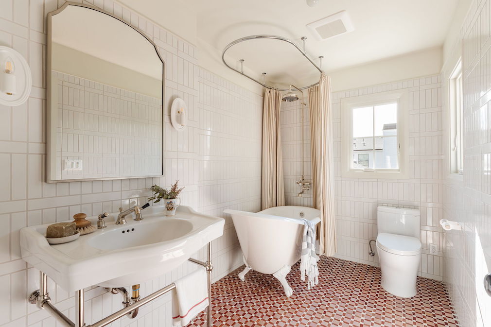
I have a real love of whimsy; I suppose that’s the English part of me. I like things to feel charming, warm, and welcoming. I like to use wallpaper. And I just love that feeling of a house that is crafted. I’m always drawn to things that are sort of traditional, but not too old granny.
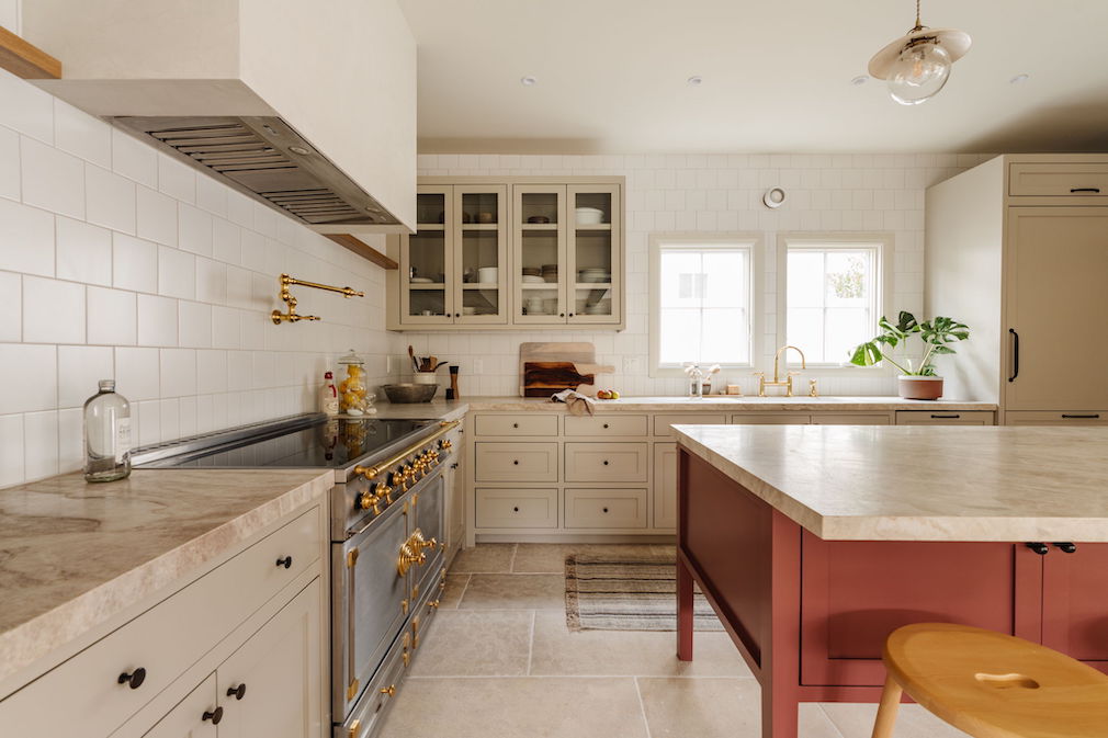
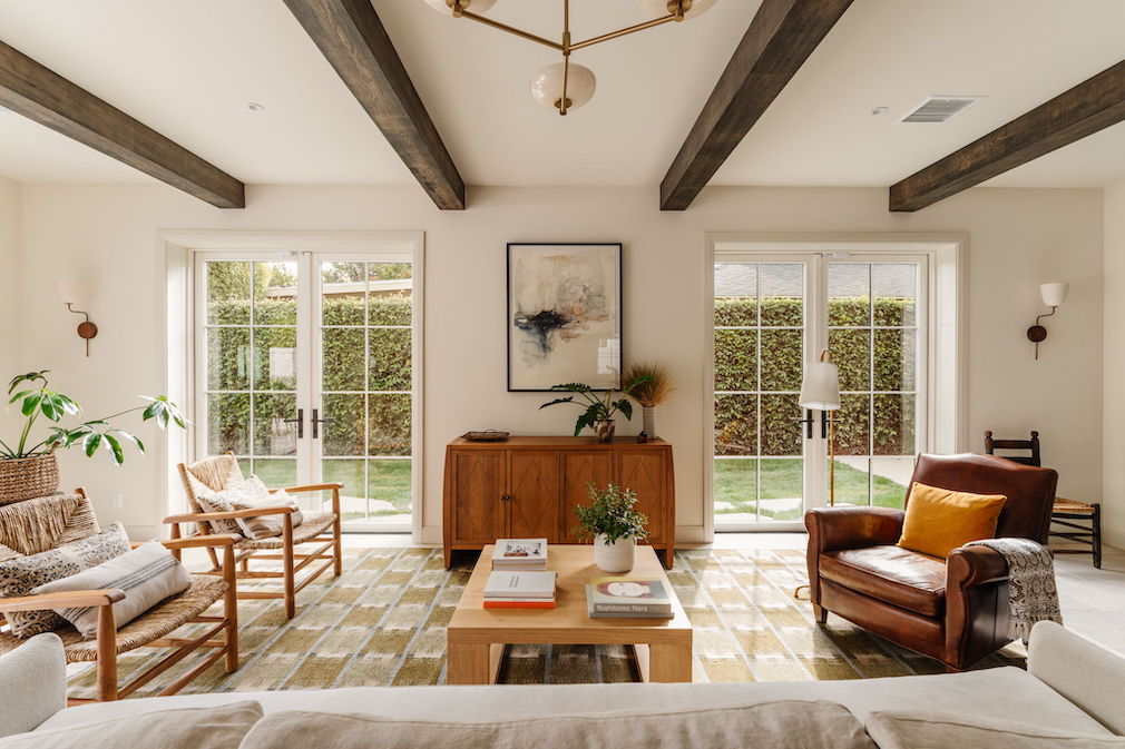
The interior took its cue from the exterior. We had a very clear idea of using cedar shingles in their very natural state. The slightly moodier stucco comes together in quite a sophisticated color palette. Then, when we transitioned to the inside, [the exterior] had already set the tone. We’re using these traditional, 12-inch tongue and groove boards in the front formal living room, and it felt very grounded. We used these more muted creams with a little bit of brown, green, and paper.
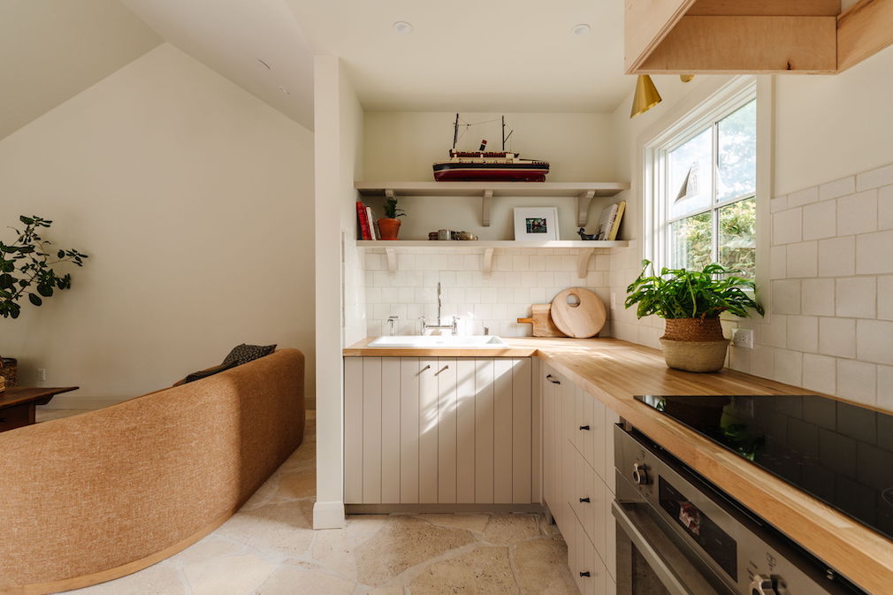
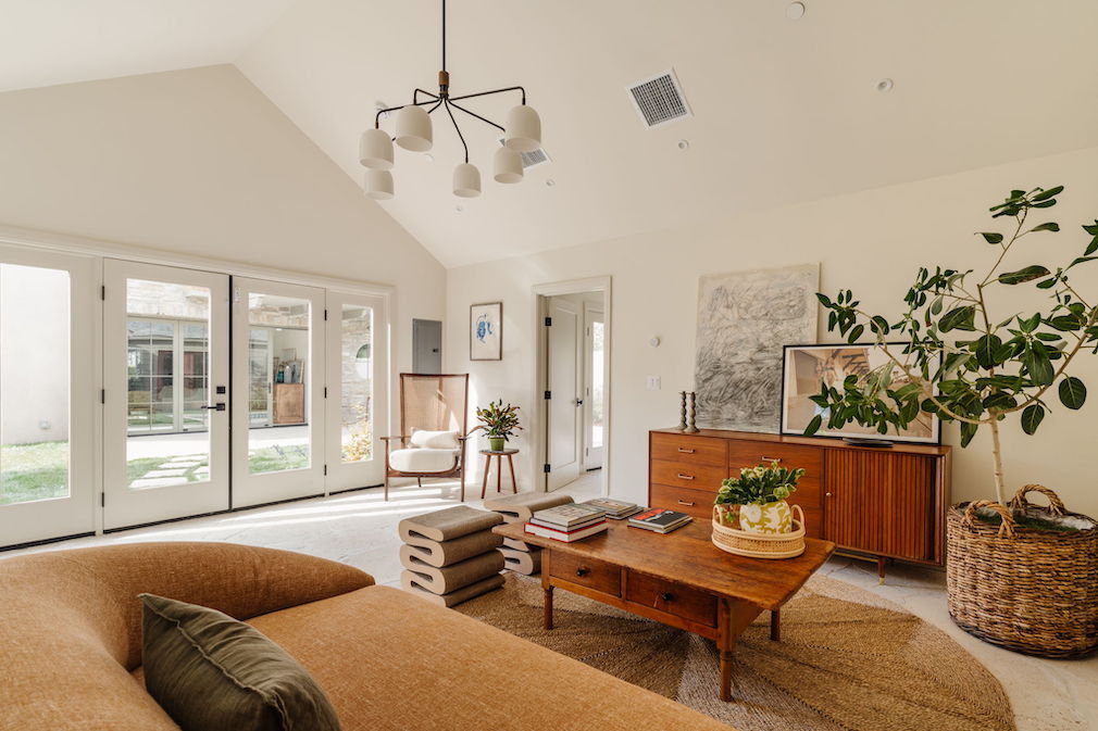
I wanted the ADU to feel connected, but not like a twin or siblings necessarily; more like cousins. I wanted it to have its own identity because it is a different structure. It has a clean palette and feels like a slightly younger version of the primary house.
From the Designer
Ryan and I spent a lot of time on site and in the home thinking, How is the light? How does this feel? For me, it’s a lot about a feeling. It was an emotional build from the ground up.
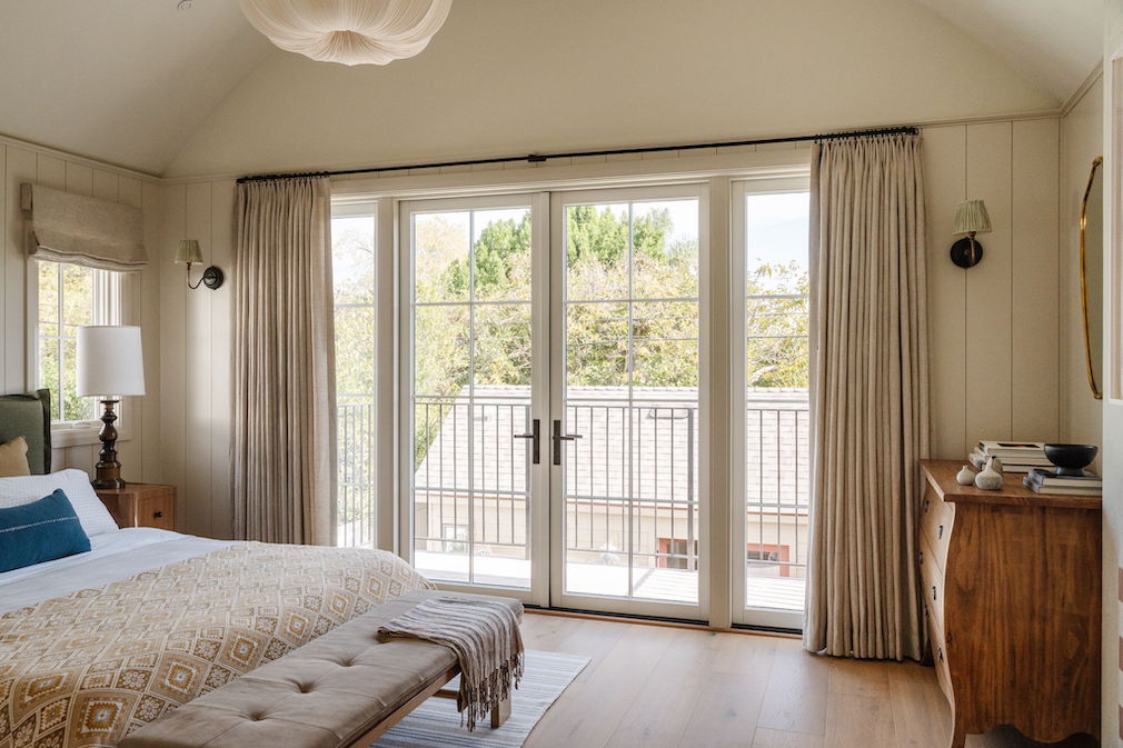
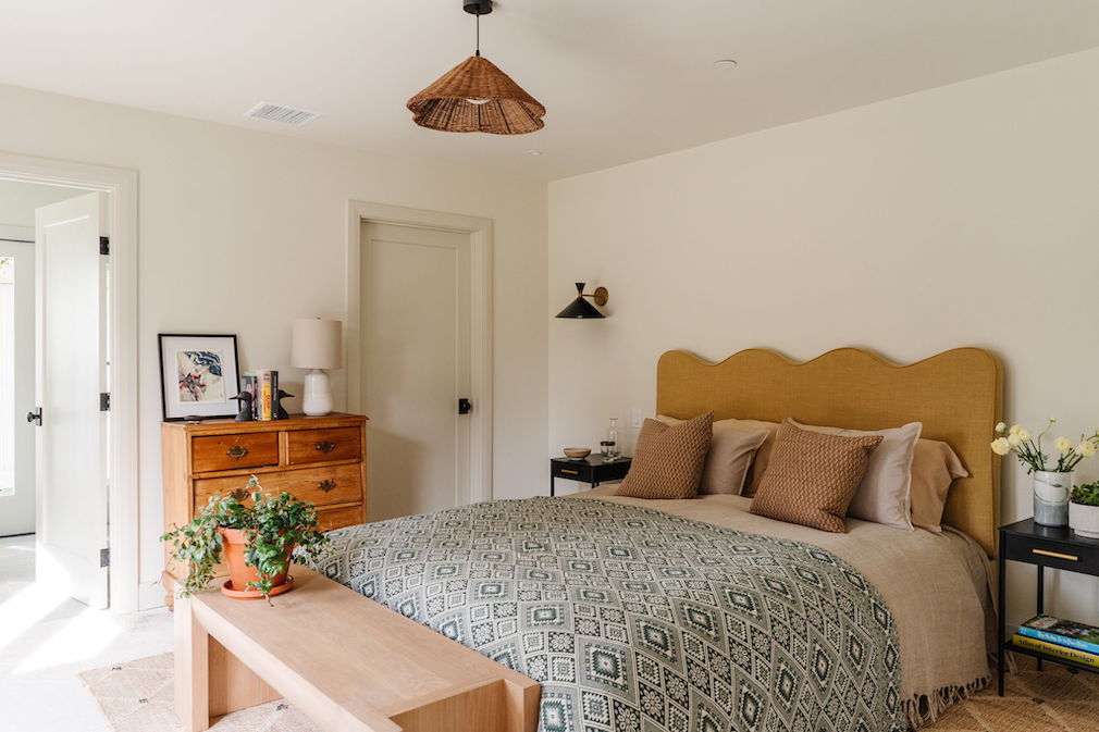
For the primary bedroom, I kept showing Ryan images of rooms with pitched roofs, so he basically took that inspiration and made it into something livable. Rooms with very steep pitches are not that easy to live with. The angles of the ceiling were really challenging to build, but the way the windows intersected with them gave us all the charm and nooks. When there’s something in the home that wasn’t the “easy” decision, you feel like the house is built with love.

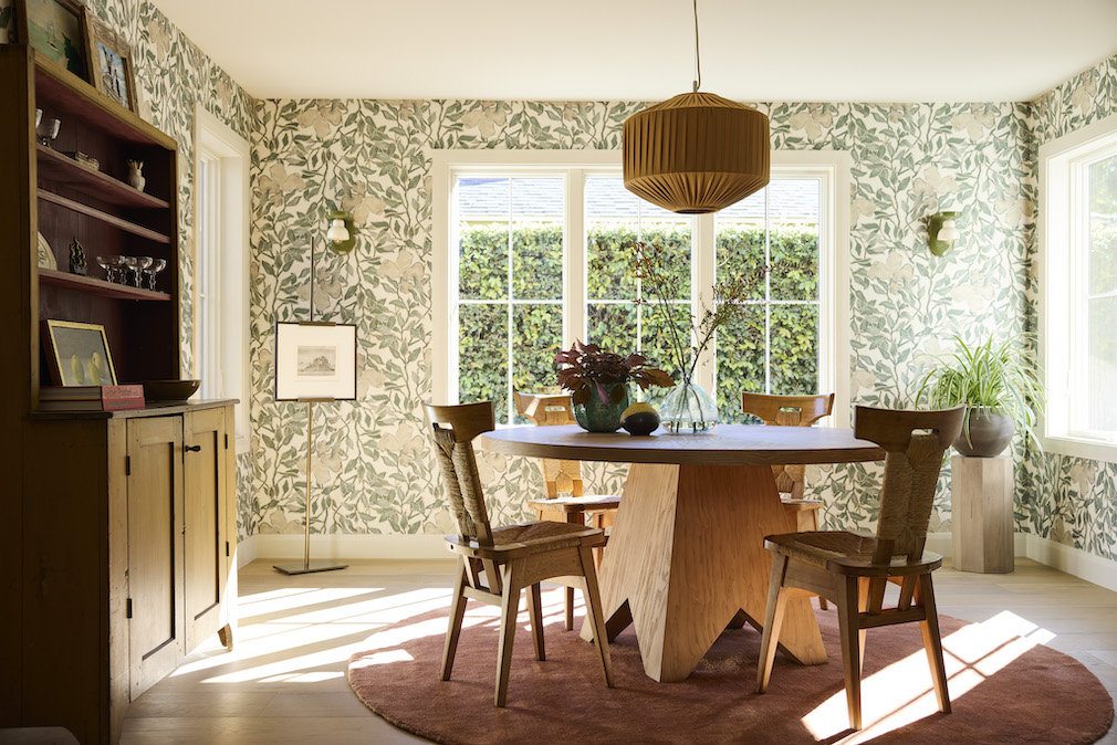
Photo by Joe Schmelzer
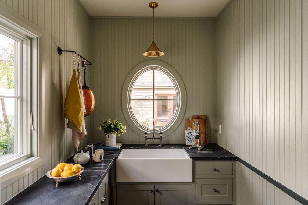
I also like rooms where you have a little surprise. You don’t have to live with it day and night — I think sometimes that can be too much — but you have it as a little joyful moment. I think that’s a lot of fun. We have two oval windows: One in the scullery and one in the entry. Our window supplier thought the window in the pantry was overkill, but Ryan and I said, “No, we have to have it.”
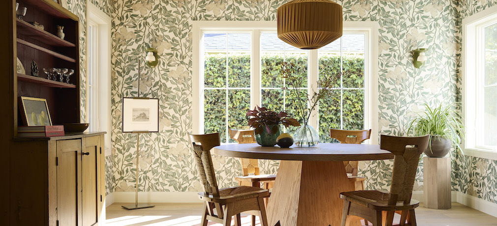
The dining room felt like a good opportunity to use a bold wallpaper because it’s not a space you are in all day long. It’s between the family room and the formal [living room], so you’re constantly walking past that wallpaper, and it makes me really happy. You come down the stairs and that’s what you see. It just gives joy. The repeat has this universal appeal: Wallpaper’s quite divisive, but everybody loved this one.

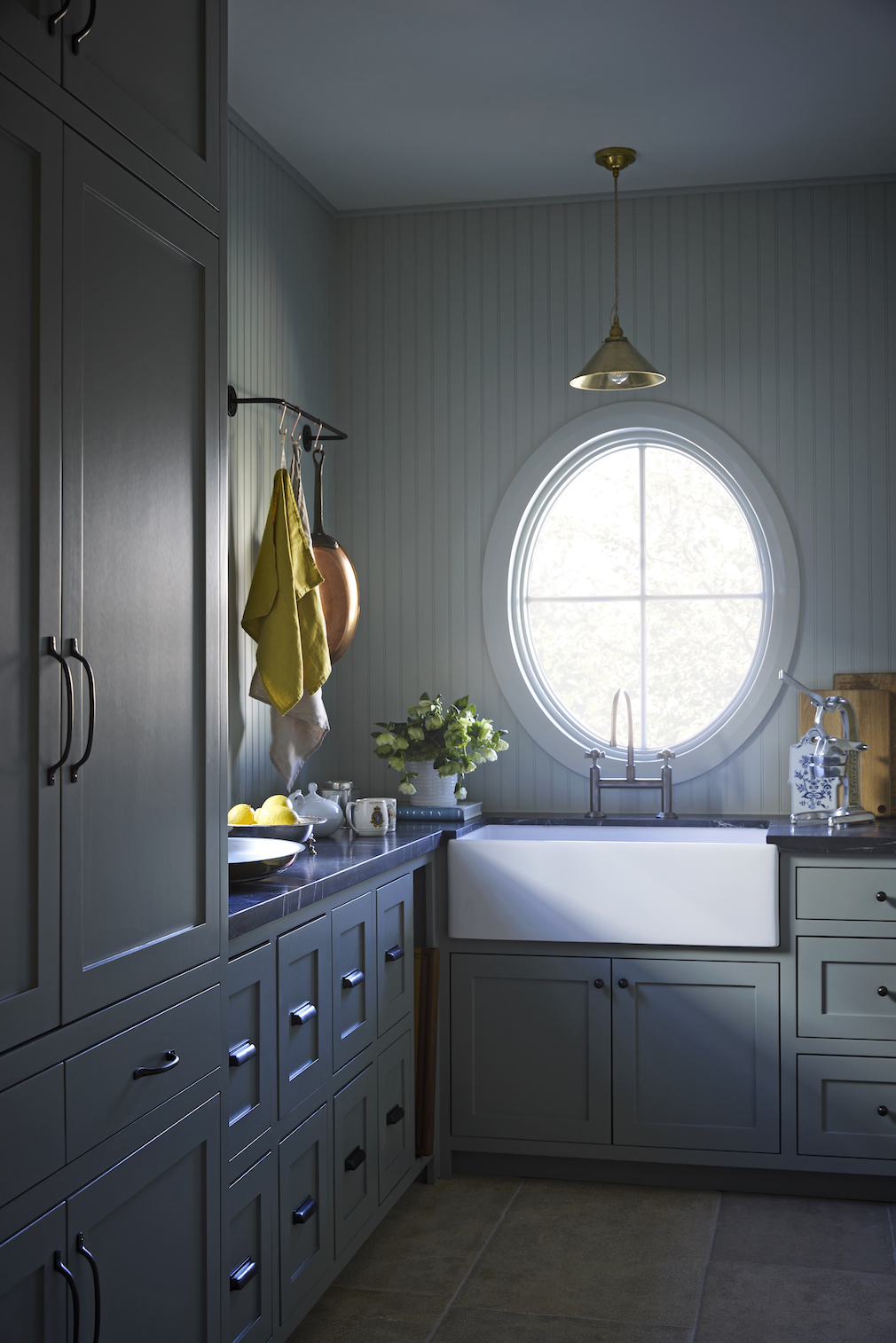
Photo by Joe Schmelzer
I tried to do [something similar] in the laundry room. Who likes doing laundry? Let’s make a room where it’s actually enjoyable to do it.
Photography by Neue Focus unless otherwise noted.
Like what you see? Get it first with a subscription to aspire design and home magazine.