
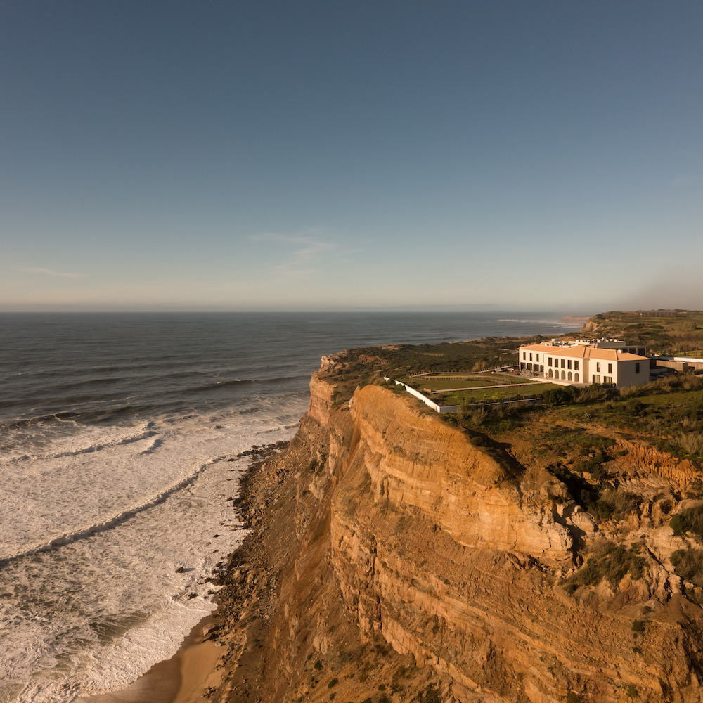

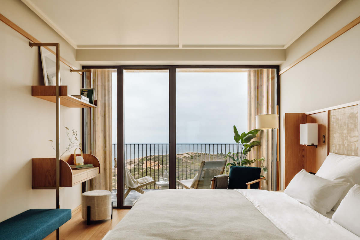
With sweeping views of the Atlantic Ocean along Portugal’s surf coast, Aethos Ericeira boutique hotel boasts a bucolic setting “in harmony with nature.” So when it came time to refurbish the interiors, it was only natural for Pedra Silva Arquitectos to take inspiration from and focus a spotlight on the surrounding environment.

The original building was somewhat lost in several subsequent extensions, with conflicting architectural solutions and a confusing mix between traditional and modern elements. During the development of this project, the architects’ starting point was to strip down the buildings to their essence, and to separate the elements they wanted to keep and those they chose to let go.
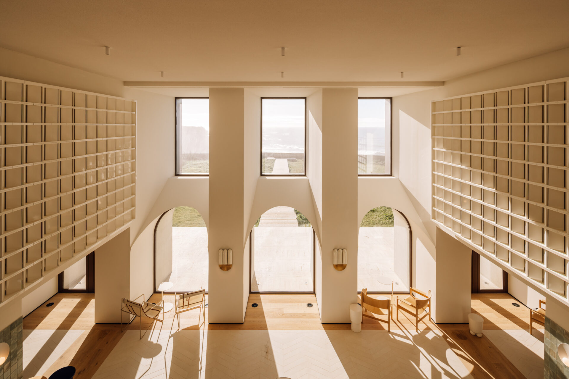
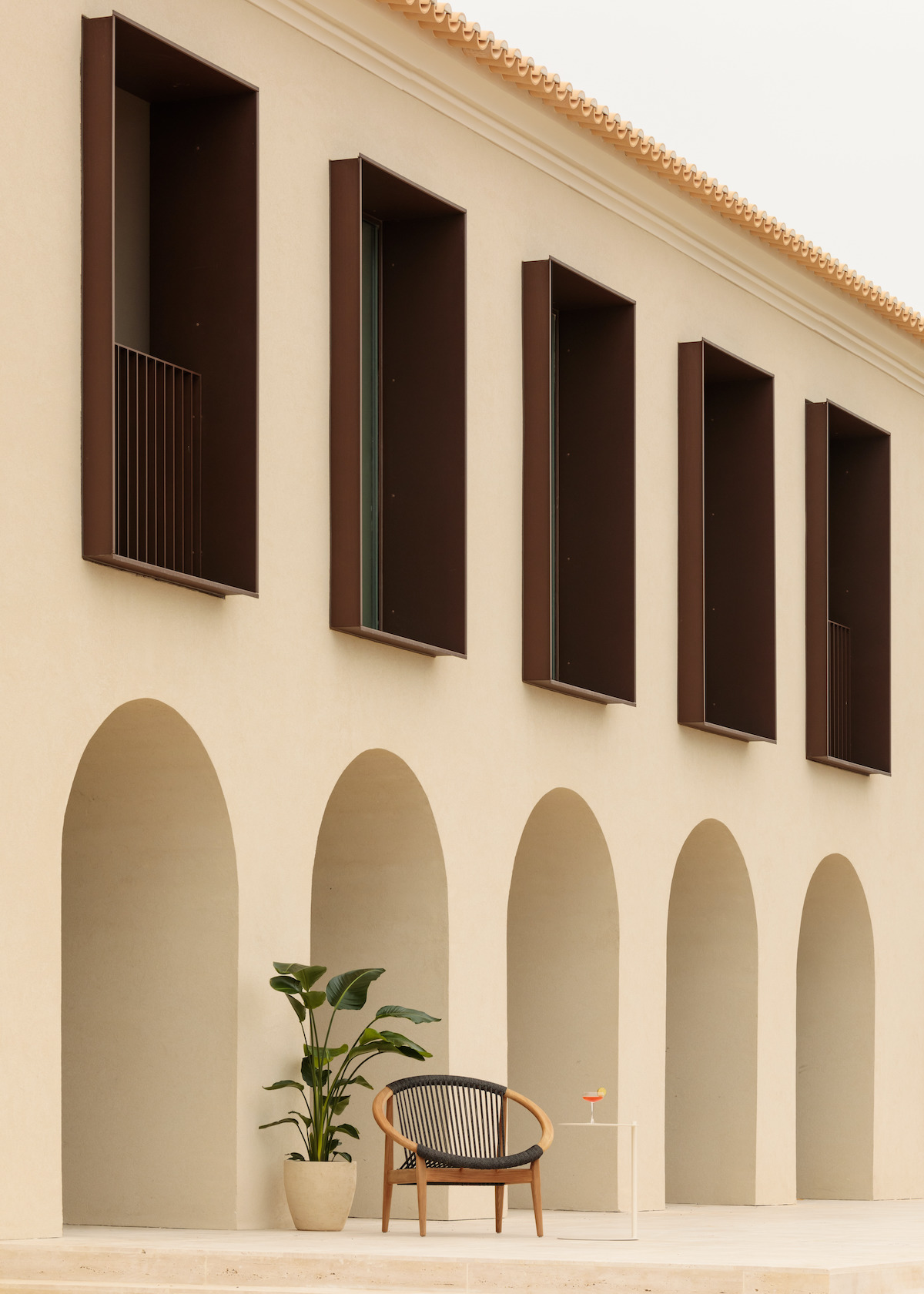
In this deep refurbishment intervention, there were a few key design iterations that completely shifted the direction of the project. One of those interactions was the change of the main entrance, from the center of the building to the sea-facing front, where the firm created a double-height area connecting the seascape and greeting users with that arrival experience. During the design process, they understood the importance of creating something distinguishable, emphasizing the character of the space. Although the existing building had arches, these had no significant expression and were deformed in scale. The architects gave them proportion, texture, depth, and mass to emphasize the presence of the walls and protect the room from direct sunlight during the warmer months. The windows were stripped down, adding a restored sense of proportion. The result is a space with well-defined architectural boundaries, and simultaneously delicate, that plays with shadows and light.
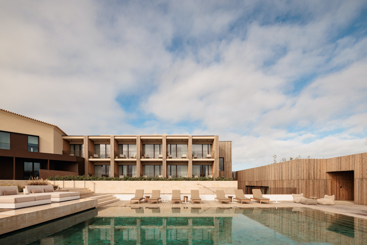

A second key iteration was the nearly complete demolition of an existing basement on the edge of the pool area, containing an underground multipurpose room. Although this meant a significant reduction of the built area, it allowed for a wider connection between the pool, which previously had been surrounded by high walls on all sides, and the hotel building, paving the way for redesigning the pool’s surroundings into a seamlessly inviting series of interconnected levels.

During the design process, various other iterations helped shape the project, such as larger windows, which were a response to the brief requirements and site conditions. The larger windows allow light in and take advantage of the views, rather than opting for the traditional smaller facade openings, especially in the social areas. In keeping with the firm’s goal of clear distinction between old and new, they gave these windows their own visual identity and materiality, designing them as metallic boxes protruding from the facades, which went on to become one of the building’s defining features.

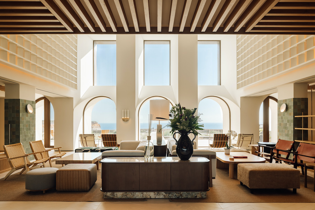
The revised layout defines a new organization of the seafront buildings, with an open plan style ambiance the briefing called for. The main entrance, at ground level, with a double-height space, includes the lounge area and reception. Adjacent to this space lies the multipurpose and supporting services rooms, and on the opposite side lie the restaurant, bar area, and connection to a second building, as well as back-of-house areas. The main rooms, such as the multipurpose, main entrance, and restaurant, have a direct connection to the exterior, taking advantage of its prime location with wide outdoor areas and large new windows that frame the seascape.
In terms of shape, color, and materiality, the challenge was to achieve a look and feel that was well integrated with both the existing building and the striking landscape. Pedra Silva Arquitectos achieved this by removing a few sloped roofs and opening the balconies, applying vertical wood slats and metallic panels covering the facades, therefore reinterpreting them into clearer shapes and volumes. Color and texture play into this concept by helping to highlight these two types of interventions: the traditional one, with light-colored walls paired with darker framed fenestrations, and the modern one, with the texture and warmth of the timber combined with the darker frames. The use of these contrasting but complementing materials played a big role in the design development of the concept and integration of the landscape and the interiors.
Pedra Silva Arquitectos believes it is important to highlight the deep intervention undertaken in the external areas, allowing the firm to maximize the use of spaces, as well as to create flows that work not only from a design perspective, but also from a functional one.
Interior design by Astet Studio.
Landscape architecture by Topiaris.
Photography by Francisco Nogueira.
Like what you see? Get it first with a subscription to aspire design and home magazine.