

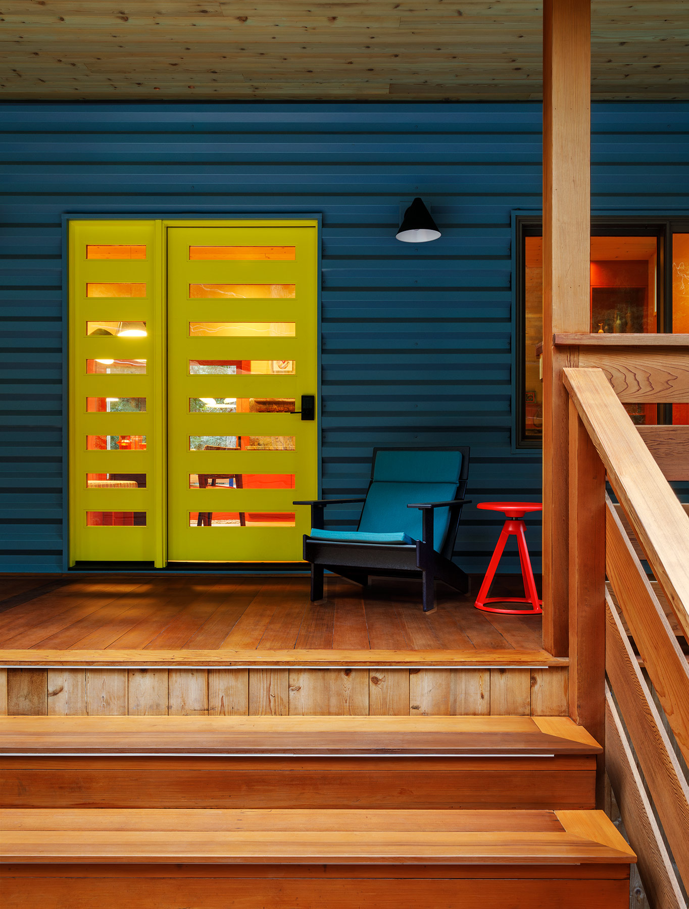
A bright-yellow door pops against the siding in Hawaiian Blue by Western States Metal Roofing, immediately establishing this vacation home’s color palette.
Design’s golden rule is that a house should reflect the homeowners. For Kevin Sawyers’ clients, Toby Peterson and Angie Sticher, that meant infusing their Sonoma County cottage with saturated color, a quirky mix of prints and a footprint made for hosting. “Angie has one of the biggest personalities I’ve ever encountered,” the designer laughs. “And they’re both about entertaining a thousandfold.”

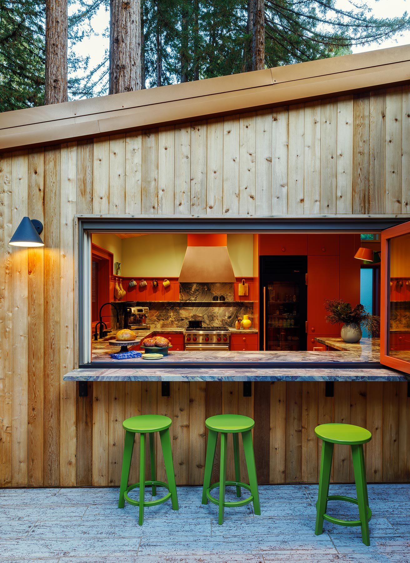
Loll Designs counter stools pull up to the granite-topped bar, which opens to the kitchen, creating the ultimate indoor-outdoor living experience. “They’re always entertaining,” Sawyers explains. “So to have that opportunity to open up these spaces like that, it really hit the nail on the head.”
Fun clients mean fun design, but before furnishings and colors could be considered, there came the not nearly as exciting aspects: permits, foundation issues and environmental regulations. It soon became clear that what began as a renovation would need to be a ground-up rebuild. Where some might feel frustration, Sawyers saw opportunity, using this as a chance to design an internal courtyard that provided an indoor-outdoor entertaining space. “It created an amazing connection to the outdoors from the dining room and one of the guest bedrooms and, most importantly, from the kitchen, where a giant window opens to the outside bar,” the designer relates.

Sawyers had previously designed the couple’s San Francisco townhouse, incorporating teals, yellows and corals. For this project, he wanted to up the ante. “This is a resort home for them,” he explains. “I wanted to take things even further.” That meant steering away from the happy palette of their main house and leaning into moody oranges, cobalt blues, pale greens and bright yellow (the one nod to the Peterson and Sticher’s main home).

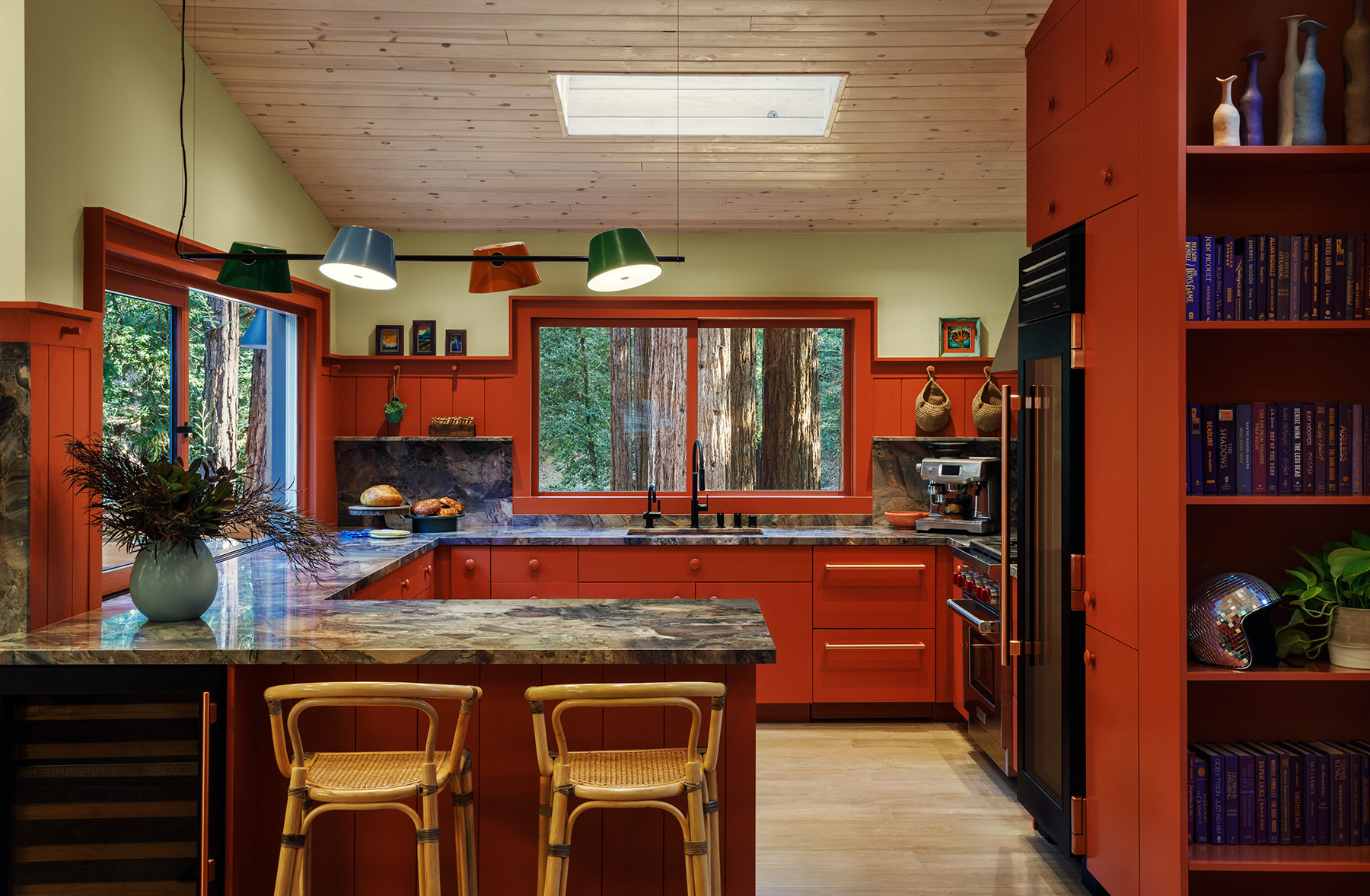
Dunn-Edwards’ Cedar Grove creates drama on cabinetry and walls throughout the first-floor kitchen and main living area, while the brand’s Silver Fern hue adds unexpected contrast.
A deep terracotta sets the tone in the first-floor living spaces, while light-sage-green paint, grasscloth wallcoverings, vein-y blue granite countertops and a sunshine-yellow fireplace provide contrast. “The color inspiration came from antique travel posters of the redwoods,” Sawyers describes. “The pigments in them have such deep, rich warmth.” He points to the woven counter stools as an example of using texture as a nod to local culture. “I wanted to pull from the basketry traditions of the Pomo Native Americans without appropriating.”

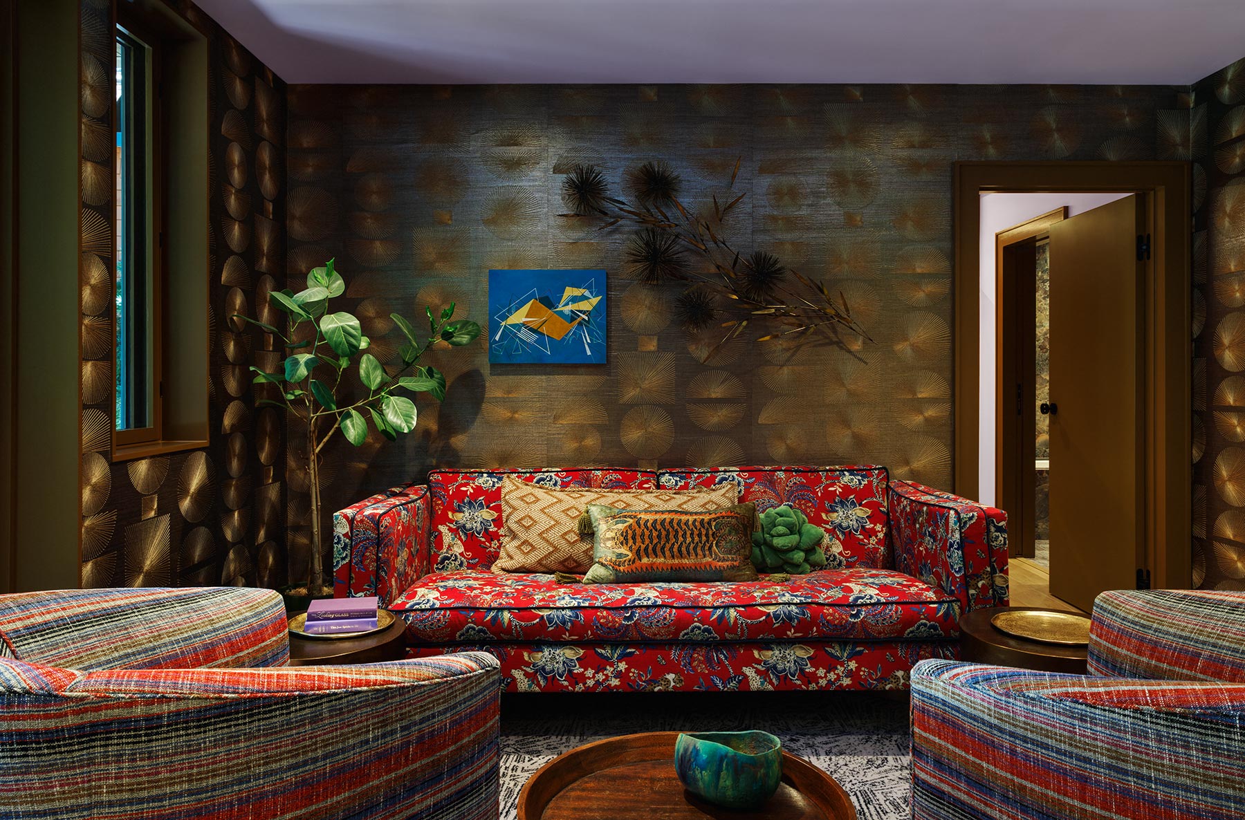
An example of mixing and matching at its best, the lounge showcases a blend of floral and stripes, all while a Phillip Jeffries geometric wallcovering serves as a backdrop.
Patterns also mingle playfully, perhaps most notably in the midcentury-inspired downstairs lounge where a geometric wallcovering provides a backdrop to striped swivel chairs and a striking floral couch. “I went a little crazy with that sofa.” Sawyers laughs. “I didn’t care if it matched. It is Angie Sticher to a T.”

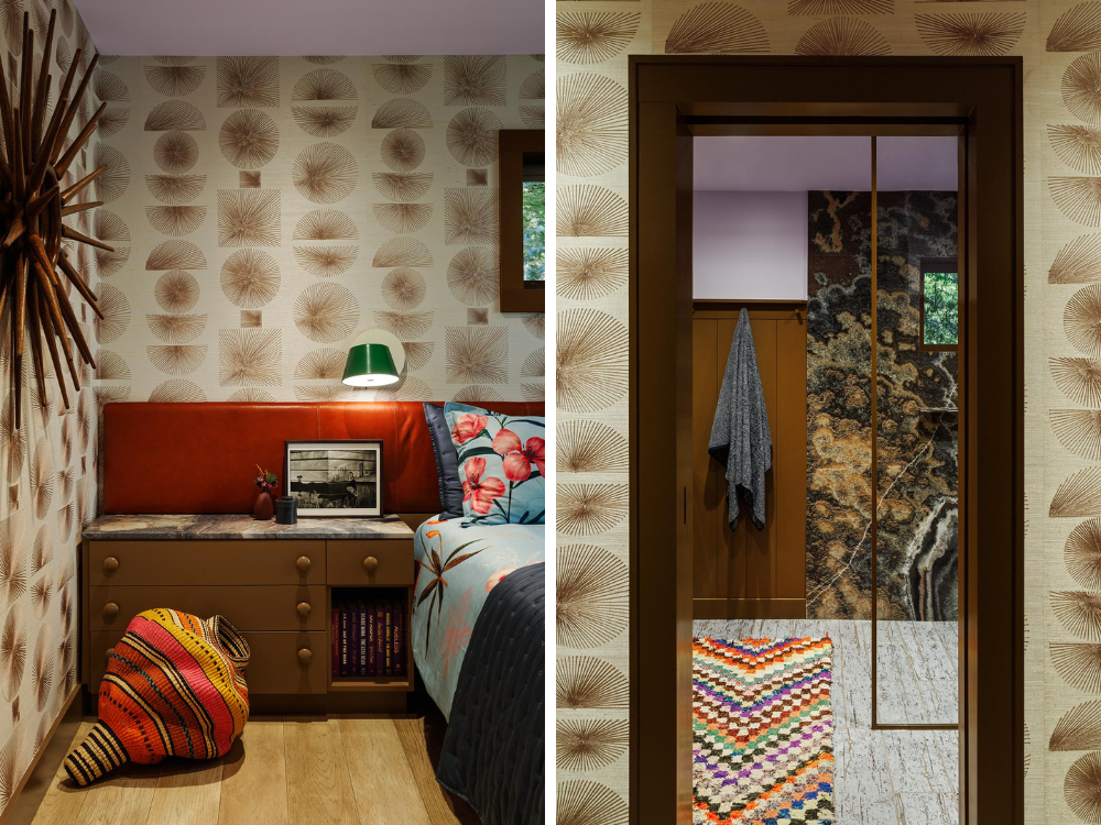
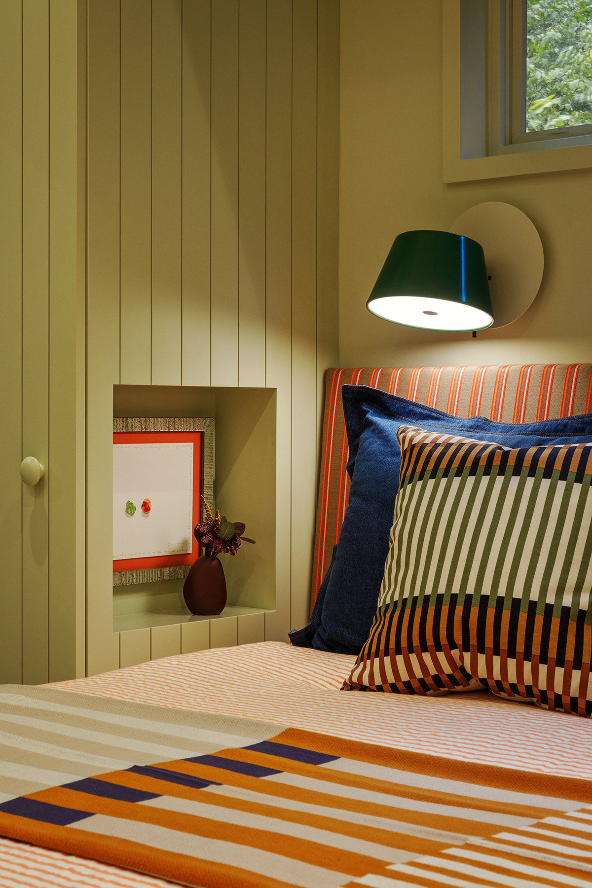
To provide continuity, Sawyers used the same Phillip Jeffries wallpaper in the primary bedroom as he did in the lounge. He then installed a custom headboard covered in Theo Decor leather that runs the length of the wall above the built-in bed and nightstands.
The adjacent primary suite serves up similar exuberance with its floral bedding, paint-splattered drapes and bedroom walls lined with the same wallpaper as the lounge, yet in a different color. “I always like to have a consistent thread running through the home,” the designer shares, noting that he also used the same light fixtures, but differently, throughout the home: as a pendant light in the kitchen, sconces in the guest bedroom and bathroom and in the chandelier above the dining table. “People don’t always outright notice those things, but subconsciously they will.”
These small touches reflect Sawyers’ approach to all his projects, but this one was special, as it was an opportunity to spread his wings. “It’s a cottage in the woods, which isn’t my usual client residence,” he states. “I was able to use the mix of color and pattern that I love but venture down a different avenue.”
Photography by Michele Lee Willson.
Like what you see? Get it first with a subscription to aspire design and home magazine.