

Designer Stephanie Seal Brown joins us this week to discuss her collaboration with Schumacher in creating the Épinglés collection. Inspired by the “practical infrastructures of impractical fabrics from another era” — the four new designs reflect the textile collection in the Swedish Royal Armoury. Although, Brown asserts, the royal textiles are extraordinarily fancy, “it is the weaves that bind them that make unexpectedly beautiful patterns to me,” and as such, were the starting point for designing the Epinglés collection.

Raymond Paul Schneider: When did you first start to develop this new collection?
Stephanie Seal Brown: In late 2019, I moved my studio from Louisville, Kentucky, to the Hudson Valley where I continue to weave linen tape trims and custom textiles for the interior design trade, some of which are carried by Schumacher. At about the same time, I began working with the Schumacher design team on this new collection.
RPS: What was the overall timeline from conception to achieving the final design?
SSB: Our initial timeframe was to launch late 2020 / early 2021; of course, everything changed with the start of the pandemic. Luckily, we only faced challenges related to mill shutdowns and supply chain slowdowns, but in the end, the entire process from conception to launch was about 2 1/2 years.

RPS: What was your initial inspiration, and where did the idea(s) come from?
SSB: Whereas I normally pull from travel and movement for inspiration, this time I went into my studio library looking for historical references that felt modern and relevant. One of my favorite books is “Royal Silks” written by Ulla Cyrus-Zetterström & Gudrun Ekstrand for the Swedish Royal Armoury which examines the weave structures of many of the Armoury’s exquisite textiles like Queen Sofia Magdalena’s coronation gown, a stunning brocade of silver diamonds and gold crowns.
But it’s the binding weaves—more than the gold crowns—which I find unexpectedly beautiful, similar to the patterns on the backside of a well-made embroidery.
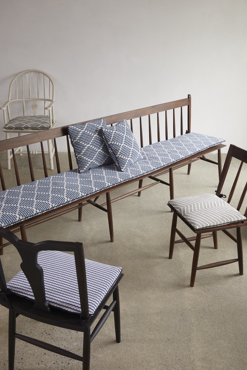
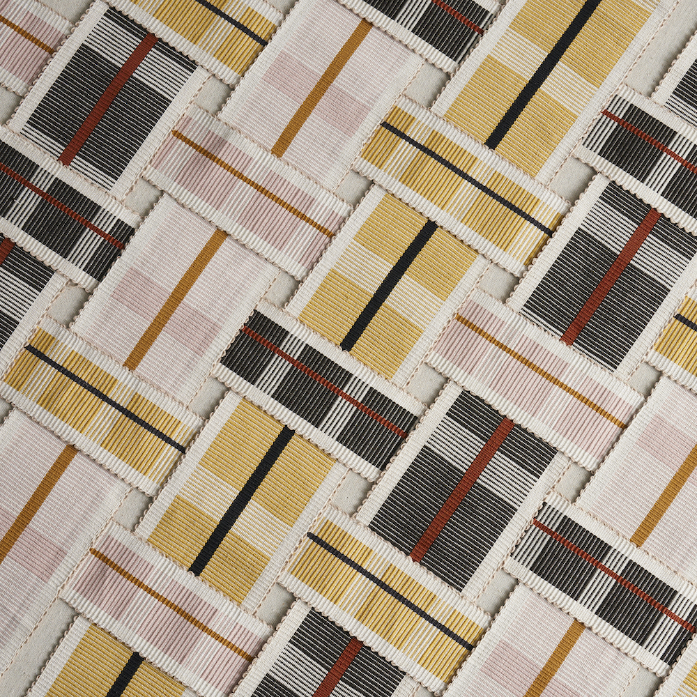
It is these patterns—the practical infrastructures of impractical fabrics—that formed the starting point for this new collection. For example, the design development for Sparre, a large chevron with a bit of a tilt, began with the binding weave for the lining of a 17th-century coat.
All of the names also reflect both the Swedish inspiration and the groundedness and durability of the collection like Struktur, which translates rather directly as structure in Swedish and Berg, Swedish for mountain.
RPS: Did you have a specific audience or theme that you had in mind?
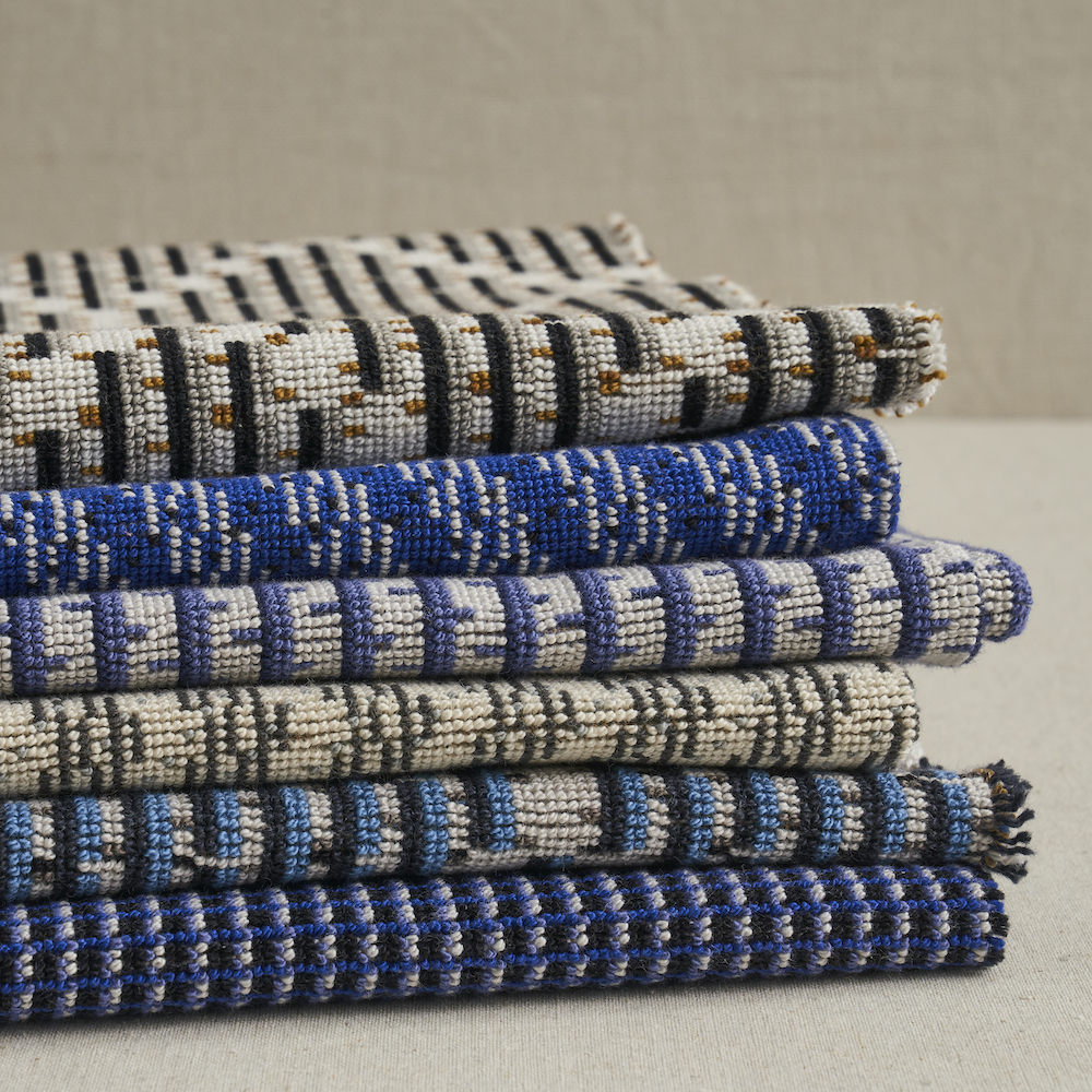
SSB: I try to design with the long view in mind and I believe this collection reflects that ethos. The robust épingle weave, a hardwearing but soft fabric made of tightly looped renewable cotton, hits the right notes for two of my three priorities—physical durability and environmental sustainability.
My third priority is design longevity—to make textiles that someone will want to have in their life for a long time—and I feel like the simple, grounded geometrics in the collection have the ability to work with trends while not being defined by them.
RPS: Please describe the methods, tools, and materials you used to develop and prototype this design?
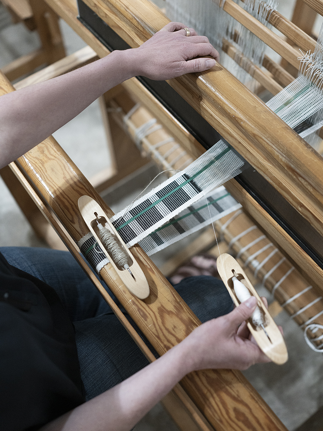
SSB: I tend to design through fiber and structure first, finding any possibilities or limitations which I then use to guide my process. I needed to learn more about the épingle weave so I began by deconstructing other examples to understand how the yarns and this particular weave come together.
Once I felt comfortable with the fabric, I went to paper and pencil to work out my ideas and initial colorways. The Schumacher design team interfaced with the mill in Belgium and a few months later, we received the initial prototypes, making a few pattern adjustments so that the warp colors lined up correctly in the weave.
After the kinks were worked out of the patterns, I spent a few weeks with the mill’s yarn collection, one of the most fun parts of the project! Using color, I wanted to add a sense of texture and depth, highlight and shadow to the patterns. Working directly with the dyed yarns, I felt like I could better understand how each one would react under various lights and to find the right push-pull between the different colors. In the end, we only needed to custom dye one of the yellows to get just the right lemony brightness.

RPS: Please describe any challenges that affected the design and perhaps steered you to an entirely new final design?
SSB: The épingle structure has a strong visual texture that can appear almost pixelated, creating its own design challenges. But it also offered a space to bring an aspect of woven textile design that I love—the drawdown—to the forefront. The drawdown is a grid in which we work out how the woven threads will interlace and acts as a guide for the weaving process. The resulting geometric patterns are similar to technical drawings and can be fantastic in their own right. I found the épingle structure to be a perfect platform to highlight these patterns.
RPS: Describe your overall brand DNA and Ethos
SSB: I began my journey as a handweaver nearly thirty years ago and am still in love with the utter simplicity and directness of the craft. I work on Swedish wooden handlooms using European linen, Egyptian cotton and regional wools from New York and New England. My goal is to create textiles out of renewable materials which stand up to many years of daily life and to design them visually so they are resilient enough to stand up to passing trends.
As a one-person studio, there is a natural limit to what I can produce and the opportunity to develop license collections for Schumacher has been an absolute dream. I find great pleasure in reaching beyond what can be produced on my looms and collaborating with their passionate design team and talented mill weavers. It is an opportunity to build on ideas with more complexity while still aiming for that space of simple, clean, approachable design.
Click here to see more of our “Anatomy of a Design” series.
Like what you see? Get it first with a subscription to aspire design and home magazine.