
A muted palette of primary colors and Bauhaus-inspired geometry come together beautifully in The Vale London’s Maddox Collection. CEO and Founder Melinda Marquardt joins us this week to discuss the inspiration and design process in creating these 16 new patterns.

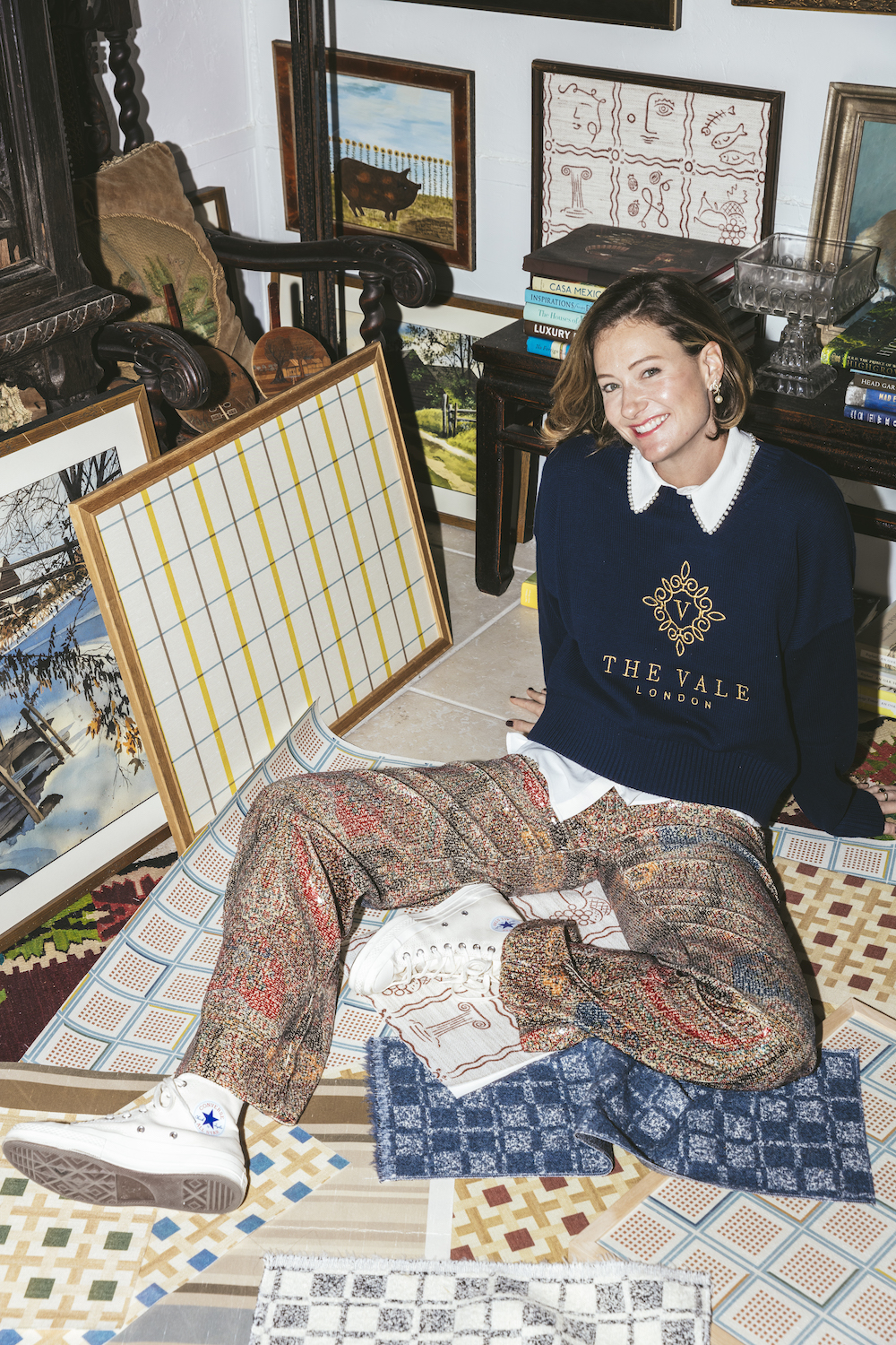
Photography by Nick Mele; styling by Zlata Kotmina
Raymond Paul Schneider: When did you first start developing this new collection?
Melinda Marquardt: The concept for the Maddox Collection began to form after the completion of the previous James Collection. James focused on secondary and tertiary color stories, and I felt a natural pull toward exploring a primary color palette for the next collection. This shift was inspired by my longstanding admiration for Bauhaus design and color theory, which played a significant role in my fine art education. Revisiting these foundational principles felt like a creative reset — an opportunity to return to the building blocks of color and design with a refined and evolved perspective.
RPS: What was the overall timeline from conception to final design?
MM: The Maddox Collection took approximately 18 months to develop. This included research, color exploration, and extensive yarn selection to bring the vision to life. The introduction of indoor/outdoor fabrics and high-performance textiles required additional testing to ensure they met our exacting standards.

RPS: What was your initial inspiration, and where did the idea(s) come from?
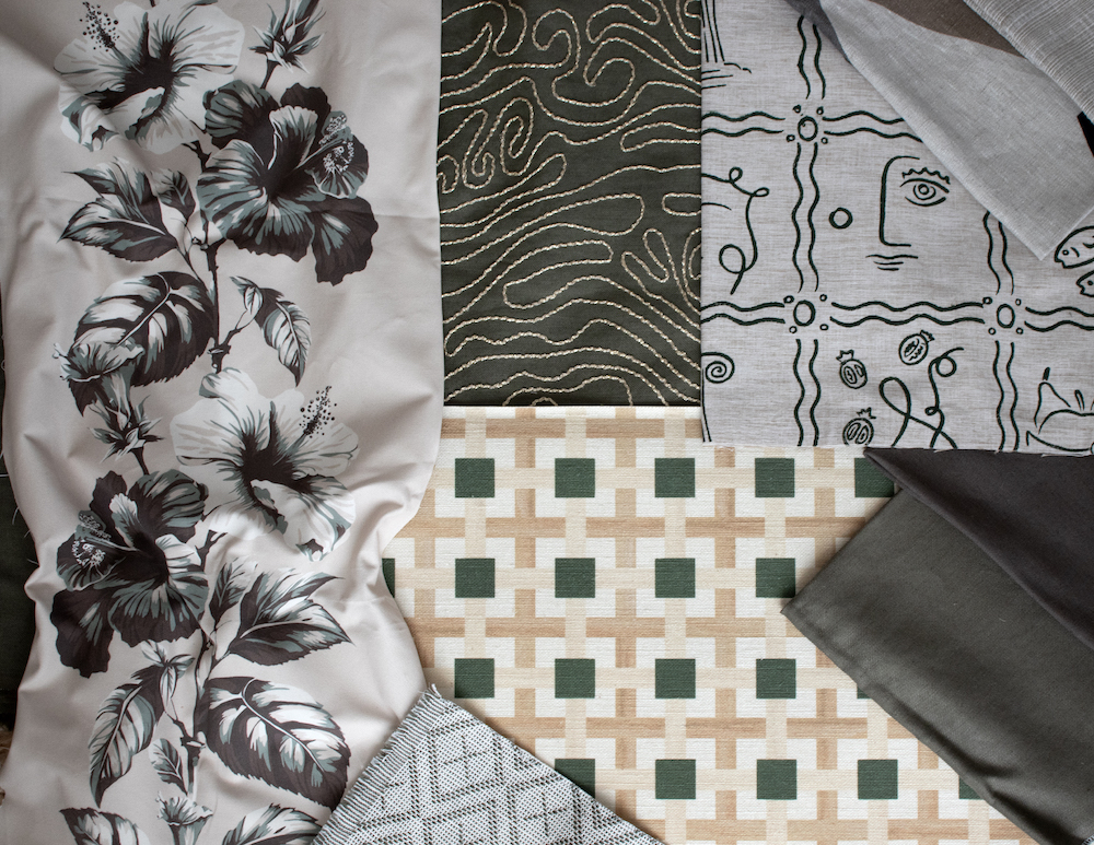
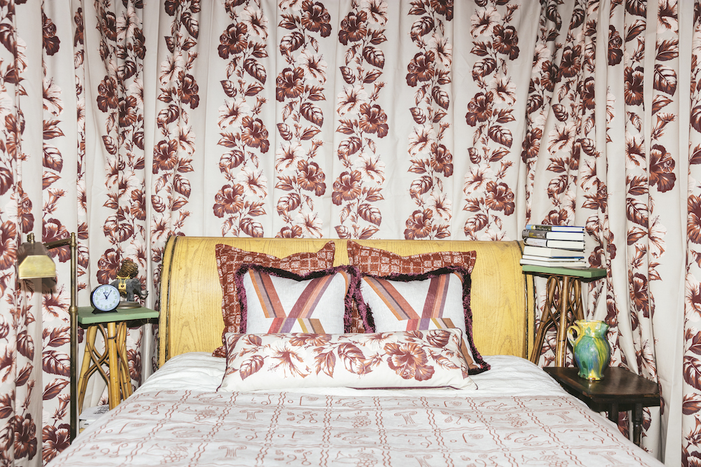
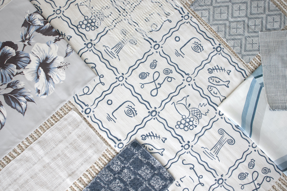
MM: The collection was deeply inspired by the Bauhaus movement and the teachings of Johannes Itten, Paul Klee, and Joseph Albers, who explored the power of primary colors — red, blue, and yellow — as the foundation of all color theory. This took me back to my early art school days, where I first studied the color wheel and the relationship between hues. I wanted to create a collection that celebrated the simplicity, vibrancy, and nostalgia of these fundamental colors while introducing an aged, sophisticated tone to make them feel timeless rather than stark.
Additionally, I was influenced by Bauhaus-era photography, particularly the works of László Moholy-Nagy, Lucia Moholy, and Florence Henri. Their use of contrast and depth inspired the charcoal and cream tones that complement the primary colors in Maddox. During the development phase, an unexpected deep bottle green emerged in the printing process, adding a rich, organic depth to the collection.
RPS: Describe your overall creative and design process.
MM: I always start with research and fine art exploration, studying historical influences that resonate with my personal aesthetic. For Maddox, this meant revisiting Bauhaus color theory and the works of early 20th-century modernists. I then moved into sketching and hand-painting motifs, experimenting with aged primary tones to achieve a depth and maturity within the color story.
Once the color direction was established, I worked closely with textile mills to select weaves and finishes that would best translate the concept into fabric. This included refining textures to mimic aged papers from the Bauhaus period and ensuring each textile captured the collection’s artistic essence.

Photography by Nick Mele; styling by Zlata Kotmina
RPS: Did you have a specific audience or theme in mind?
MM: The Maddox Collection was designed for those who appreciate the intersection of fine art and interiors — designers and homeowners looking for textiles that tell a rich, artistic story while maintaining a luxurious and contemporary feel. The bold primary hues, balanced by sophisticated neutrals, make the collection versatile — it can seamlessly integrate into both modern and traditional spaces.
Additionally, the introduction of indoor/outdoor performance fabrics allows Maddox to extend into hospitality and high-performance residential applications, making it a functional yet luxurious choice.
RPS: What methods, tools, and materials did you use to develop and prototype this design?
MM: I relied on hand-painting techniques to develop the initial patterns and color palettes, as this allowed me to control the organic texture and depth of each hue. The designs were then digitally refined and translated into textiles.
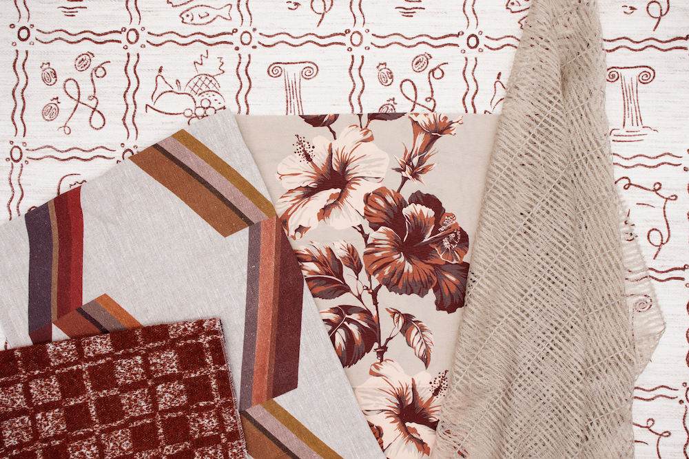
A key aspect of this collection was the selection of Trevira CS yarns, which provide a luxurious hand feel while offering flame-retardant properties and durability. Additionally, fabrics like Charlie bouclé, Isla hemp twill, and Persinette macramé sheers were carefully woven to add tactility and depth to the collection.
RPS: Did you use any new techniques or technologies to conceptualize or create this product?
MM: Yes, Maddox introduced several new textile innovations to The Vale’s portfolio:
Indoor/Outdoor Luxury Fabrics – Icarus and Helios are crafted from 100% Trevira CS, making them highly durable, UV-resistant, and flame-retardant while retaining a soft, refined texture.
Eco-Friendly Hemp Twill – Isla, made from 72% hemp and 28% viscose, offers a sustainable alternative to traditional textiles while maintaining a luxurious drape.
Metallic Appliqué Techniques – Kalahari features topographical-inspired metallic embroidery, creating an elegant play of light and texture.
Block Printing – Both Roman Holiday and Positano Wallcovering are inspired by hand-painted ceramic motifs, translated through block printing to preserve the original artistic quality.
RPS: Were there any challenges that influenced or changed the final design?
MM: One of the biggest challenges was refining the primary color palette to feel elegant and timeless rather than overly bold or elementary. The solution was to develop aged versions of primary hues — resulting in Claret (aged cadmium red), Sky (aged cobalt blue), and Ochre (muted yellow).
Another challenge was ensuring performance fabrics retained the softness and luxury expected from The Vale London. The development of Trevira CS yarns allowed us to achieve both durability and refinement, expanding the collection’s usability while maintaining a high-end aesthetic.
RPS: Describe your brand’s overall DNA and ethos.
MM: At The Vale London, we are committed to creating textiles that blend artistic heritage, luxury craftsmanship, and innovation. Each collection is rooted in fine art traditions, drawing inspiration from global cultures, historical references, and personal artistic experiences.
Sustainability is a core value—we prioritize eco-conscious materials like hemp, recycled polyester, and Trevira CS, ensuring our designs are as responsible as they are beautiful.
The Maddox Collection exemplifies this ethos by merging Bauhaus-inspired design principles with modern textile advancements, resulting in timeless, sophisticated fabrics that honor tradition while embracing the future.
Like what you see? Get it first with a subscription to aspire design and home magazine.