


Twenty-two years ago, when designer Victoria Bartlett saw the 1970s A-frame on the Delaware River, she knew it had potential, even though it looked “kind of creepy.” She had been looking for a country home upstate, and a friend in the fashion industry convinced her to come in with them on a property on the New York-Pennsylvania border. They subdivided the property, with her friends taking the farmhouse, and Bartlett taking the A-frame. “The best thing was that it was on the river, so it had a great vibe and such a deep natural feel. Water is life-giving. That was important to me.” Once the purchase was made, she proceeded to gut the house (which had been divided into two apartments), open up windows and create a new, more open plan with a better use of space. But she kept the green exterior the way it was. “I love the fact that it is green. It vanishes into the nature around it.”

Bartlett is no stranger to the effects of color and design. She earned a degree from the London College of Fashion in 1982, assisted Couturier Rhavis of London, and later she partnered with designer Jeffrey Costello in New York creating a collection called BC in 1990. She was also a fashion editor at Allure, Interview and BIG, and worked on editorial concepts for French Vogue, ID, Italian Vogue and many others. She has styled a plethora of bold-faced names, including A-listers such as Madonna, Scarlett Johansson, Ed Norton and Tilda Swinton, and she has been a lead creative on brands such as Christian Lacroix, Calvin Klein, DKNY and Miu Miu, helping to visualize and develop their ethos.
In 2003, she made the leap and created her own brand, VPL, which blended lingerie with sportswear for a utilitarian collection that combined comfort with functionality and fashion. Since exiting the brand in 2016, Bartlett has continued to work on new projects, including an S/S2018 collaboration with Stella Ishii; costuming for the stage and film; as well as collaborations with artists like Kai Althoff for a recent MOMA installation. Her couture and fashion journalism aesthetic are a throughline in her interior design as well. “My DNA and my aesthetic are closely tied in both worlds. I have a very strong color field that I am known for in design, and it translates into the work I do in interiors.” The designer is particularly fond of nudes and uses them frequently in her interior design work.
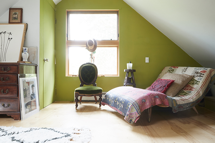
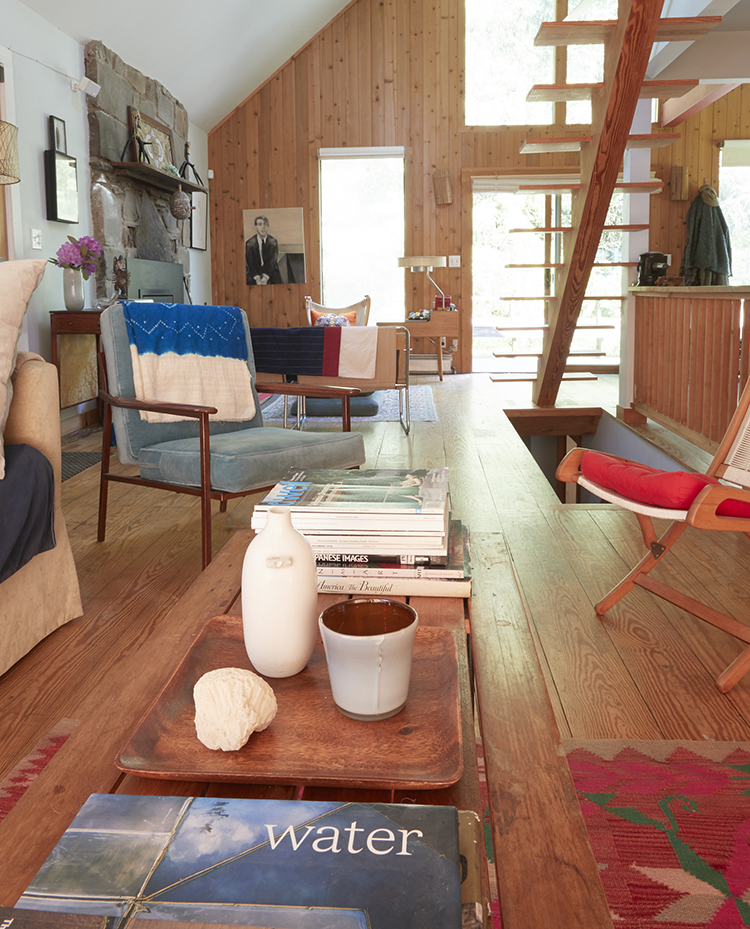
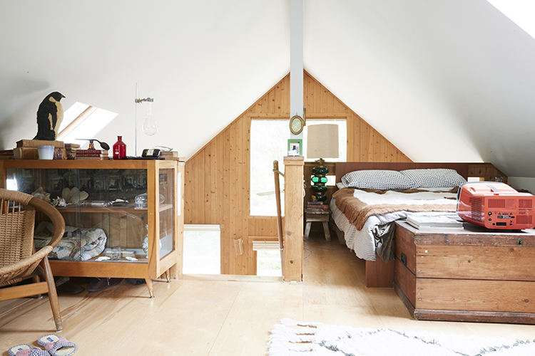
After the A-frame was gutted, Barlett restructured the inside with an eye toward maximizing features, such as a cathedral ceiling on the main floor that was previously hidden by drop ceiling panels. She also added windows all around to allow light into the rooms. “There is a sense of being within nature, as opposed to just observing it. With all the windows you are not walled in, you are part of it,” remarks Bartlett.
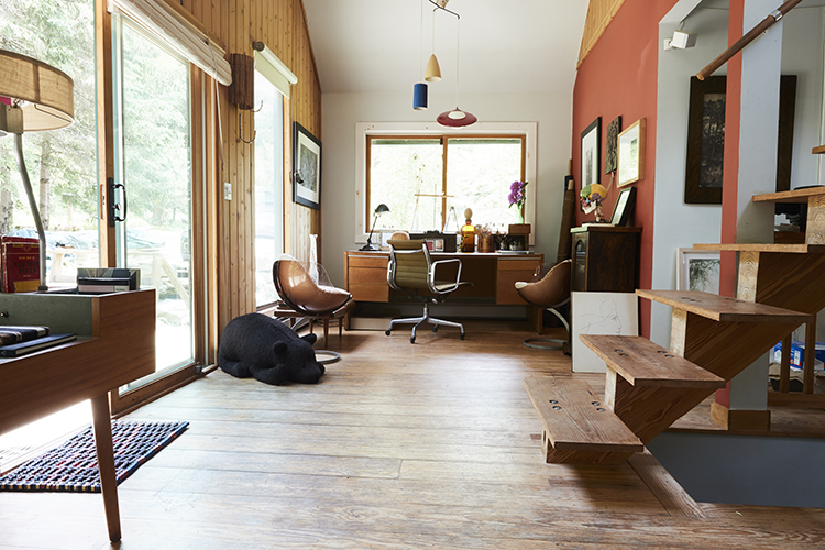
Expanding the little home’s footprint meant adding an extension in the back of the house for the kitchen on the ground floor, and above it, a screened porch. “I really didn’t want to overdo it with the design. I kept an open, modernist feel to contrast with the country location, but the design is still very warm.” Bartlett used a color palette of muted brights, including a saffron shade in the home office area, and a soft green in the bedrooms. “The saffron shade almost turns green in the summer because of the reflections from the leaves.” The rest of the home is a combination of neutrals like light grey and decorator’s white, which the designer prefers because it is less harsh than optic white. The home has nautical touches in keeping with its proximity to the Delaware River, like marine wire around the deck, and a round nautical-style window in a downstairs bedroom that brings in light from the room beyond.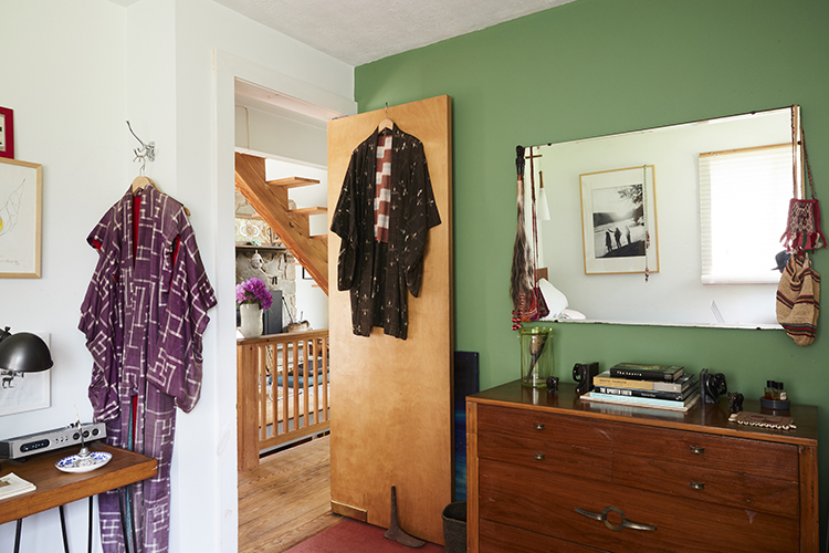
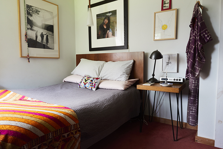
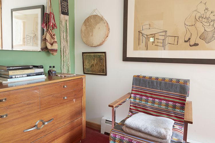


The home’s warm feel comes from a mix of color and natural finishes, and a layered mix of vintage and modern décor. Adds Bartlett, “I love to combine old and new from many periods. When you integrate antiques in a modern way, they become timeless. And I love to use pigment colors. In London, no one uses color and I don’t understand it. It makes you feel alive!”
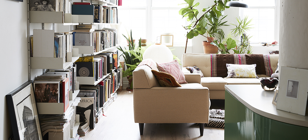
“The previous iteration of this loft space was absolutely awful,” comments Bartlett. “The designers should have been fired.” When the designer took over the tiny space in a 1924 Brooklyn building that once housed a chocolate factory, she discovered that all the “inner workings” – the pipes and columns – had been covered over, removing almost a foot off the ceiling height and taking precious space from the overall floor plan. She removed all the coverings and exposed the guts of the industrial space. “We exposed all of those elements and forced the dynamics of it to integrate with the architecture and the linear context.” Using tricks like incorporating the column into the island and creating a hallway with storage cabinets from the office/guest room area, Bartlett was able to have just as much storage for her things as she had in her previous home – a townhouse in Boerum Hill. The key for Bartlett was structural minimalism. She kept the color palette to nude tones, colors that resonate with Bartlett in her fashion design as well as interiors. “The nude color was very important to make the space feel bigger. Even the red oak floor was bleached and whitewashed to give it a soft blush color.”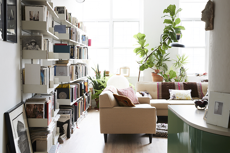

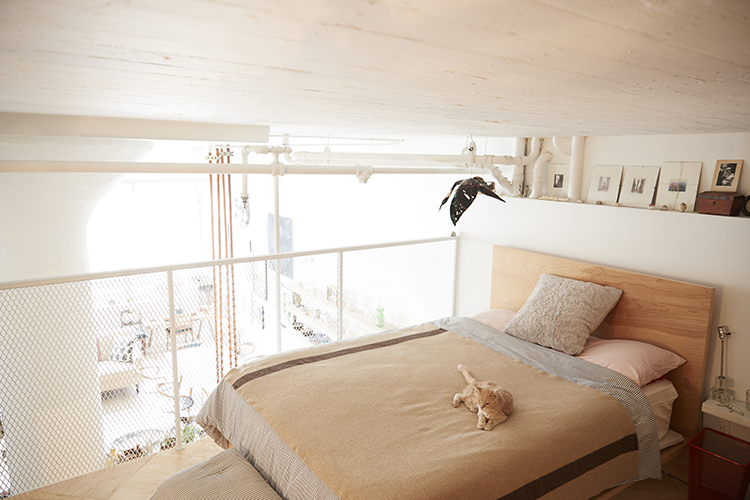
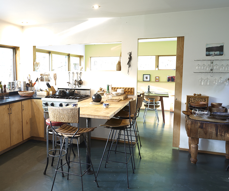
In the upstairs sleeping loft, the architects convinced her to use industrial mesh grid for a protective rail that also affords privacy. “When you look through it from the bedroom you can see everything. But when you look up there and it’s dark in the bedroom, it blurs so = you can’t actually see through it.” In the kitchen, the plumbing comes down from the ceiling and becomes an industrial sculpture. Bartlett quips, “That is something we copied from [artist] Donald Judd, but it really works here. The pipes become sculpture!”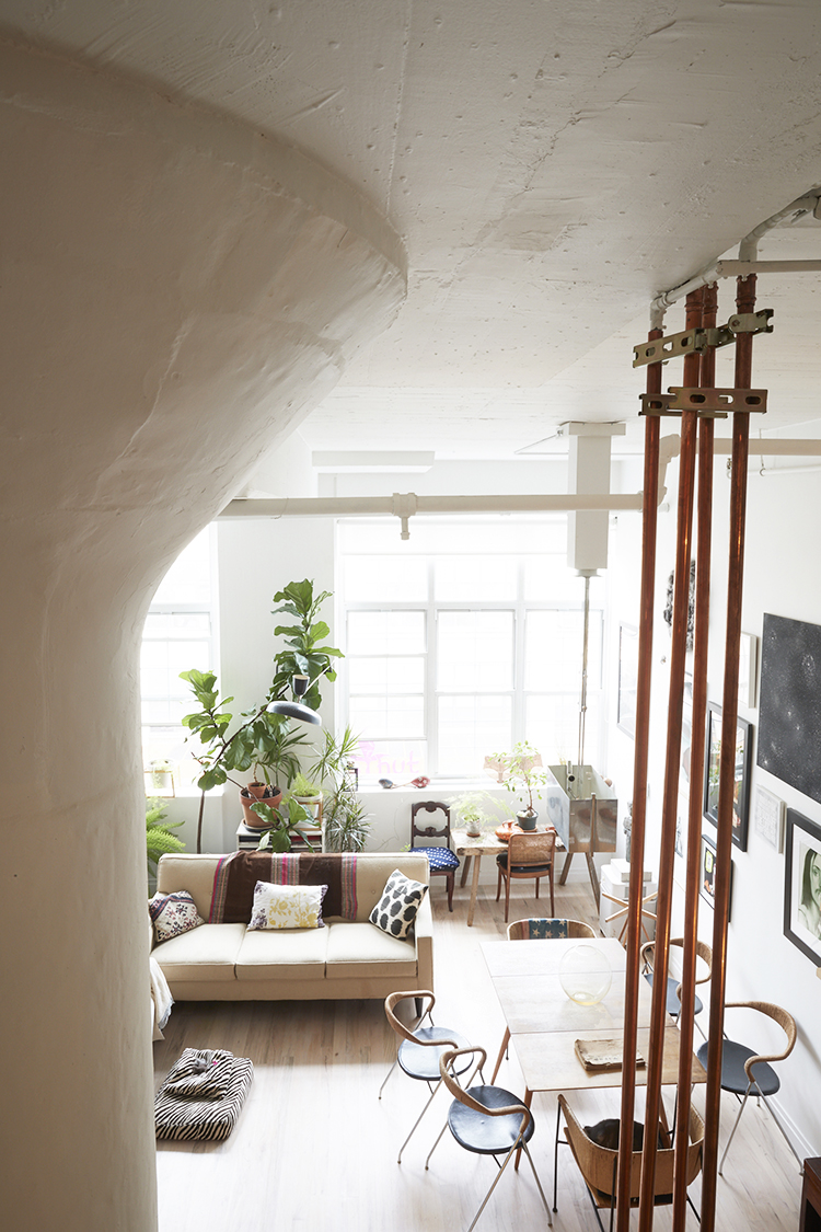
Architecture by New Affiliates.
Photography by Christian Kilrain Carter Coleman.
Like what you see? Get it first with a subscription to ASPIRE DESIGN AND HOME magazine.