A fresh new color can instantly transform a space from drab to fab, but finding the right shade can be daunting. For the ASPIRE DESIGN AND HOME Magazine Summer issue, eight top designers shared their favorite color-filled projects, and their personal philosophies on utilizing color.
Take in their wisdom below:
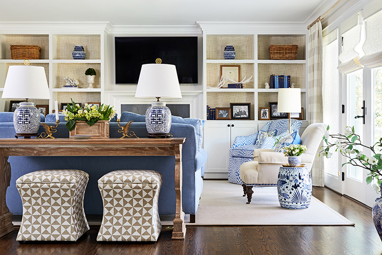
Kelley Proxmire | Kelley Proxmire Inc.
Project: An Arlington, Virginia family room serves double duty as a cozy room for the family to gather as well as a space for entertaining.
“The clients are a fun, active family, who loves color and wanted to incorporate more of it into their home, as well as redesign their entire main level. In this project and many other decorating projects, I work with neutrals and add “pops” of color. In this case, we used tan tones for the walls and window treatments, with the furniture, including the sofa, which is the largest piece, in a blue. A Scalamandré print fabric featuring tans, blues and whites influenced the scheme. We used this fabric only in the pillows, but it was the genesis of the color scheme. I often use blue of all shades, especially on ceilings. I love all colors, except for mauve.”
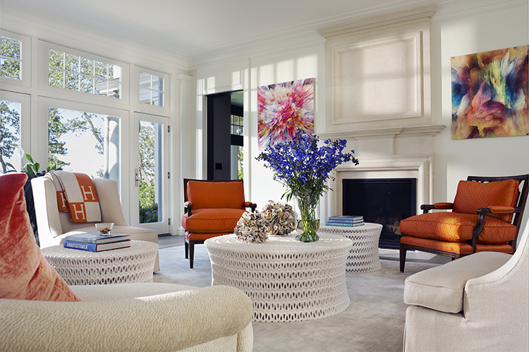
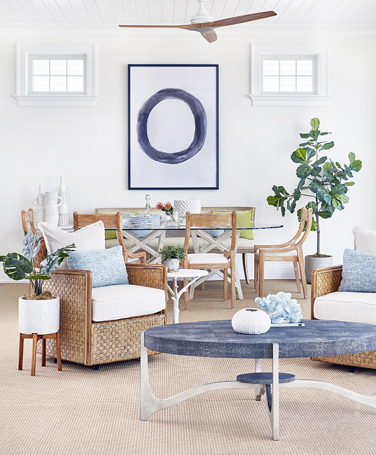
Ronal Fenstermacher, ASID & James Smiros, Architect
Project: A sun-drenched, classical home with a traditional façade facing the Long Island Sound.
Smiros: “With beachside views to the north and sun to the south, we created an “enfilade” style great room where long sides maximize both northern shore views and filter southern light. Presenting a traditional shingle-style face on arrival, the open floor plan and traditional details inside facilitate a modern family lifestyle and entertaining.”
Fenstermacher: “I use an intense orange often, because in the right setting there is no such thing as too bright. I work with both bold and soft colors depending on the room, and I usually feel that a dark color in a small space is more interesting. Adding pops of color can change a neutral scheme – as in this sun-drenched room – quickly and easily.”
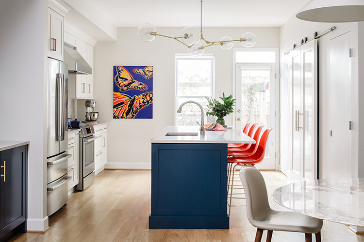
Nadia N. Subaran | Aidan Design
Project: For this Capitol Hill home, Subaran created a fresh look for a dark and dated kitchen.
“The clients have two young boys and they really wanted some color, as well as a kitchen that felt fresh, modern and a little playful. We like contrast, even when it’s more tone-on-tone; we want spaces to feel crisp and well defined. We’ve designed lots of spaces with navy, and in this project, the blue is brighter and a little punchier (Deep Aegean by Wood-Mode). Another way to add color is in appliances. Sometimes folks are looking for a statement piece and a colorful range can provide an opportunity to bring color into the kitchen. Punches of color are best done in furniture, lighting, tile, decorative accessories and artwork.”
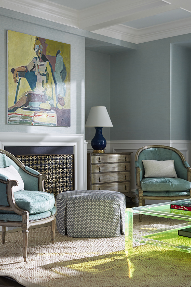
Heather Hilliard | Heather Hilliard Design
Project: In a Los Altos Hills, California home, Hilliard mixed color and style to transform a room.
“This room is a great example of how we like to layer color through various mediums like furnishings, paint, textures and art. We wanted to mix old and new, referencing the past but also showing a curiosity for the future. There’s a way to do this without going completely modern or all traditional. For example, the traditional profile of the bergère chairs is made edgier with the brightly colored hair-on-hide upholstery. We helped the client purchase this art piece for her previous home, and it worked with the design we envisioned for her new space. Because of the client’s love of blue and green, we referred to Madeleine Castaing’s historic use of those colors but turned up the volume to 11 to make it more current and fresh, and incorporated traditional elements with a youthful twist for this fashion-forward client.”
Virginia Toledo & Jessica Geller | Toledo Geller
Project: A living room in Mantoloking, New Jersey gets a dose of harmonious color from this design duo.
“Sometimes a color is so intense that it can be hard on the eyes. While we would rather the pendulum swing more toward bold rather than a neutral palette, when designing for clients we strive to achieve a livable balance between neutral and bold colors. In most of our projects, black weaves its way throughout; it can be impactful in tempering vibrantly colored rooms, and adds an element of sophistication. We embrace color in so many ways, whether it’s bold paint, dynamic wallpaper or vibrant upholstery. We prefer contrasting trim and details, and sometimes will do neutral walls with a colored trim. In rooms that lack natural light we will go dark to embrace the cave-like feeling. A darker color, like Farrow & Ball Parma Gray, can make a smaller room feel larger as the darker color obscures the edges, creating the perception of a larger space. For the lighter rooms, it largely depends on the North, South, East, or West exposure of the room.”
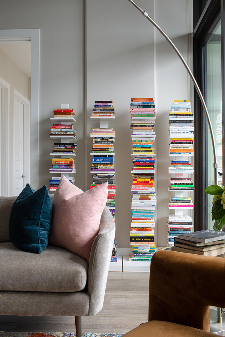
Kiyonda Powell | Kiyonda Powell Design Studio
Project: In an Atlanta, Georgia home, this designer adds her signature touch to brighten the space.
“This room is a good example of having a neutral base with finishes layered with fun color pops throughout the space. My client has a large book collection (categorized by topic). We found these cool spine bookshelves for a non-traditional way to display them. We could not have been happier with all the color the books provided on this wall. If a client is willing to push the envelope a little with wall color, I suggest checking out the lighter colors at the top of the paint fan deck charts. Select a color that works with the overall scheme in a soft wash of color that can almost become a neutral. Artwork and textiles as wall display also provide color with less of a commitment. These might be the gateway for a client to get comfortable and explore more color. I love how color can stimulate a mood or spark a feeling. We can always find ways to use those brights without having to sit in a room with sunglasses! More subtle uses of the bright colors can be with art and accent furnishings, or even with trim. My preference is to use the bold and bright wall colors in spaces with defined rooms versus open floor plans.”
 Annie Elliott | Bossy Color Design Group
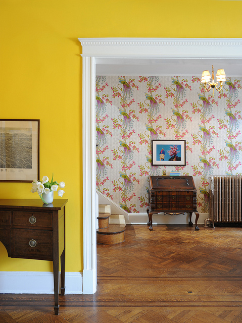 Annie Elliott |
 Project: In her own home in Washington, D.C., Annie Elliott brings the sunshine in with her favorite color.
“Our living room is tricky. It’s north facing with only one gigantic window, so the light is limited. We’ve painted our living room many times: it has been two shades of dark blue-gray, an intense red, white, light yellow and pale pink, to name a few. We are delighted with this egg-yolk yellow – it’s fun and cheerful, and it stands up to the gloom! Thomas Jefferson had a dining room this color. Because the yellow is so intense, it was important for the wallpaper in the foyer to have a white background to give your eye a break from the saturated color. This wallpaper (Paradiso by Nina Campbell) has a lot of color – teal, chartreuse and purple peacocks! But they’re set against a field of cool white with a light gray trellis pattern. Interestingly, there’s no actual yellow in the wallpaper, but that’s one of the reasons it works so well. The colors coordinate without being overtly matchy.”
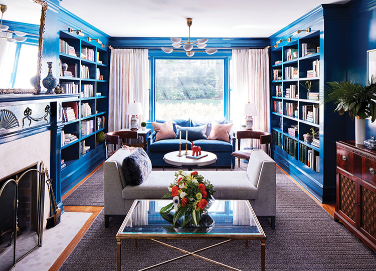
Sandra Funk | House of Funk
Project: In this home in Montclair, New Jersey, a client’s favorite color becomes the theme for an elegant living room.
“For this living room, the client wanted bright, peacock blue. We came up with the scheme to do the color from the crown molding to the base, including every bit of trim AND every wall (on the fireplace, new built-ins and window sills). We lacquered everything in high gloss. The sky’s the limit with great color, but we always look for depth of color, which is why we tested many colors before we knew we had the right one. When working with bold color, it’s important to layer in neutrals and different degrees of depth of the color you’re using. We then repeated a dustier version in the strié velvet on the sofa and on the shiny velvet faux-fur and wool pillows. You’ll see that color in different values repeated throughout the space. We also layered in accessories to create visual interest. We brought in tons of neutrals, wood tones, metals, marble, tile and great lighting. All of this ensured that the room didn’t feel flat.”
Like what you see? Get it first with a subscription to ASPIRE DESIGN AND HOME magazine.