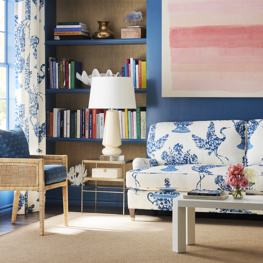
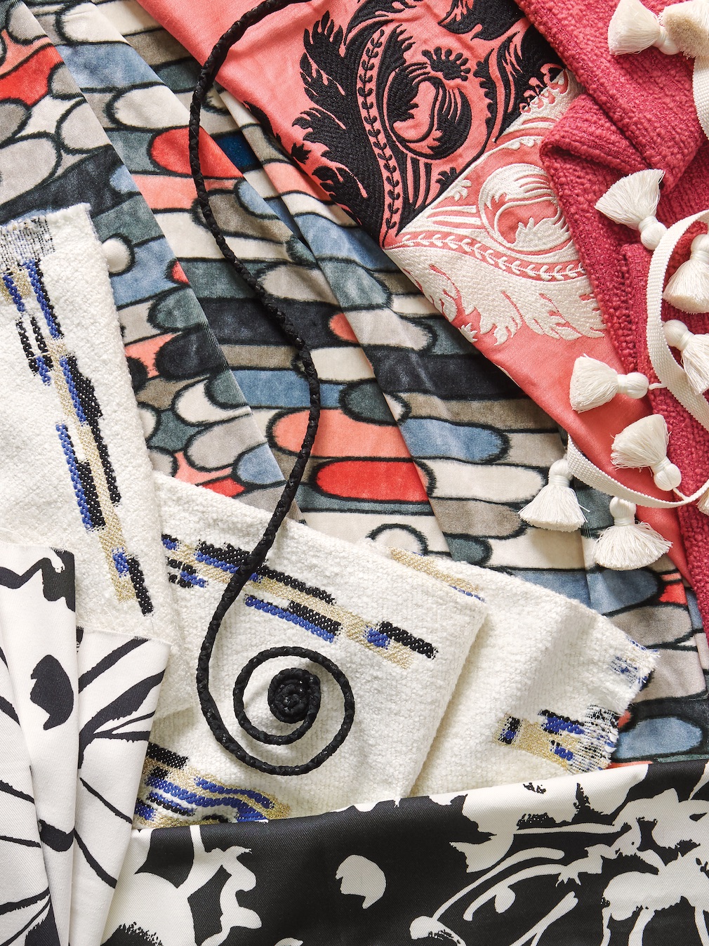
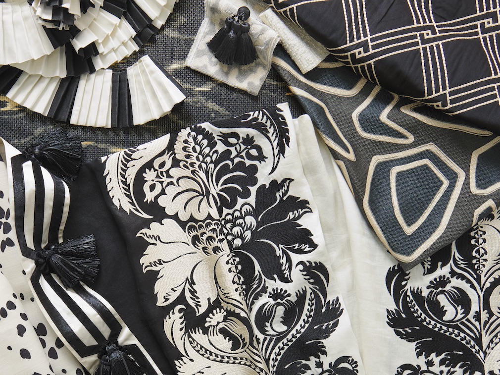
Designer Caroline Price’s collection for Vervain, The Montespan Collection, is imbued with both history and modern flair. The fabrics, wallcoverings and trimmings tell the story of Caroline’s vivacious muse, Madame de Montespan, long-term mistress of King Louis XIV of France and mother of seven of his children.
Passion, wit — and above all — style, exude from this curated collection of sensuous textures and remarkably unique patterns interpreted through prints, embroideries, wovens and appliques. The textiles burst with color, elegance and fun, bringing together an unmistakably contemporary look with design concepts that are centuries old. Take a closer look at how it all came together in this week’s Anatomy of a Design.

Raymond Paul Schneider: What was the overall timeline from conception to achieving the final design?
Caroline Price: Though I’d been thinking about making designs for a couple of years, I started working on the first piece of artwork in about 2017. By 2020, I had developed a series of patterns with complementary designs working together in groupings. I met by chance David Finer and Nina Butkin (CEO and VP of Design at Fabricut), who felt my collection and its story conveyed the values and sensibility of Vervain. Over the next year and a half (2021 and 2022), we as a team developed the designs into fabrics, wallpapers, and trims. It launched at Paris Deco Off in 2023 and hit Fabricut showrooms later that year.
RPS: What was your initial inspiration, and where did the idea(s) come from?
CP: The idea for my new collection hit me years ago when reading The Age of Comfort, a book about the historical development of upholstery and luxury. In it was Madame de Montespan, whom I’d never heard of. She had a torrid love affair with King Louis XIV during the long transformation of Versailles. As his official mistress and mother of seven of their children, she had considerable influence on him and became an epicenter of court life. My curiosity about her led me to dive into French diaries of that time and other materials about her. I was fascinated by her rise and fall with the King, the wild stories in her diary, and the design aesthetic she embraced. As a creative outlet, I began designing textiles that told her story. I sought inspiration in everything from centuries-old fabric fragments, vintage kimonos, the colors of flowers in my Aunt’s Napa Garden, references from my Mother, and my own life experiences. All of these inspirations ultimately led to the creation of my new collection, with each fabric, wallpaper, or trim telling a story that happened in the romance.

RPS: Please describe your overall creative and design process.
CP: My creative process for making a textile design is by no means linear. I may find inspiration through a story, things I see that could be literally anything, experiences, or little bits of intuition that just hit me. It’s like starting a puzzle with the first piece. When that raw idea piques my interest, and I find something else that further inspires or aligns with it, I have an indefinable affirmation that I must do this. Then, I work on the idea, and it becomes something physical. This is so esoteric that it makes absolutely no sense to most people, I am sure. Here is an example: I was eating at an Italian restaurant, having cantaloupe with thinly sliced ham. I took a picture of my half-eaten food because the ham slices had patterns in them that I thought were cool. A year later, I was looking at a photo of my mother’s large-scale moire patterned rug, and I could see why I was intrigued by the pattern in the ham because, at the time, the ham looked like moire. Now we have Madame’s Moire fabric and wallpaper.
For a more granular answer, after receiving the inspiration for a pattern, I work it out on paper until it’s right in design, scale, proportion, repeat, and color. Nina Butkin and I would select the ground fabric for a particular application and run multiple rounds of tests of our ideas for colorways, weaves, appliqués, and embroideries.

RPS: Did you have a specific audience or theme in mind?
CP: The collection has a modern look with traditional references, is high luxe, and is statement-making. The edgy designs pair unexpectedly with the traditional ones, which have a modern twist. The collection is a playground for designers who like to work with black, black and white, or black with accent colors. We also have most every other color in the collection. So, with that being said, the audience can be of almost any age group, likes color and large-scale repeats, and appreciates materiality and luxury. Designers can shop within the collection’s 87 SKUs for fabric, wallpaper, and trim for a complete look.
RPS: Please describe the methods, tools, and materials you used to develop and prototype this design.
CP: We used high tech and low tech. I scanned all my inspiration artwork or antique textile fragments at a place with special large format extremely high-res capabilities or sketched it myself. Then I would give the files to my graphic artists and direct them in rounds of development using software. Each design was printed to scale on 54″ wide pieces of paper, where I could address any issues. The finals would be very different than the inspiration. To arrive at color, we all used Pantone decks and swatches. Nina and I selected from her books of hundreds of embroidery thread colors. And we selected from hundreds of ground cloth options from printers, and weaves from mills. Nina would often get out her scissors to cut out a motif in a pattern to test it on a different color cloth or unravel a fabric’s warp and weft to discover the problematic issues with a particular weave. It was pure magic to watch Nina apply her technical understanding and expertise, on all fronts.

RPS: Did you use a new technique or technology to conceptualize or create this product? If yes, please share the details.
CP: We did everything old school, hands-on. No AI involved.
RPS: Please describe any challenges that affected the design and perhaps steered you to an entirely new final design.
CP: When translating a fabric at 54″ wide to a wallpaper at 36″ wide, we always had to redo the repeats. This would change the pattern and affect its scale. We did a lot of trials until we got them as close as possible to the fabrics. On Montespan Rocks, we wove our own special ground cloth with Zari (metal) in it to have the luminosity of a diamond. Nina and I were intrigued with the idea of embroidering the rocks so that they each had their own character and facets, to be more jewel-like. The idea just didn’t work in the trials, so we ended up printing the pattern on the special cloth. I just love it!

RPS: Describe your overall brand DNA and ethos.
CP: The ethos of the textile line is: Modern, Unexpected, Elegant. My home design business incorporates that ethos too. The DNA of my home design business is to help people express who they are. That’s the core of it. I provide them comfort, beauty, and function in a high-level and creative way.
Photography courtesy of Vervain.
Click here to see more of our “Anatomy of a Design” series.
Like what you see? Get it first with a subscription to aspire design and home magazine.
