Interior Designer: Cristine Alvarez, Curio Interior Design
Studio Location: Miami, Florida
Client review: These were repeat clients, and we’d previously designed their modern vacation condo in Miami. When they sold that home, they wanted something completely different and purchased this 1940s cottage in Coral Gables. Their daughter studies at University of Miami law school, so they saw this as being her main home while the rest of the family could visit throughout the year.
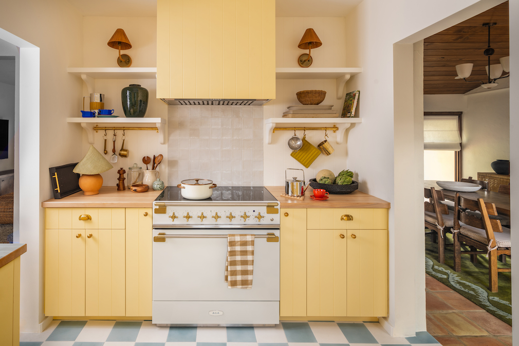
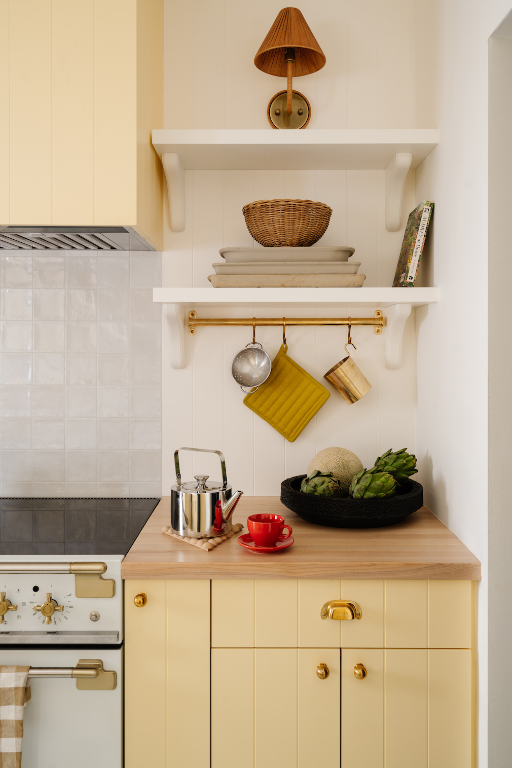
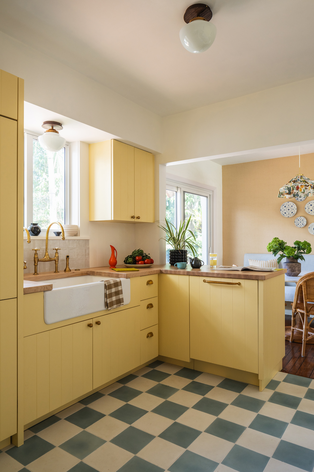
Design Aims: Our goal was to stay true to the style of the house. It was so cozy already, and we loved the Spanish tile and original hardwood throughout. The clients wanted to lean into the charm with color and pattern. The only specific directive they gave me was that they wanted a yellow kitchen. Besides that, they said, “Take it away.”
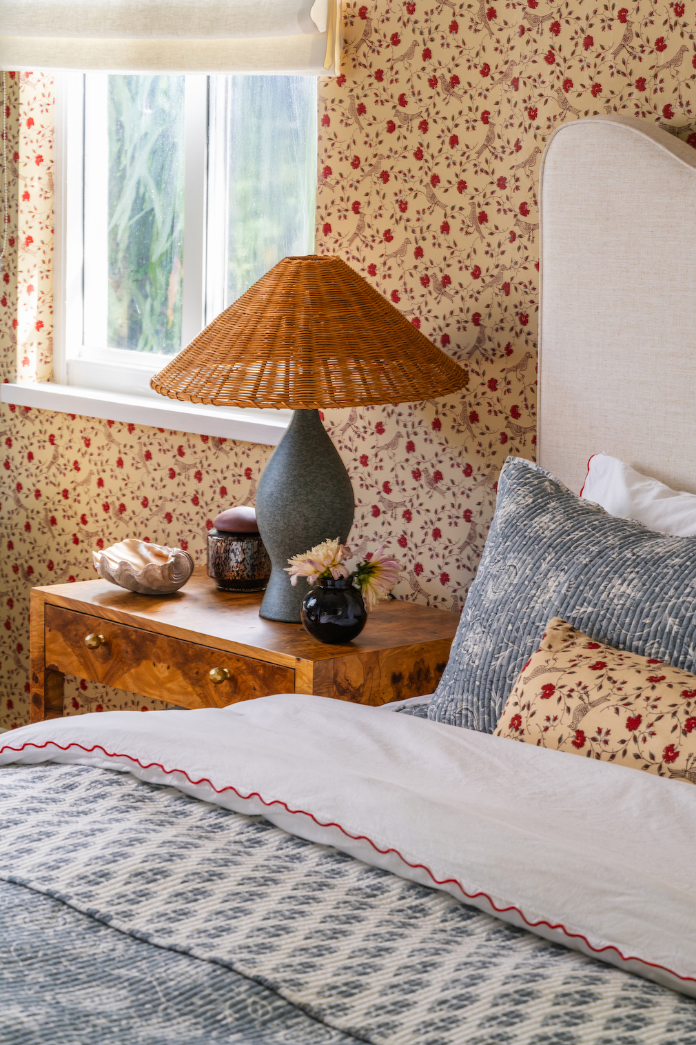
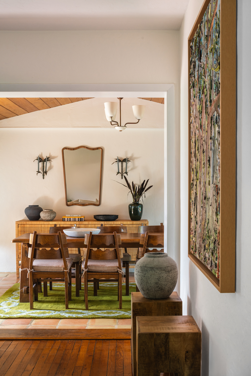
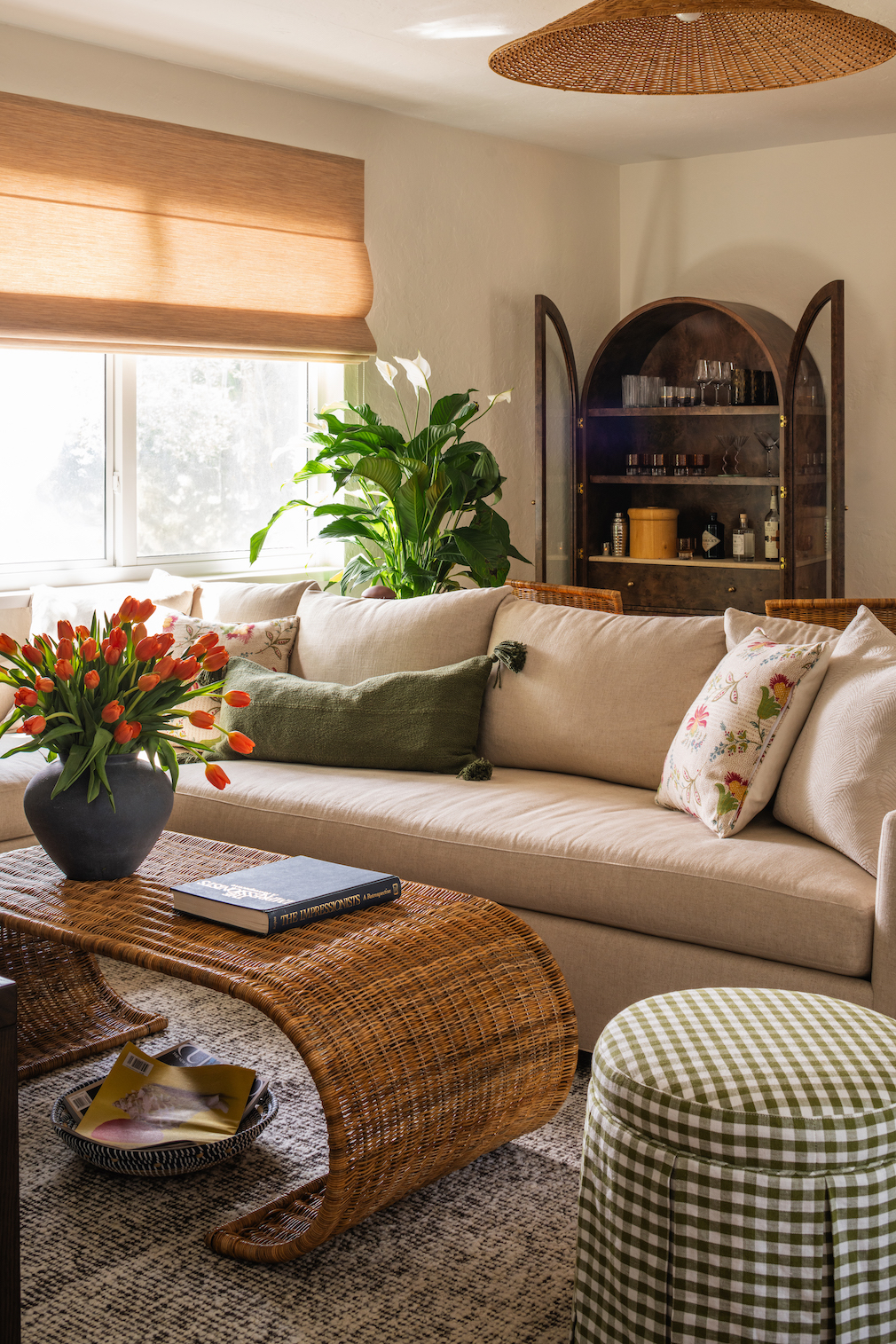
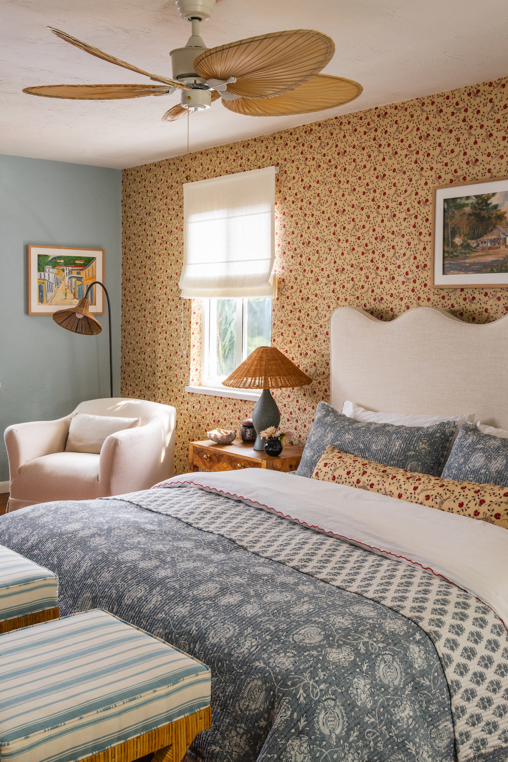
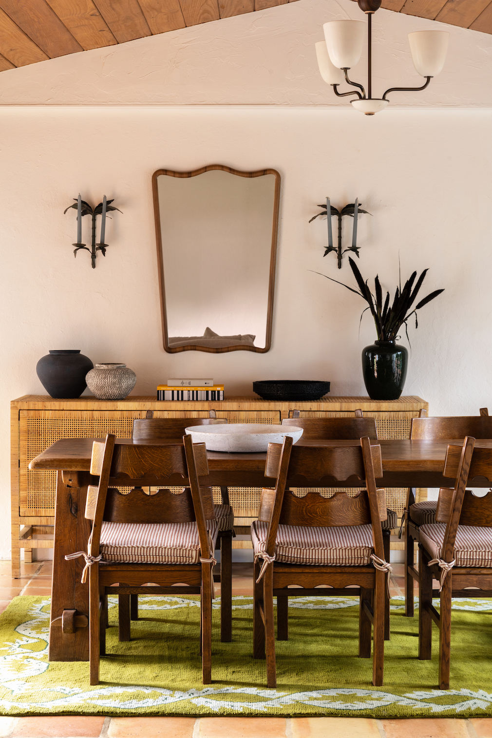
From the Designer: This house isn’t what I’ve typically done in Miami. People here often want contemporary, white boxes. But these clients were all in for whimsy, so we had a lot of fun with it. The starting point for the palette was the peacocks and greenery outside. There is a thread of turquoise throughout the home, which you can see on several walls in the primary bedroom, and in the Cuban art, such as the Lilian García-Roig work in the dining room and the living room’s Ismael Gómez Peralta piece.
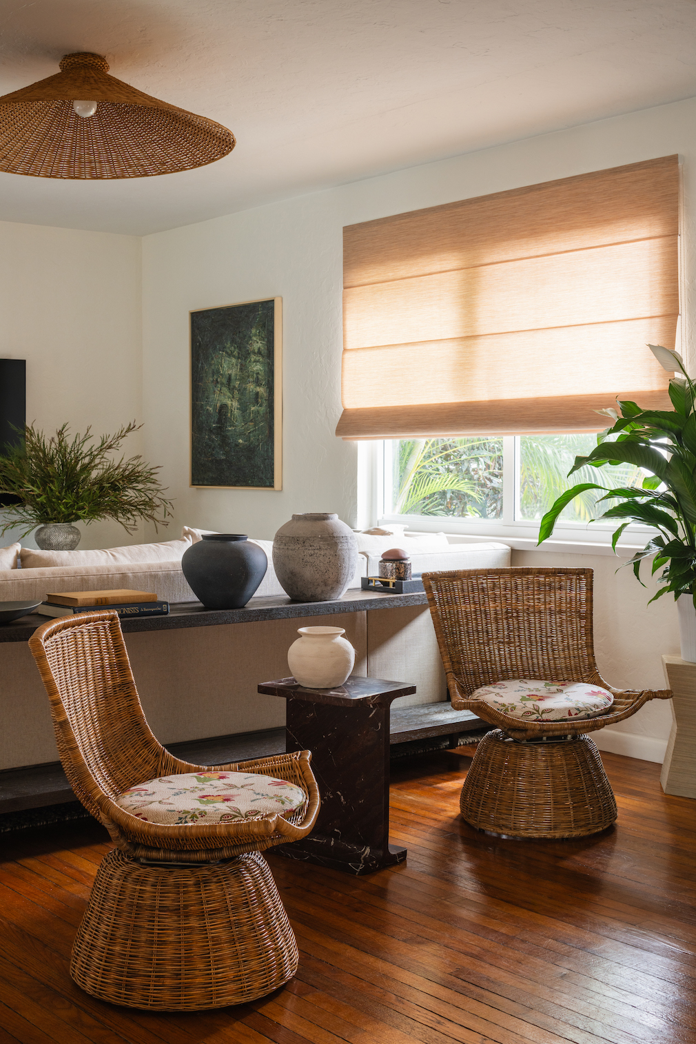
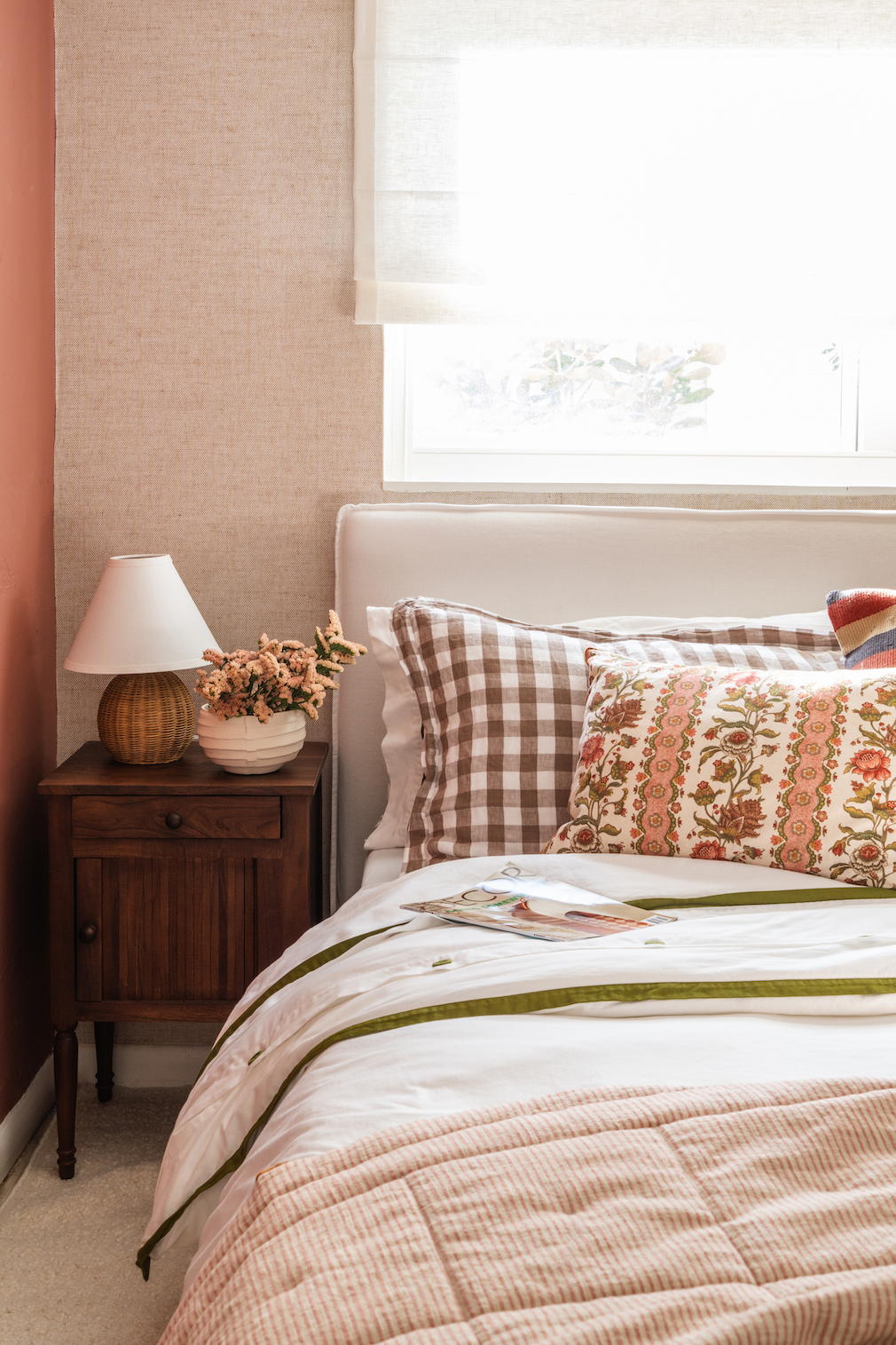
Then we mixed in vintage-inspired patterns. I thought a lot about scale. You’ll notice that the smaller print on the primary bedroom’s Pierre Frey wallpaper plays well with the larger floral design on the bed’s quilt. We wanted to combine this English cottage feel with a lush Miami vibe, so we brought in a lot of rattan pieces, which have a 1970s beach sensibility. We installed a very Florida-esque ceiling fan and Woven Shop coffee table in the living room. And in the bar area behind the couch, we topped two cute wicker chairs with custom cushions in a Sister Parish Design fabric that matches the pillows on the sofa.
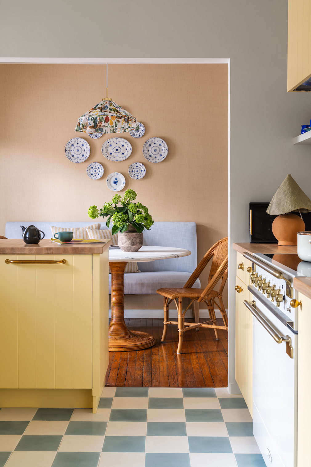
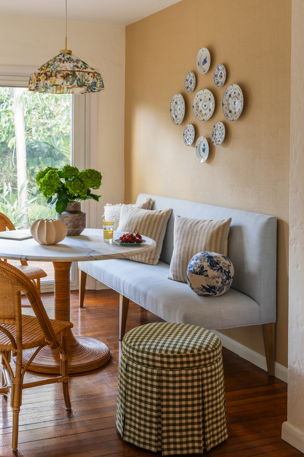
The kitchen and the breakfast nook are where the cottage style really shines through. We played with the shade of yellow because we didn’t want something too bright that the daughter would get tired of over time. I loved the idea of bringing in turquoise again — this time working in that vintage feel by doing a checkered pattern on the flooring. The breakfast nook’s patterned light fixture and wall plates top off the English country look. This is the daughter’s favorite space. She says it’s like sunshine: cozy and warm. You want to be in there.
Photography by Jeanne Canto
Styling by Vanessa Vazquez
Like what you see? Get it first with a subscription to aspire design and home magazine.