For a family of five in need of some elbow room, Frederick Tang Architecture (FTA) combined two Upper West Side apartments into one, reconfiguring the spatial layouts to merge them into a fluid, highly flexible home to fit the family’s expanding needs. The result is a 2800-square-foot, 4 bedroom residence that pays homage to the family’s love of materiality and gesture.
“Every New Yorker’s fantasy is to tear down the wall and join the space next door,” reports Frederick Tang, founder and principal of FTA. “In this case, our clients thought it would be a simple merger, for example, in which we would simply choose one of the two kitchens and take the other out. But to get the most out of the space, we really thought about how every member of the family might go through their days.”
Inspired by their Indian heritage, the family wanted to incorporate stone into their home, and they were also drawn toward color and painterly strokes via an appreciation for a grandfather who was an artist. The interior design therefore revolves around the use of richly colored and patterned stone surfaces, which sets the tone for the overall palette of the space.
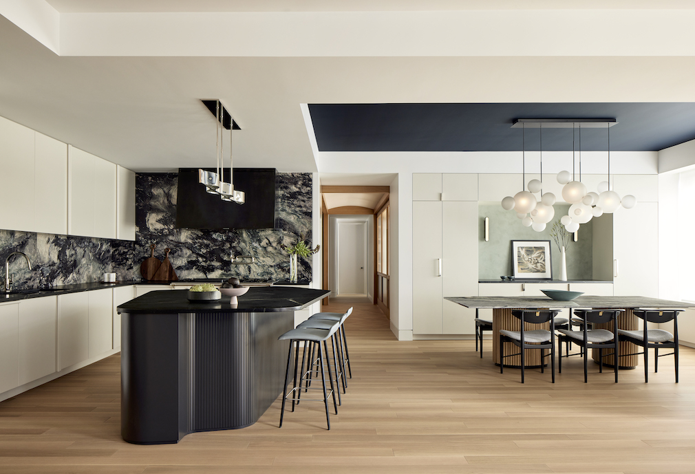
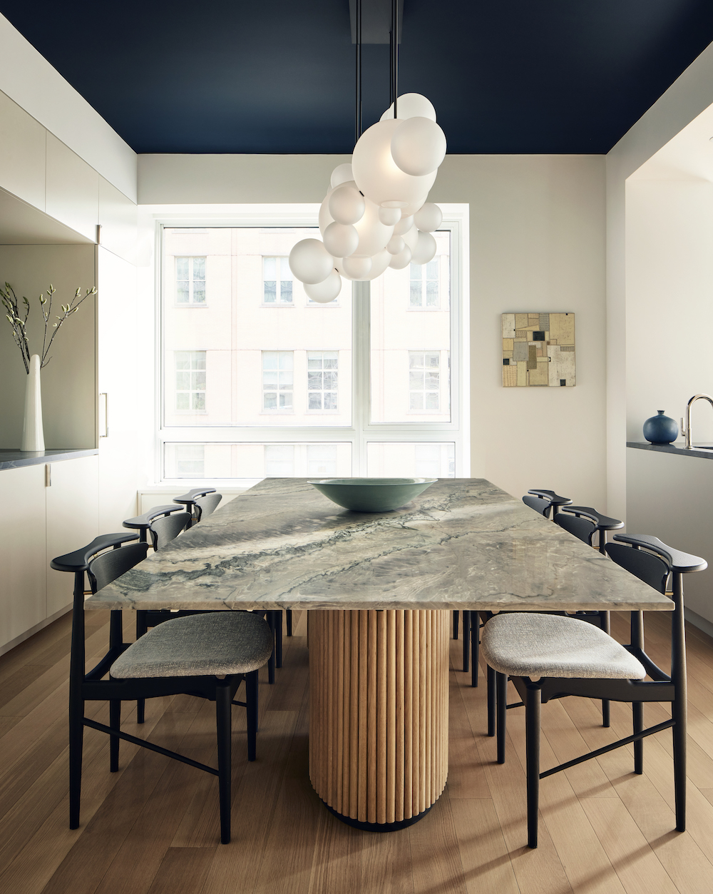
The kitchen anchors the corner of an open, flexible space that also houses the living and dining areas, perfect for the family’s frequent large weekend dinners. Defined on one side by a stormy blue marble backsplash (Phoenix marble from ABC Stone), it is anchored by a black soapstone island in the shape of a rounded, asymmetrical pentagon, surrounded by five seats for casual family dining. In the adjacent space is a dining table custom-designed by FTA in quartzite platinum crystal stone from Bas Stone. A sculptural Bolle chandelier in frosted glass and blackened metal from Giopato & Coombes floats above the dining table, like clouds. The tambour-like fluting at the base of the dining table also graces the base of the kitchen island, setting forth a repeating motif that initiates a sculptural language to the entire apartment.
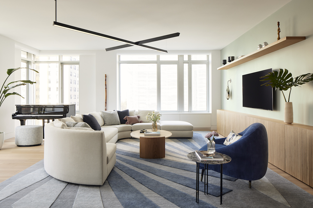
In the adjacent living area, custom-slatted white oak millwork continues the fluted language, running horizontally along the base of one wall and extending into a vertically oriented, sculpturally rounded closet at the end. Carving out the sitting area is a rounded sectional sofa that was the clients’ own – a family favorite in which everyone would plop upon to watch movies. FTA customized it, re-upholstering it and splitting it up so that pieces could be used elsewhere in the home. A grand piano sits by the corner window, and a custom intersecting blackened brass lighting fixture designed by FTA hangs overhead.
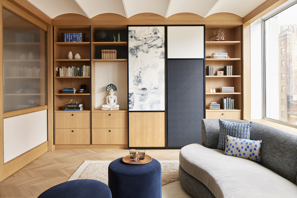
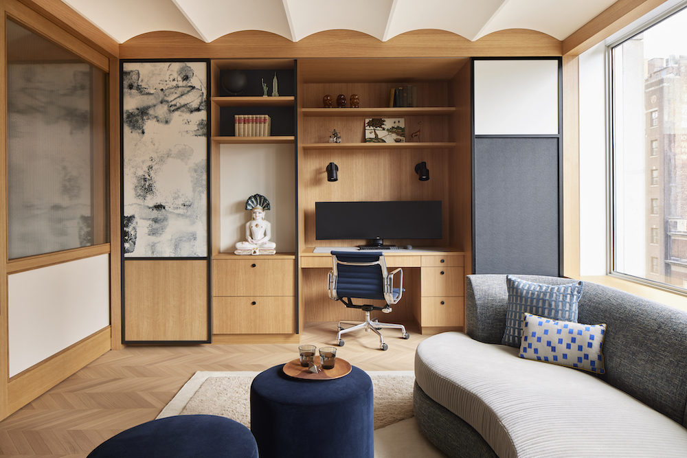
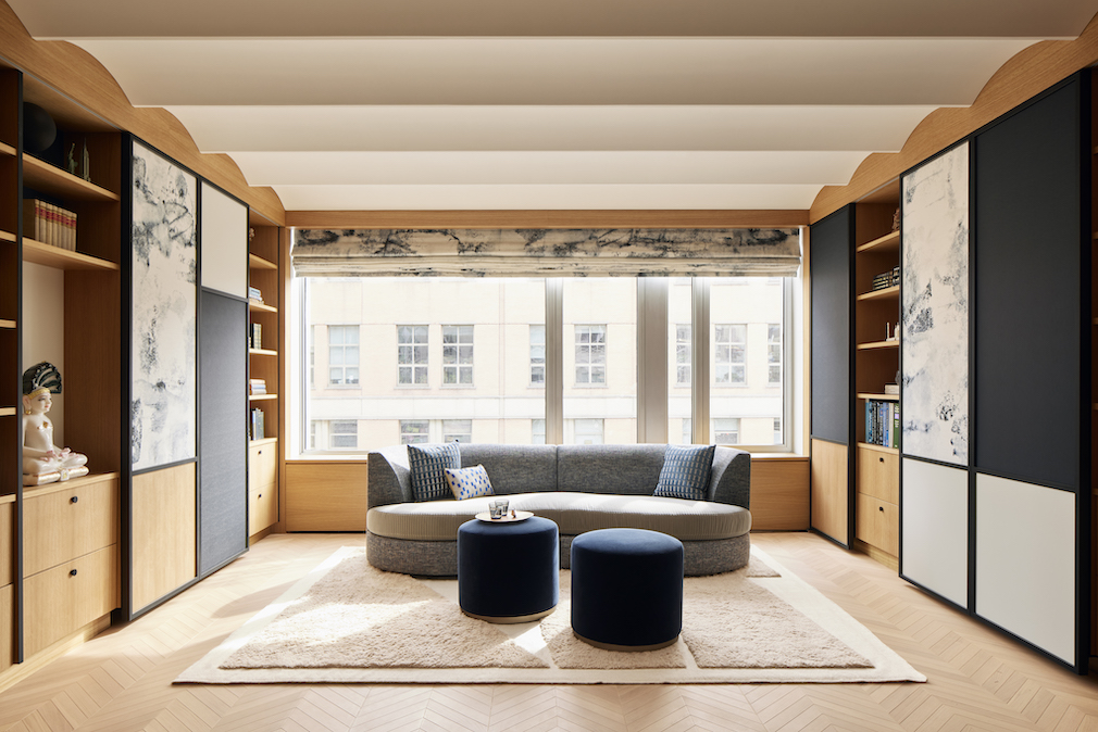
At the entry to the apartment is a convertible library and sitting room that also functions as a guest room, office, and entry foyer. Vaulted ceilings, with curvature reminiscent of the tambour seen elsewhere in the apartment, lend it the grandeur befitting an entry, but sliding panels and hidden doors allow multiple functions to exist and be concealed where necessary. A pull-down Murphy bed for guests is hidden in the cabinetry on one side of the room, and a small work-from-home office is concealed by beautiful sliding panels in deep blue, slate gray and marbled patterning. The sofa in the library was also the clients’ own, which FTA transformed through upholstery and cushions.
“The family wanted a beautiful home but knew the practicalities of the kids and all their belongings,” says FTA Design Director Barbara Reyes. “The story of this home is about revealing and concealing, whether it’s a work-from-home office and guest bedroom tucked away behind water-colored fabric panels, or sliding tambour to hide a kid’s shoes, the result is a seamless effect.”
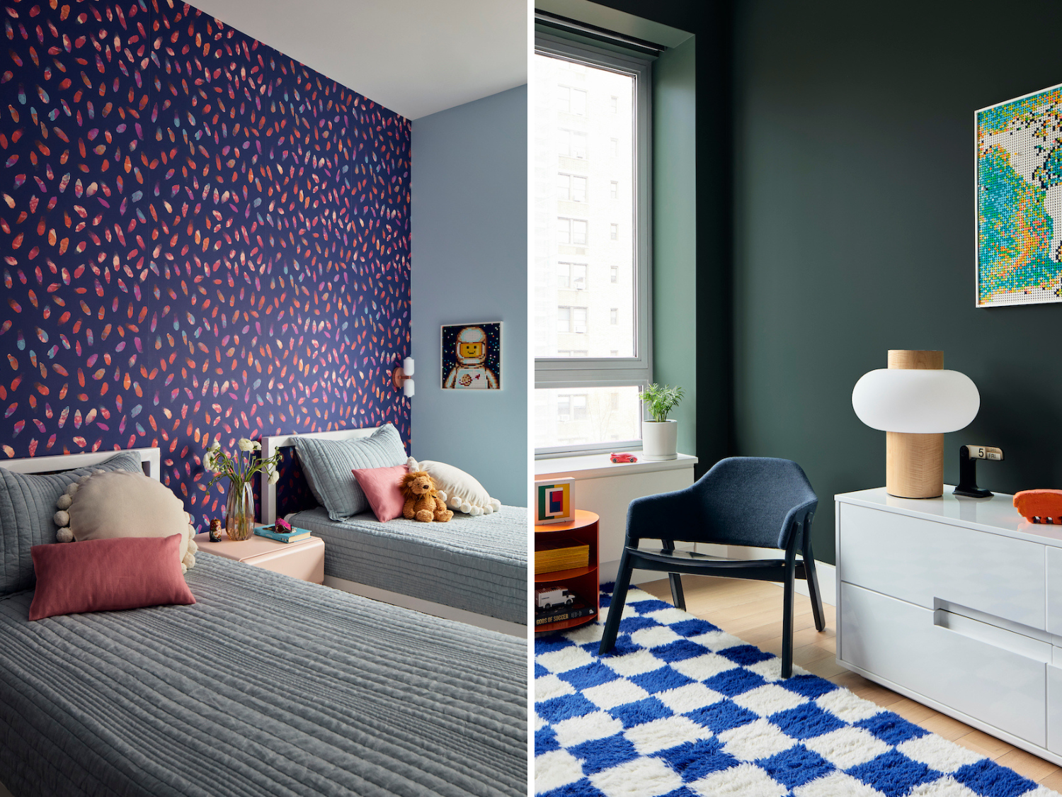
Private sleeping areas reside in zones at opposite ends of the newly combined apartment. Past the living area is the kids’ zone, with two children’s bedrooms preceded by a small nook containing three cubbies, one for each of the kids, with differently colored/patterned cushions that the kids chose themselves with FTA’s guidance. The shared younger kids’ room features wallpaper from Flat Vernacular in a deep blue with lively pink gestural brushstrokes, in keeping with the family palette, while the bathroom is playfully clad in light iridescent tile.
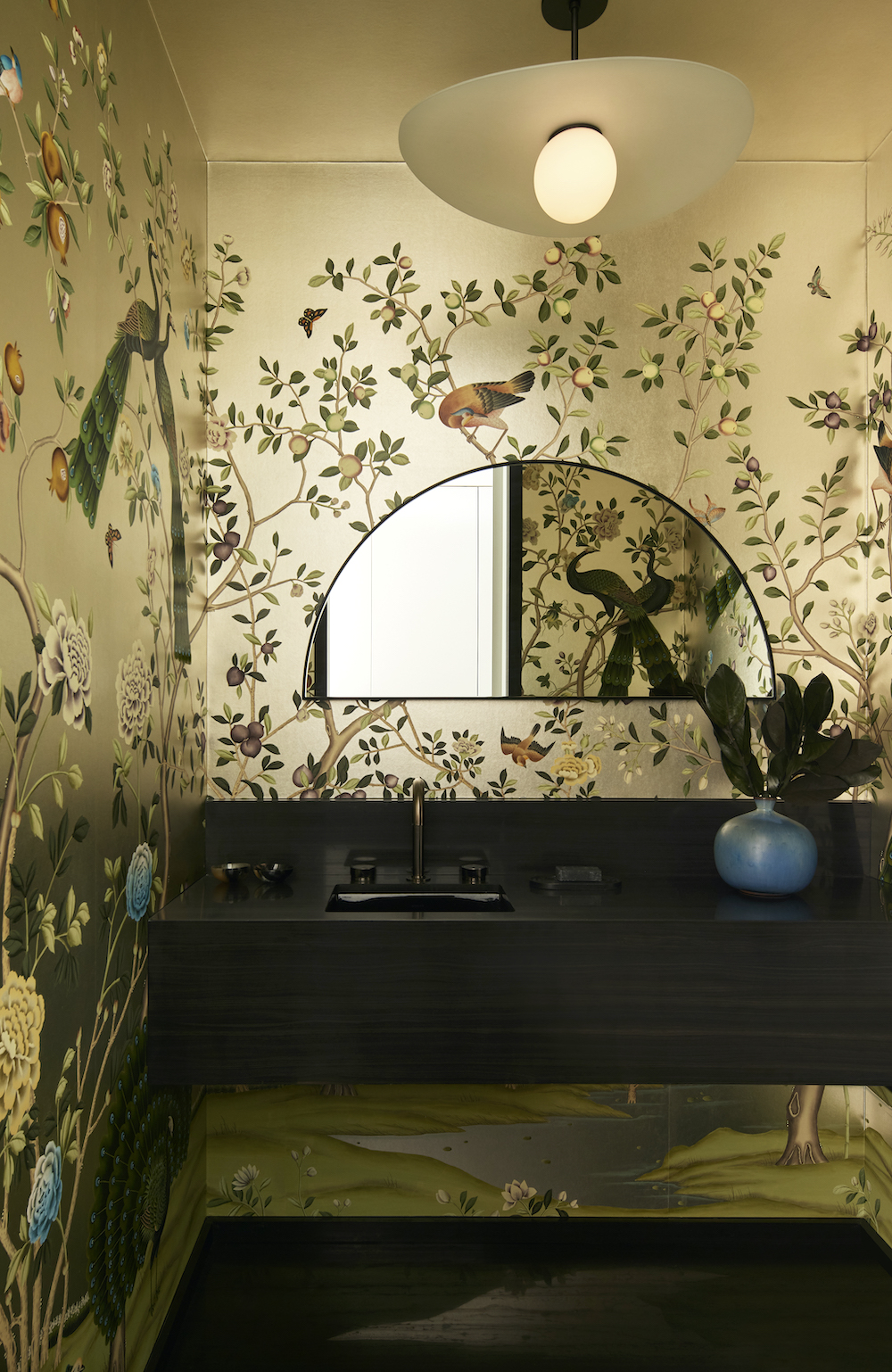
On the opposite end of the newly combined apartment, adjacent to the library-foyer, are the primary bedroom and bathroom, as well as guest bath and bedroom, comprising an “adults zone”. Deep blues and greens characterize this wing, as well as richer patterns and textures, including the scenic peacock wallpaper from De Gournay in the powder room – a favorite selection of the clients.
Photography by Gieves Anderson.
Like what you see? Get it first with a subscription to aspire design and home magazine.