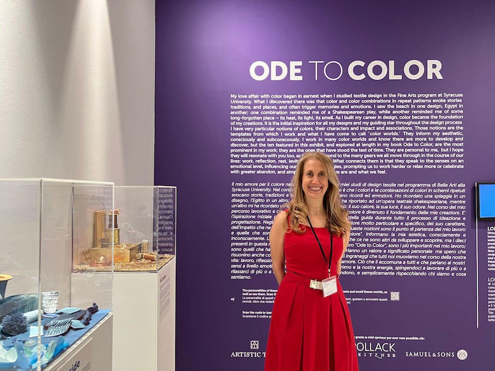
For this year’s Venice Biennale celebration, Lori Weitzner put together a multi-sensory immersive exhibit called “Ode to Color.” Through ten translucent boxes, Weitzner transports us through her personal “color worlds” inspired by her time in the design industry.
“Ode To Color” is on view now through November 2022.
Raymond Paul Schneider: What was your initial inspiration, and where did the idea(s) come from?
It all stemmed from my book, Ode to Color: The Ten Essential Palettes for Living and Design published by Harper Collins a few years ago. I wanted to bring these ten color worlds to life in a multi-sensory way. My love affair with color began in earnest when I studied textile design in the Fine Arts program at Syracuse University. What I discovered there was that color and color combinations in repeat patterns evoke stories, traditions, and places, and often trigger memories and emotions. I saw the beach in one design, Egypt in another; one combination reminded me of a Shakespearean play, while another reminded me of some long-forgotten place – its heat, its light, its smell.
As I built my career in design, color became the foundation of my creations. It is the initial inspiration for all my designs and my guiding star throughout the design process. I have very particular notions of colors, their characters, impact and associations. Those notions are the templates from which I work and what I have come to call ‘color worlds.’ They inform my aesthetic, consciously and subconsciously.
RPS: Please describe your overall creative for this exhibit.
It is a combination of a visual presentation as well as elements to engage the auditory and olfactory, providing an entirely immersive experience in color.
RPS: Did you have a specific audience or theme that you had in mind?
I wanted my exhibit to be accessible to anyone that has an interest in color or anyone who is simply open to feeling how color can be transformational.
RPS: Please describe the methods, tools, and materials you used to develop and install the exhibit?
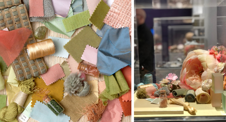
Through ten translucent boxes, in a mostly all white room, I transport us through these personal worlds of color using mixed materials both man and nature-made. In addition, I pair each world with original musical compositions as well as unique scents that also reflect each of these unique color worlds. The installation invites visitors to not just “see” color but to experience it with all their senses and reflect upon the colors that are most personally impactful.
RPS: What did you want to convey with this exhibit?
These color worlds correspond to the many gears we all move through in the course of our lives: work, reflection, rest, levity, passion, love. What connects them is that they speak to the senses on an emotional level, influencing our moods and energies, prompting us to work harder or relax more or celebrate with greater abandon, reflecting who we are and what we feel. My goal is that people walk away with a newfound sense of how color can be used as a tool for wellness and well-being.
RPS: Please describe any challenges that affected the conception and installation, and perhaps steered you to an entirely new execution?
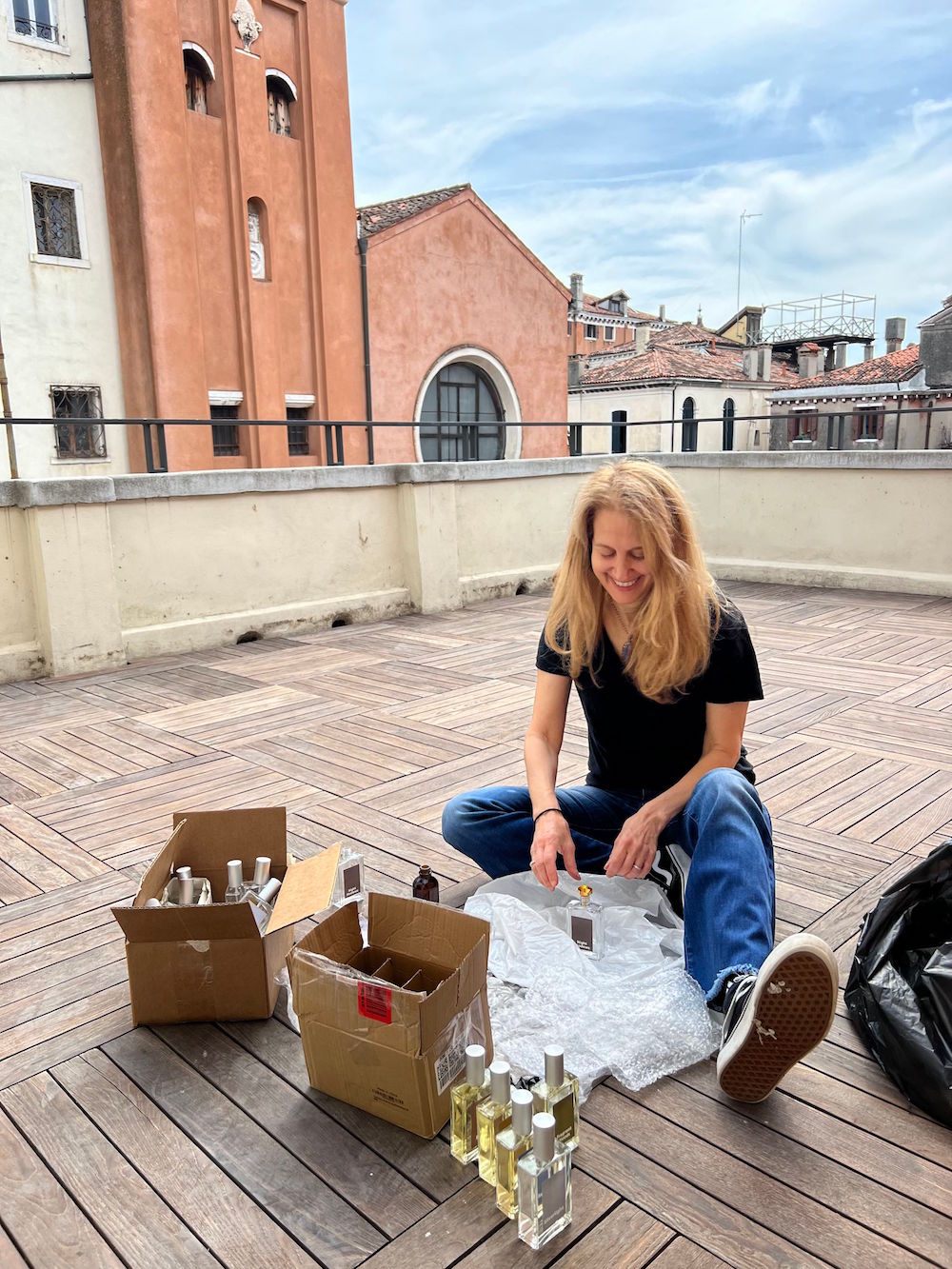
Since I live in New York City and the exhibit is in Venice, I needed to figure out how I was going to put it together. I spent months collecting and gathering items for each of my boxes. Things like fabric swatches, yarns, shells, glass, stones, beads; finally sending them all off to Venice in hopes they would make it. I knew I had to assemble the installation on-site and so set off to Venice three weeks ahead of the opening to quietly, meditatively and meticulously assemble all these moving parts to create the whole. It was a special and unique time for me – living there on my own with no interruptions. I had the luxury of time and space to assemble, create, tweak, tweak some more and finally feel good about it. The curatorial team at the ECC (European Cultural Centre) were a great support during this process. The biggest challenge for me however happened months before when I was determined to find just the right scents and music to embody each of my color worlds. Color has always been my first language, music and scent are harder for me to communicate what I wanted to achieve. By collaborating with a scent master and two wonderful musicians. It stretched me in wonderful ways and I eventually found, we found together, what certain colors smell and sound like. I hope as people experience my exhibit, they feel it too.
Click here to see more of our “Anatomy of a Design” series.
Like what you see? Get it first with a subscription to aspire design and home magazine.