 Is someone on high pulling our strings, making us like one color this year and another the next? Is there a secret cabal of futurists who determine the color they want everyone to use each year as a form of mind control? Or, is there something more serious, maybe even psychological, that influences the way we view color?
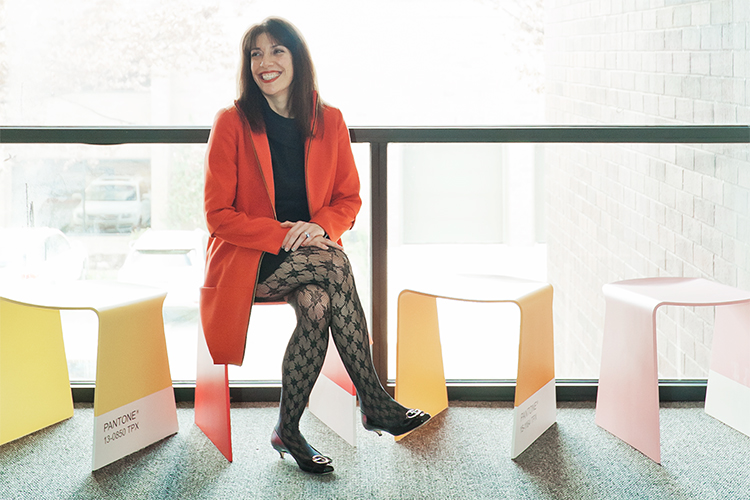
Laurie Pressman, vice president of the Pantone Color Institute, and intimately involved with the Pantone Color of the Year program, says the selection process “has always required thoughtful consideration and analysis.”
The process has changed a bit over the years – there are more areas the team looks at for color influences now for example, such as the entertainment industry, art, socioeconomic conditions, new technologies and social media platforms among others – but the goal stays the same, “to identify the one color we see as ascending, and building in importance across all areas of design, the single shade that is really pushing through, that we think has the ability to communicate color message that best reflects what is taking place in our culture at a particular moment in time.”
While Pressman has never been completely shocked by the color selected for a particular year, what has surprised her is the increase in types of companies using the Pantone Color of the Year in a greater variety of ways. “When we first started, I don’t think we would have expected to see food being colored in our Color of the Year, or music being used to convey the Color of the Year mood or a fragrance designed to embody the message of the Color of the Year.”
Begun in 1999 as a way to educate its clients on the symbolic nature of color and illustrate how color choices and the popularity of certain colors or color families reflect what is taking place in our culture at a particular moment, Pressman says, “With color and context so intertwined, there really are reasons why certain ones come into prominence when they do.
“Just look at the choice for this year, 2018: Ultra Violet. ‘Dramatically provocative and thoughtful, the blue-based purple shade communicates originality, ingenuity and visionary thinking that points us towards the future,’ is how Pantone describes it.”
As she’s experienced since the beginning with the Color of the Year, Pressman expects Ultra Violet to affect any number of industries, from graphic design and packaging to food and fashion, beauty and home décor. “Keep your eyes open,” she advises. “You might be surprised at just how many places you begin to see this luscious shade.”
Like what you see? Get it first with a subscription to ASPIRE DESIGN AND HOME magazine.