Are you looking for the trendiest color of 2015? According to Pantone, you need look no further than the reddish-brown hue, “Marsala”.
I’m not a fan. And neither are a lot of people, apparently. In theory, Pantone’s goal seems to have been to evoke full-bodied and robust appearance and flavor of Marsala wine, and a grounded, warm earthiness. Unfortunately, in practice, the shade seems to have missed the mark, instead reminding one of rust, dirty brick, gloppy meatballs, and dated 70’s era carpeting. I’m going to keep it classy, and merely refer you to what NY Mag’s “The Cut” had to say about it.
I still can’t tell if this chunk of Marsala-colored material is a rock or an unfinished scoop of lipstick.
Are we all wrong? What does it mean when popular opinion goes against the color experts’ top picks?
I have to agree with Tim Gunn: in a 2013 interview with Brendan Francis Newman and Rico Gagliano for Dinner Party Download, he shared his opinion that all of these trends and “Color of the Year” choices are “…completely arbitrary. It’s the fashion and retail world’s wanting people to buy new things….They’re a catalyst for people buying things they may not need.”
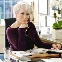
Then on the other hand, there are the wise words of another fashion expert to consider- Meryl Streep Miranda Priestly, of The Devil Wears Prada. (I’m sorry, but I just couldn’t help myself):
Queen Meryl
“But what you don’t know is that that sweater is not just blue, it’s not turquoise. It’s not lapis. It’s actually cerulean. And you’re also blithely unaware of the fact that in 2002, Oscar de la Renta did a collection of cerulean gowns. And then I think it was Yves Saint Laurent…who showed cerulean military jackets?… And then cerulean quickly showed up in the collections of eight different designers. And then it filtered down through the department stores and then trickled on down into some tragic Casual Corner where you, no doubt, fished it out of some clearance bin. However, that blue represents millions of dollars and countless jobs and it’s sort of comical how you think that you’ve made a choice that exempts you from the fashion industry when, in fact, you’re wearing the sweater that was selected for you by the people in this room from a pile of stuff.”
Now, everyone has their own taste in color, independent from the influence of trends and what various color “experts” say are the must-have shades. (They all pick different colors anyway.) I’m a fan of brighter, wilder colors: so I delighted in radiant orchid, and you can give me pretty much any shade of cerulean and I’ll be content. So in my humble opinion: Good colors are ones you (or your clients, if you’re a designer) enjoy, bad colors are ones you don’t.
I think the best venue for Marsala is the beauty and cosmetics industry, and this was one of the ideas behind its selection. From Pantone:
“Flattering against many skin tones, sultry and subtle Marsala is a great go-to color for beauty, providing enormous highlight for the cheek, and a captivating pop of color for nails, shadows lips and hair.”
Other proposed venues for this color include menswear, kitchen and dining rooms (via small appliances and linens), rugs and upholstered furniture, or paint colors. The appearance of this color varies with the material used, so hopefully designers will manage to find some way to effectively use it.


 I think the best venue for Marsala is the beauty and cosmetics industry, and this was one of the ideas behind its selection. From Pantone: