Artist and designer Sarah Von Dreele joins us this week to discuss her new collection, “Intersections“. Read on to get to know the Seher, Little Deb, Robert and Avery fabrics, and how they got their names and inspirations.

Raymond Paul Schneider: When did you first start to develop this new collection? What was the overall timeline from conception to achieving the final design?
Sarah Von Dreele: I work about 18-24 months out from when a collection is scheduled to launch. The paintings which informed this collection were developed during the spring and summer months of 2021. I try to paint all of the colorways myself, so when I feel good about a direction, I explore other color combinations to capture that unique, creative moment. While in painting mode, the best way for me to move forward is to not look back. I don’t really know what is going to end up in product development, so it is important to capture that particular artistic energy while I have it.
Once there are about 300-500 works on paper, I meet with my product development team. Shortly after the New Year, the body of work is spread out, patterns and connections emerge, and the collection begins to reveal itself. It is actually a really fun day and reminds me of RISD art school crit. Once we have a preliminary edit, it takes about 10 months to finalize colorways, engineer manufacturable repeats, run samples, and roll it all out to our showrooms.
RPS: What was your initial inspiration, and where did the idea(s) come from?
SVD: Responding to the “inspiration” question is always tricky for me since my work is very conceptual and introspective. Trained as a graphic designer, I never thought of myself as an artist until recently. What landed me here in this industry was using painting as a vehicle for processing trauma. And while that is no longer an acute experience, I want to preserve the openness of my creative space. As artists, our work is a manifestation of how we process our experiences and relationships. What I find interesting is how much my work has evolved over the last three years. I don’t work from a mood board or have preconceived notions as to what a collection is going to be. I just paint. I think it is very challenging to sit in a quiet space, not knowing where you are going. While this may be an uncomfortable space, I find the most interesting work begins here. I try to find inspiration from within.
RPS: Please describe your overall creative and design process.
SVD: Iterative. Hands down, capital “I” iterative. I recently moved my daughter to a new school and the admissions director made a comment about their philosophy being more about process over product. That idea really resonates with me. Through rich processes, there is so much to see along the way, and that is the foundation of my work.
RPS: Did you have a specific audience or theme that you had in mind?
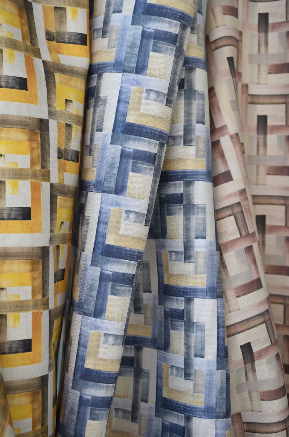
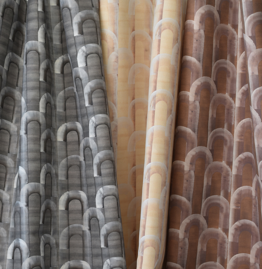
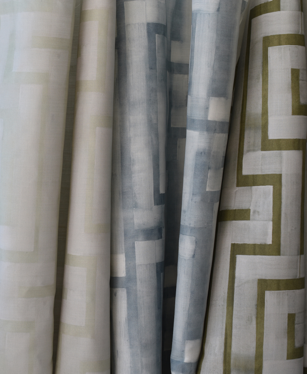
SVD: All you lovelies reading this! While I paint for myself, once the bell rings for brushes down, I switch over to the left side of my brain. I want to make sure I’m providing a wide range of work across iconography, color and scale giving our designers ample tools. This collection is no different. I did put in a few fun mustard yellows and golden browns – they have these retro, archival references which are so fun, but not to worry, there are soft blues and neutrals in there too.
While all of the collections are different, the body of work is united in how I name my patterns. I look for references that remind me of friends and family members, a tribute to the relationships that are important to me. There are, of course, some funny inside jokes. For instance, Little Deb is named after my dear RISD friend who I met at an internship in Providence, RI in the mid-90s working under the late Michael Westcott. She lived on Nantucket for many years after school, and we spent our early 20s roaming around the island in her old Saab that was missing a key but amazingly started with a screwdriver. Not gonna lie, there was some chasing of boys. In between jobs, I spent an entire Fall out on the island through an artist’s grant, working in my barn studio, weaving native grasses. Little Deb’s colorways reference Nantucket (Salt Meadow, Grey Lady) but also Little Deb’s California roots (Almond) growing up in an almond orchard.
RPS: Please describe the methods, tools, and materials you used to develop and prototype this design.
SVD: I go through a ridiculous amount of watercolor paper. You know those loud beeps when a truck backs up? Like that amount of paper. For each final design, there might be 50 sheets exploring just that one idea. My gouache library is also quite extensive. I found these wooden, suitcase boxes with dividers so I can organize my colors, although it is well overdue for an edit. Gouache, which is water-based, is unlike watercolor – the range of opacity is so versatile. It also allows for superior, precise color mixing. Mixing colors is like a math equation for me. I can look at a color and break it down in my head as to how to mix it to match. That’s totally normal, right? PS: Middle school mathlete, t-shirt to prove it, and college calculus in high school. Not kidding. I wish I still had that t-shirt.
RPS: Please describe any challenges that affected the design and perhaps steered you to an entirely new final design.
SVD: I like to meet with our showrooms about 6 months before a launch to show them what I am working on, which has the potential to be humbling. Their opinions are really valuable to me as they have such intimate relationships with their design communities. I was unsure about one pattern in this collection and considered eliminating it. However, it was made clear to me that should not happen and they also wanted it ASAP in wallpaper!
RPS: Describe your overall brand DNA and Ethos
SVD: Recently during a presentation, after I finished going through a series of paintings and samples, the designer looked up at me with a smile and said, “this is like polished graffiti.” I took it as a compliment – I hope that my work will continue to have that duality. Duality is a theme for me – the constant hand amongst an evolving body of work; the oscillation between both sides of my brain required to make art and run a business; the ability to transition in and out of a creative moment. My hope for the brand is that I am able to preserve an open creative space that facilitates discovering new work because without reserving the right to change, nothing new will be discovered.
Click here to see more of our “Anatomy of a Design” series.
Like what you see? Get it first with a subscription to aspire design and home magazine.