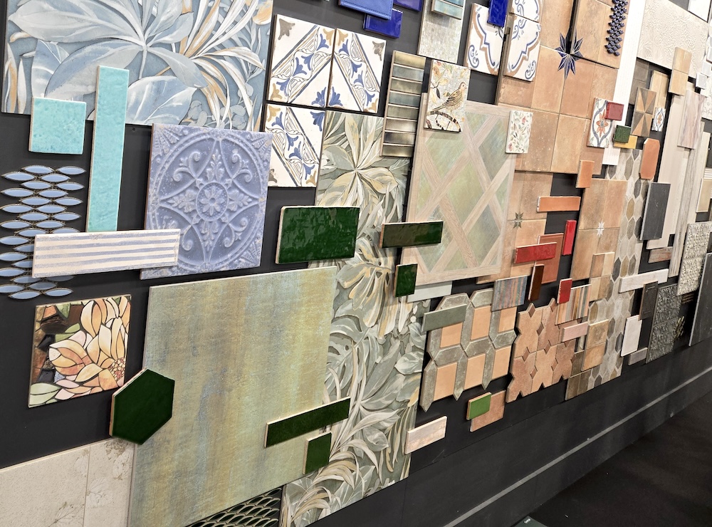
What beautiful tile surprises did we spot at Coverings 2026? One might wonder: what could bring a fresh feel to the “miles of tiles” from top international brands that gather each year at Coverings, North America’s premier ceramic tile and natural stone exhibition? Certainly, transferring the action to fabulous Las Vegas injected some Elvis energy into the expected discussions about durability with industry experts we love, including Alena Capra and Ryan Fasan. But, as in years past, it was the latest and greatest offerings from the convention floor that had design visions dancing in our heads — from tile that marvelously mimics other materials to mosaics that offer a special sense of magic. Let’s take a look at some of the eye-catching products from this year’s show and the trends they represent.
Tile Is for Touching
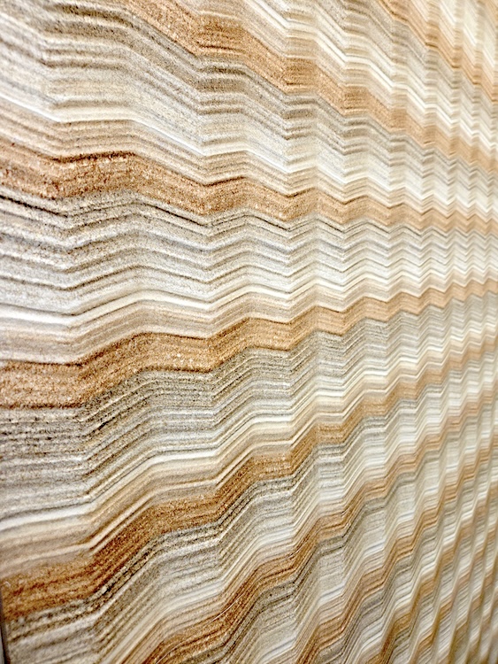
Tile that engages the senses continues to be an industry-wide trend. Makers use technology to build upon or carve into surfaces, performing a delicate balancing act. They want the texture to be impactful to the touch. But they want it smooth enough not to attract extra dirt. And, particularly for flooring, it should still offer an effective amount of grip. Achieving this balance allows for neat tricks like feeling the veining in marble-look tile or the knots in wood-look. We liked both the look and feel of this Pietra Essenza in Dune Multicolor from Emilceramica — evoking a quarry for both the eyes and the fingertips.
Gold Is Winning
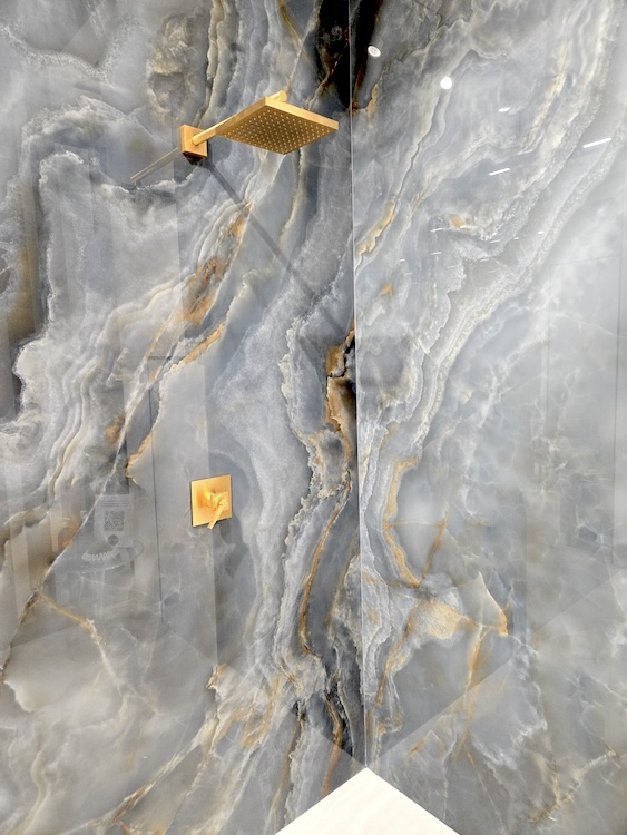
Gold was having a moment at this year’s show. We saw examples from dazzling, full gold-leaf looks to spectacular mirrored mosaics that seemed pieced together by a jeweler’s hands. But even where it was used as an undertone — such as within this Incanto Onyx Blue from Ragno, the color application has evolved to give golden steaks the surface an inner light — seemingly designed to rival fixtures for the title “jewelry of the bath.”
Mother Knows Best
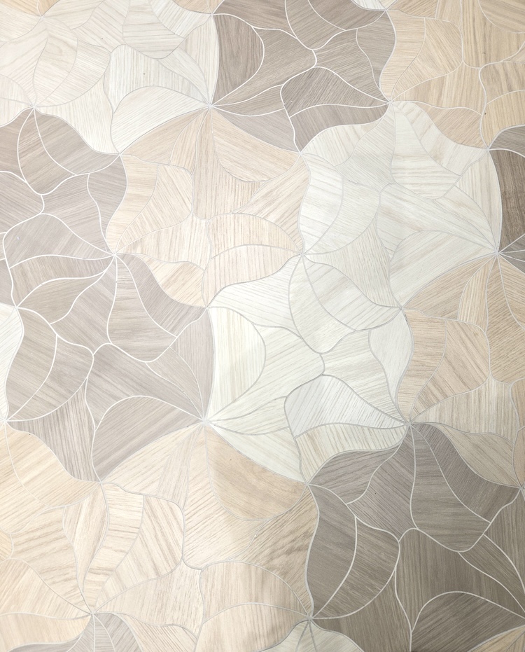
Organic minimalism abounded, which broadly translated to expanses of creamy beige tile — often inspired by the materials of mother nature herself — such as marble and wood. And while these are often intended to serve as the easy backgrounds of serene spa baths and cheerful country kitchens, there were more decorative interpretations, as well. Among them was this Milestone Calissa Plank Blossom with its floral patterning — shown here in a mix of Maple, Golden and Urban Walnut colorways.
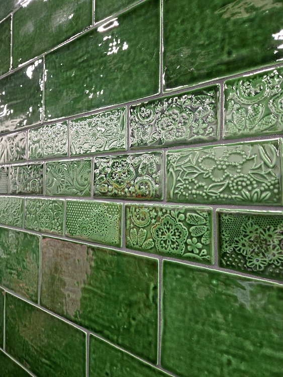
It’s Still Easy Being Green
Though vivid color was less in vogue, we were still definitely seeing green. In some sense, this follows a longer-term trend of the color being on the rise since 2015. But it was also mixed with the spirit of other trends — for example, in terms of color: less fluorescent and more forest floor. And some of our favorite examples — like these Antic Feelings Lava and Viva Antic tiles in Verde by Merola — also had that trending rough-hewn quality about them, as though they bore the touch of a craftperson’s hands.
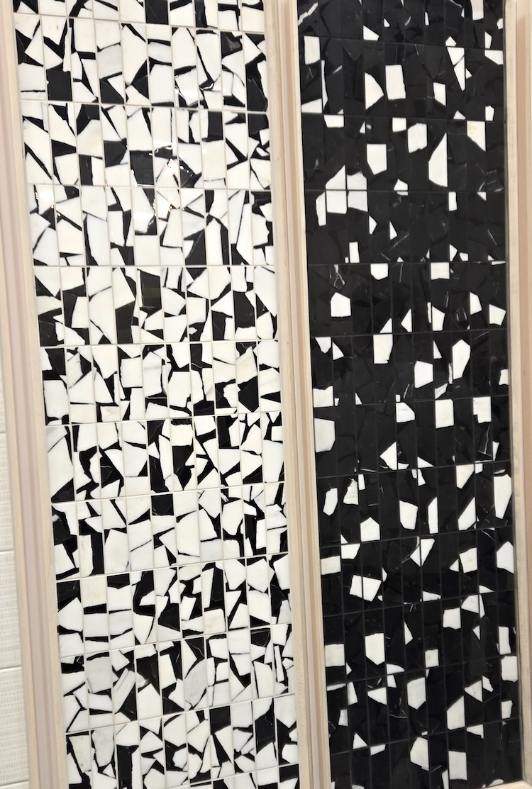
Basics Are Back
Basic can be a tricky term when discussing tile that is offering the look of something else. So while we could say we saw swathes of brutalist exposed concrete, what we mean is: we saw tile that cleverly captures that look. But whatever you want to call these throwbacks, there were pieces aplenty that called back to the classics. For example, terrazzo-look tile was omnipresent, and we particularly liked the Portobello Dual Mosaic, which is also serving sustainability as it is largely constructed of materials that would otherwise be wasted while creating the rest of the line.
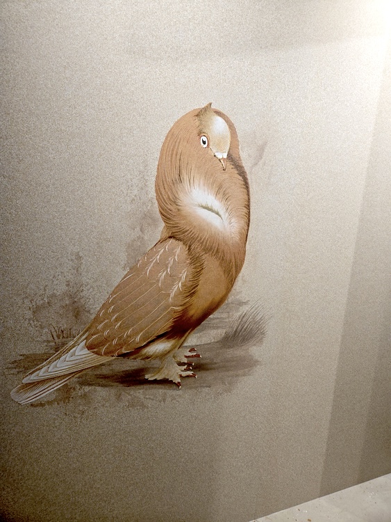
The Pantry Is Open
Yes, the 2026 Coverings color story contained more muted tones. But the best way we heard it described was: featuring colors drawn from nature’s pantry. Yellows were soft and buttery. Purples had the muted majesty of eggplant. And in the above example from the Mooi Nesting Room collection, note how the body of the bird is a rich cinnamon, defined with highlights of chocolate, over a field of toast and cream. It’s enough to stoke the appetite.
 Say It Ain’t Sew
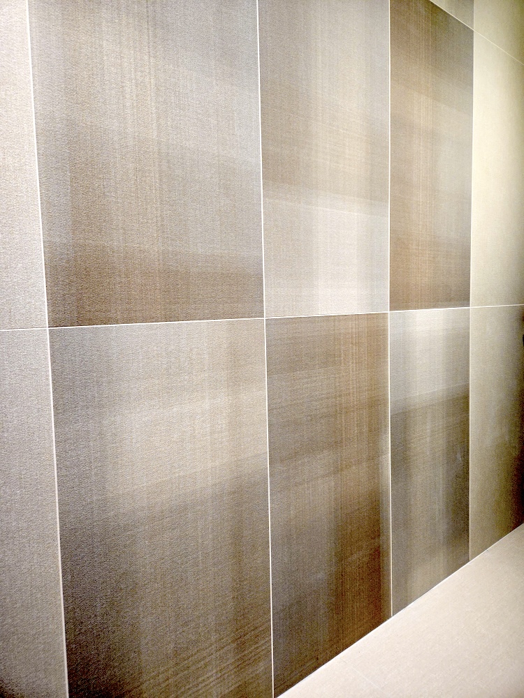
Ever dream of bringing the rich look of upholstery to a wall where it would be worn away? Tile is increasingly a way to deliver that sense of sumptuousness. For example, we saw some amazing porcelain made to resemble leather right down to the feel of its grain and hand stitching. But without a doubt, the fabric-look story of Coverings 2026 came from Florida Tile, which is part of Panaria Group. Their Threadscape collection boasted the completely convincing look and feel of plaid linen in a variety of blues, browns and other shades appropriate for men’s suiting. We even snagged one of the coveted scarves available that proved an uncanny match.
The Art of the Possible
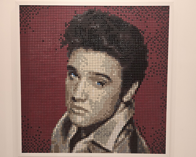
The people who make and install tile seem to be forever searching for ways to make the impossible possible — with ever larger tiles and more advanced color applications allowing the creation of larger-than-life-size images. At the same time, the industry is also finding ways to more efficiently create effects once only possible through time-intensive applications — offering complex patterns featuring tiles of multiple sizes and colors pre-arranged on webbing that disappears upon installation.
So we had to take a moment as we left Las Vegas to nod to custom creations from Appiani, part of Bardelli Group. Not only did they offer us a quality photo op with the King of Rock ‘n’ Roll, but they also promised they can break down almost any image into color points and recompose it as tiles, while also guaranteeing the flexibility to adapt the results to fit any design. What will they think of next?
Photography by Paul Hagen.
Like what you see? Get it first with a subscription to aspire design and home magazine.