 Bridget Beari founder and designer, Susan Jamieson joins us to discuss the brand’s new Rays Collection of coastal-inspired wallcoverings, available just in time for summer!
Raymond Paul Schneider: When did you first start to develop this new collection?
Susan Jamieson: The Rays Collection began when I was designing a coastal home in Alys Beach, Florida. Captivated by the location’s casual elegance and the natural neutrals of scrub oaks and crystal blue waters, I started sketching my first Rays’ patterns and palettes there. After Alys, I designed a home in Naples and took the opportunity to explore Miami and Palm Beach, where I discovered a whole other realm of architectural and natural inspiration. All of my collections begin with sketches from my travels, near and far.
“Bridgey” in Winston.
Raymond: What was the overall timeline from conception to achieving the final design?
Susan: The process is a long one for my wallpaper collections! It can easily take three years from sketchbook to final product. Once I refine my sketches into patterns and palettes, I share them with my graphic designer who helps turn them into digitally layered designs. There is much back-and-forth until my vision for scale, repeats and colors is perfected. Next comes an in-depth printing process. Because I print on various grounds, I work with several companies across the country who are masters in their respective materials. Each printer requires much communication and reviewing/refining strike-offs and colors, which can take up to six months.
Raymond: What was your initial inspiration, and where did the idea(s) come from?
Susan: The Rays Collection is inspired by Florida, from Mizner’s 1920s Mediterranean-eclectic Palm Beach to the 1930s glamour of Miami and today’s casual-chic Alys Beach. These patterns and palette are meant to reflect the rich architectural history and spirit of the Sunshine State … with a ray of my own Southern style. Rays’ patterns and colorways are not a literal Floridian interpretation in the palm trees and tropical flowers sense, but rather an expression of the wonderfully varied natural, cultural and architectural elements.
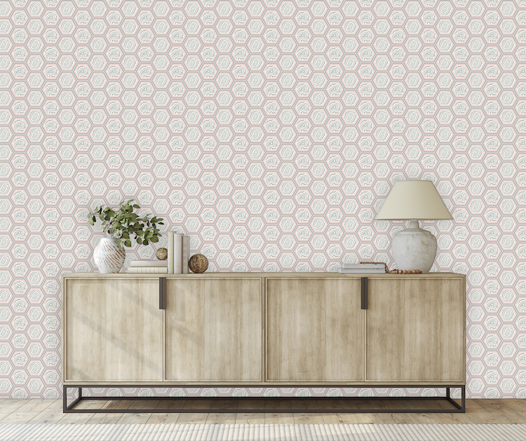
“Hudson” in Shelby.
Raymond: Did you have a specific audience or theme that you had in mind?
Susan: As an interior designer, I am always delighted by the diversity of what makes people feel good in their homes. And so, I love to offer a broad variety of pattern and color in each collection. Rays ranges from bold metallic Art Deco geometrics to more traditional Mediterranean tile motifs in classic neutrals.
Raymond: Please describe your overall creative and design process.
Susan: Traveling and experiencing new places are my creative stimuli. Wherever I go, I fill my sketchbooks with beautiful details and memories, which emerge into my wallpaper designs. I have a great appreciation for the grand scope of architectural variances and am creating patterns in my head all the time, especially when I experience new places and structures. For Rays, a honeycomb-coffered ceiling became Hudson. A sketch of The Delano’s four-winged tower evolved into Jaegar. An outdoor fountain fish scale study became Ripsie.
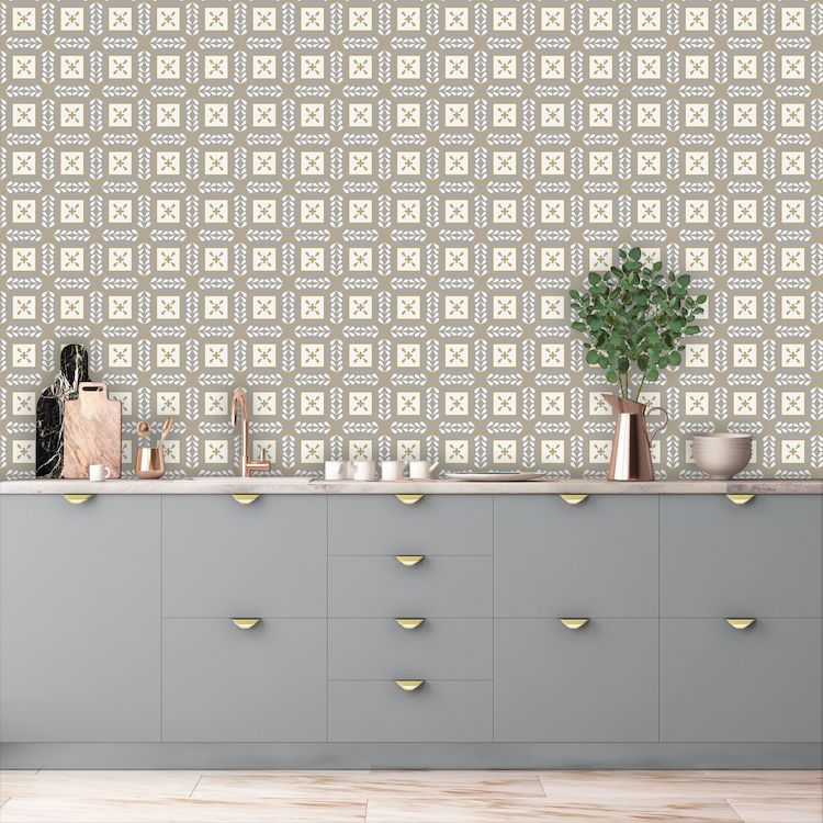
“Boss” in Inka Dinka.
Raymond: Please describe any challenges that affected the design and perhaps steered you to an entirely new final design?
Susan: Since I match Papers to my Colors paint collection, color accuracy is always a challenge to perfect. And because I offer grasscloth, matte, metallic, pearlescent and Type II grounds, I work with the best companies across America for each variant. Every paper has its own texture and coloring that impacts the final product. For example, natural grasscloth has a creamy cast, which doesn’t work for all of my colorways. This is why I only offer certain patterns and palettes in grasscloth. The same goes for my metallic grounds. Lots of trial and error and always worth the time and love that goes into the beautiful final product!
Raymond: Describe your overall brand DNA and Ethos
Susan: Since launching Bridget Beari Designs in 1992, my passion remains to celebrate a breadth of periods, places and styles. The Bridget Beari brand (Papers, Colors, Interior Designs and Home Store) is intended to speak to distinct tastes and lifestyles — I call this “living the mix”. Many designers are recognized for a “signature style,” and while I am known for historical restorations and my focus on accentuating and creating unique architectural details, at the end of the day, the style that matters most is that of those who live, play and work within a given space. My ethos is to help clients and customers discover their own singular style and love their environments.
The brand also serves another passion of mine, which is animal care and rescue. All of my wallpapers and paints are named after the pets of family and friends and I donate a portion of all proceeds to animal care and rescue organizations.
Like what you see? Get it first with a subscription to ASPIRE DESIGN AND HOME Magazine.