Gallery walls can be a wild assortment of randomly collected artwork, photos, posters and ephemera, or a cohesive, tightly curated grouping of works, such as black- and-white photography, sculpture or even Polaroids. But whatever the subject matter, a gallery wall is a multitasker, serving as an intriguing focal point as well as a peek into the internal life of the room’s inhabitant. We asked the creators of these walls to share their approach.

ATLANTA, GA
DESIGNER: Lathem Gordon, GordonDunning
IN BRIEF: I had a collection of art from travels and from family that all had stories that we wanted to be part of our home. Each piece had been framed on its own through the years. Sitting in a pile, they didn’t necessarily look like a cohesive gallery; however, once I began laying them out, the wall came to life. We love that this wall is part of our daily lives now. BIG IDEA: If you are hanging a grid or symmetrical grouping, start from the middle and work outward. If you are working with an asymmetrical arrangement, start with the largest piece and work from there. Photography by Emily Followill.
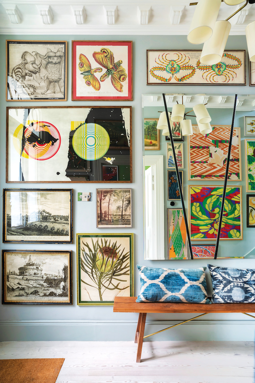
LONDON, ENGLAND
DESIGNER: Adam and Amy Ellis, Adam Ellis Studio
IN BRIEF: We have a large collection of prints, so we chose to be bold and display as many as possible. They are everywhere: in the stairwell, the bathrooms, on the lintels of the doors and even above the cupboards. It all comes from our passion for plants and animals. BIG IDEA: Be bold and try to tell a story. Photography by Bénédicte Drummond.

HAMPTONS, NY
DESIGNER: Sarah “Podge” Bune
IN BRIEF: This house had absolutely no redeeming architectural features. I took down a wall, and now it’s basically one big room with the fireplace, telly, kitchen and dining area. The wall has 29 pictures, and the first ones that went up were the two over the fireplace. Then the mirrors, which add some symmetry. And then I sort of whacked the rest up. BIG IDEA: Put everything on the floor and see which ones complement each other. Photography by Francesco Lagnese/OTTO.

DALLAS, TX
DESIGNER: Mauricio Lobeira, Ten Plus Three
IN BRIEF: This gallery wall next to the main entrance was created to showcase the homeowner’s personal collection of figural sculptures, and the wood and steel pedestal gives it a 3D effect. We used a textured wallcovering, light wood floors and wood baseboards, which enhance the art’s raw colors and textures. A large window in front of it provides abundant natural light. BIG IDEA: Accentuate the art pieces with direct lighting. Photography by Stephen Karlisch.

NEW YORK, NY
DESIGNER: Rayman Boozer, Apartment 48
IN BRIEF: My home office space is a large open loft that demands artwork. Other large walls are taken up with windows and millwork, so this is the natural place for my collection. I’ve collected favorite paintings and photography throughout my life, and have always preferred a medley of mediums, frames, canvases and mattes. BIG IDEA: Balance colors across the wall, always keep it personal and incorporate things you care about. You can create a digital (or paper!) template before attempting to hang artwork on the wall. Photography by Kelly Marshall/OTTO.

SÃO PAULO, BRAZIL
DESIGNER: Ana Strumpf
IN BRIEF: A bright pink wall takes center stage, adorned with a collection of portraits in this jewelry designer’s apartment. The black-and-white patterns on the leather armchairs mellow the tone. On the opposite side of the room, a large, colorful painting hangs over the bright windows, allowing the sunlight to stream through its canvas, breathing yet another element of color throughout. Photography by Fran Parente/OTTO.

SUMMIT, NJ
DESIGNER: Aaron English, W.C. English Co.
IN BRIEF: This client had a growing collection of Polaroids that were scattered on the wall, taken by various members of their family, primarily the children. I thought it was such a sweet idea I gave it a fresh arrangement. BIG IDEA: Make it personal and embrace asymmetry. Photography by Mike Van Tassell.
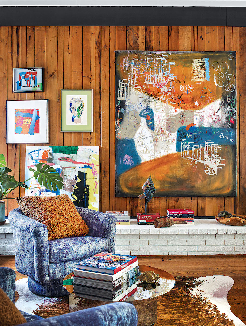
ATLANTA, GA
DESIGNER: Jessica Davis, Atelier Davis
IN BRIEF: This room in our own home was challenging. It’s long and really the only place for the TV. Therefore, we had to separate it into two seating areas. I have a lot of art, so it was natural to display it here. I wanted it to feel warm and eclectic but still pulled together. BIG IDEA: Instead of thinking only about framed or 2D art, I also like to incorporate items that are 3D, such as a wall sculpture or a piece that might not have a standard rectangular shape. Photography by Emily Followill.
Like what you see? Get it first with a subscription to aspire design and home magazine.