
Project Details
Designer: Ginger Curtis, Urbanology Designs
Location: Fort Worth, Texas
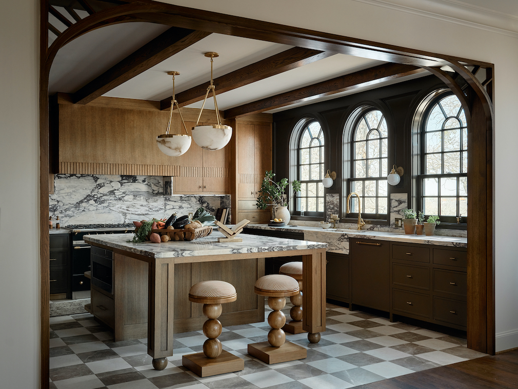
Design Brief: Designer Ginger Curtis operates her practice with a focus on neuroaesthetics — the scientific study of how the brain perceives, processes, and responds to art and beauty. That’s why the cooking enthusiasts who occupy this charming 1920s home approached Urbanology Designs for one of their most personal projects yet: transforming their cramped kitchen into a culinary dream while maintaining the residence’s historic integrity.
Hear from Ginger below on how the project came together:
How did the existing footprint/home style influence the design?
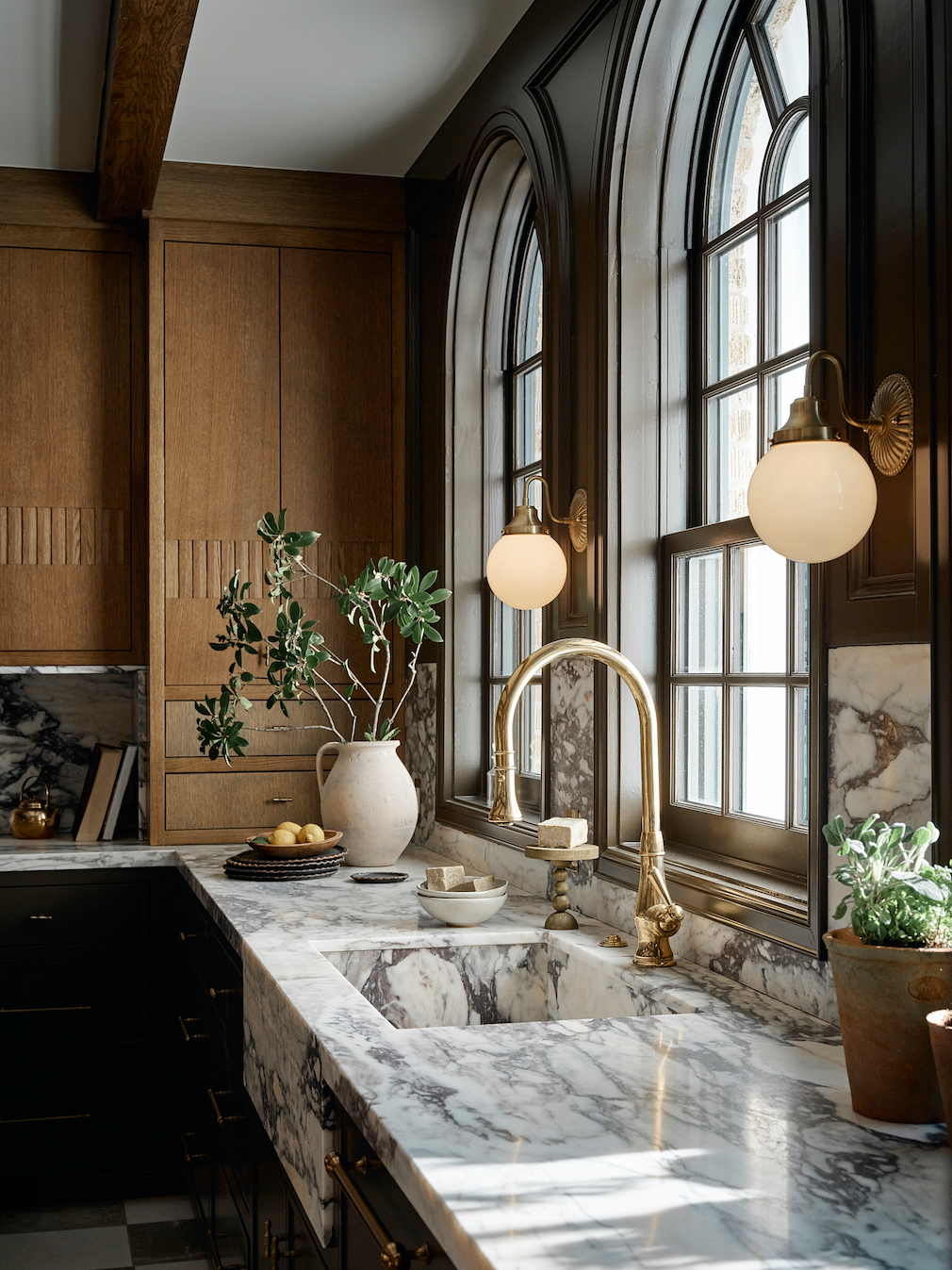
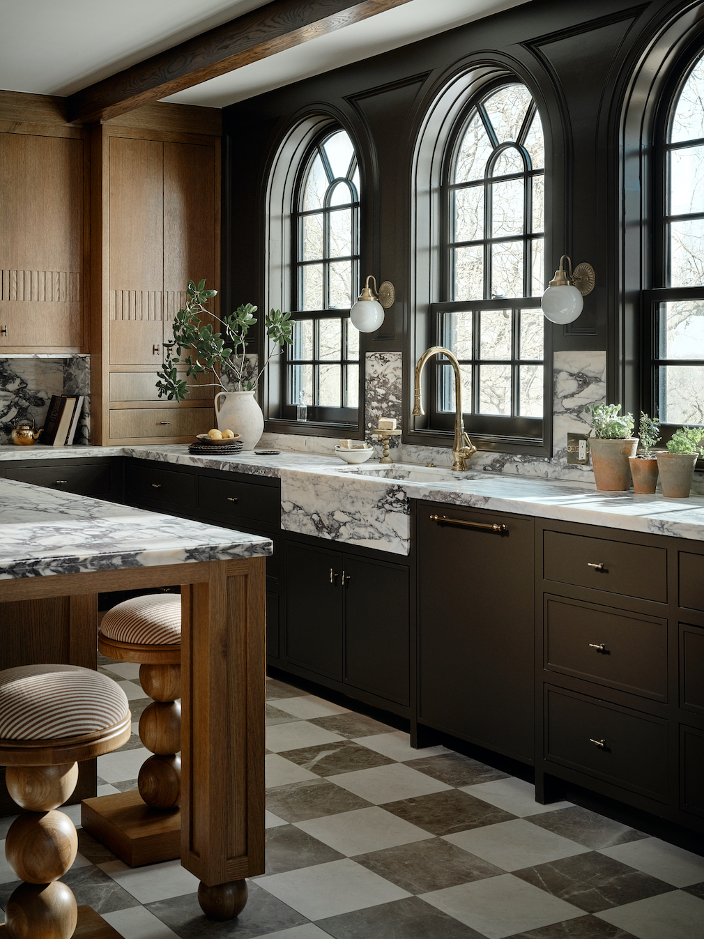
Ginger Curtis: The home was built in 1928 in Fort Worth’s Park Hill neighborhood, and later remodels had diminished some of its original character. Our job was to bring back some of those nostalgic and charming traits from the home’s original time period, but to also blend modern elements found in today’s kitchens. We love historical homes, probably more than most, but we also know many of their kitchens lack ample storage and function, so that was one of our main challenges, especially for our clients who are very passionate cooks. We removed a closet to reopen the original arched passageway, added structural support so we could rework the layout, and introduced arched windows at the back of the house that echo the original windows at the front. We wanted the kitchen to feel like it had always been part of the home’s story.
You approach design with an emphasis on neuroaesthetics; what tone and lasting emotional impact were you looking to set for the homeowners here?
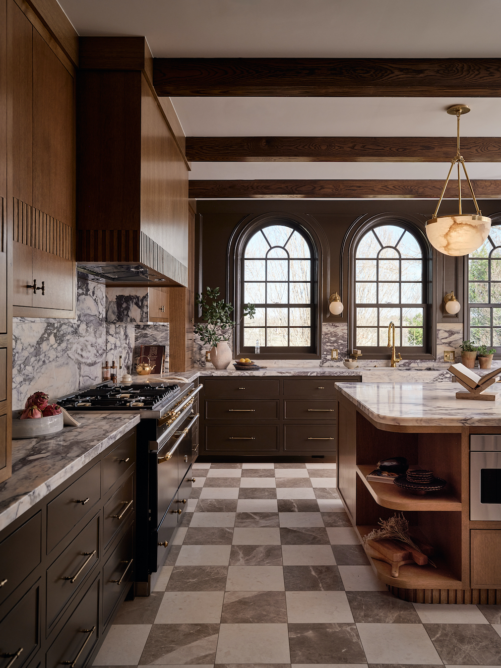
GC: Our clients told us they wanted the kitchen to feel homey, lived-in, relaxed, calm, and warm. That gave us a clear emotional target. Neuroaesthetics tells us that natural light, organic materials, and a sense of visual order lower stress and help people feel at ease. So we brought in daylight and nature views through the arched windows, grounded the room in warm white oak, and kept the lines clean to give the space visual interest while preserving its calm. The goal was a room that restores you and makes you want to linger, whether you’re cooking dinner or just standing at the island with a cocktail and a record playing.
How did layout, flow, and material selection influence the design?
GC: Our clients are very passionate cooks who were used to a very small kitchen, so function drove every early decision. We presented several layouts before landing on the one that gave them the best workflow without losing the home’s integrity, as well as intimacy. From there, the materials did the emotional work. Rift-cut white oak brings warmth and depth, and Calacatta Viola marble wraps the range wall like a single architectural gesture. It’s layered and quietly confident, and echoes the original inspiration for the space, which was that of a European-inspired kitchen.
In a space that is used so frequently (especially for these clients), how do you balance beauty with durability and performance?
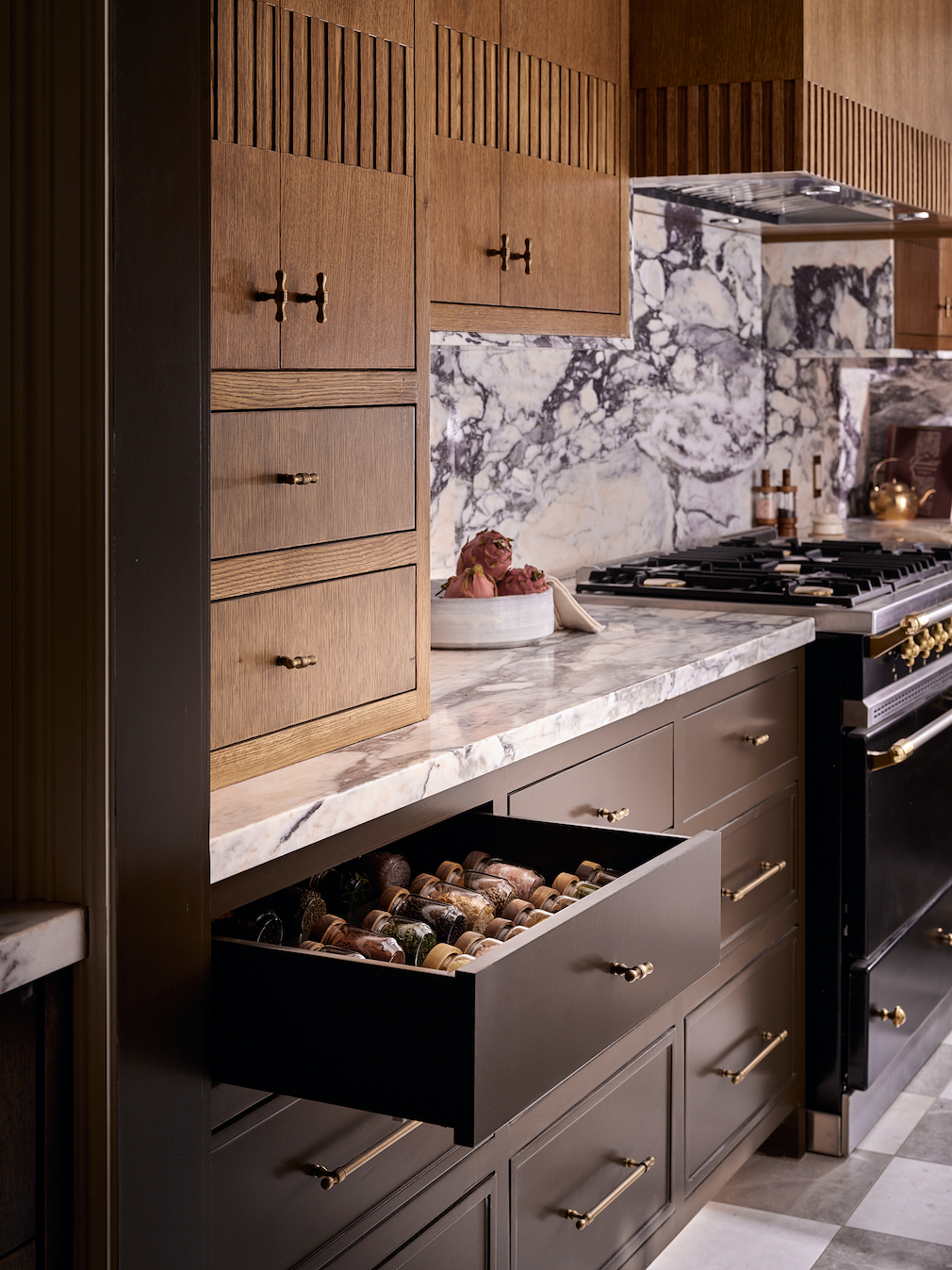
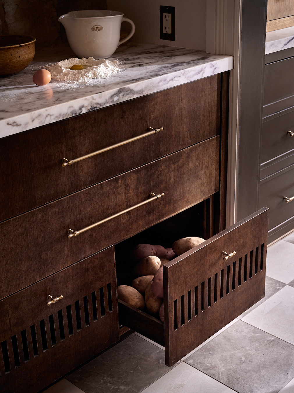
GC: For clients who truly cook, beauty that can’t hold up isn’t beauty at all. We designed storage around how our clients actually worked in the kitchen: pans in drawers, dedicated plate, cup, knife, and spice drawers, and appliance storage so the counters stay clear. Appliances are concealed, so the room performs like a chef’s kitchen without looking like one. On the materials side, we chose honed stone, which wears in gracefully over time, and a hardwax oil finish on the oak that can be refreshed rather than refinished. Even the custom counter stools are upholstered in a Perennials performance fabric. Every choice had to earn its place in daily life, or it was a no-go for us, as well as the clients.
What is your favorite design element within this kitchen?
GC: It’s hard to choose just one, but the element that stands out most to me is the mix of wood tones. Many designers, and even clients, are hesitant to combine woods, but we love the challenge. I always think of a forest. Nature blends hundreds of wood tones, and it always looks stunning. For me, when it’s done with intention, blending tones creates dimension that feels interesting, unexpected, and versatile.
Photography by Stephen Karlisch Photography.
Like what you see? Get it first with a subscription to aspire design and home magazine.